


Last updated on
April 5, 2023
Have you asked any blogger or business how important their opt-in email list is?
Chances are that they’ll say it's very, very dear to them. Expert opinions and a Radicati study also underscore the importance of being able to grow your email list.
You already know that in order to grow your blog, you need to build an email list.
But how do you do it?
Sure, you can read up on all the great articles offering advice on how to get subscribers. But if you are short of time and money, and need results fast? We have you covered.
These 16 actionable tips will make a huge difference to your conversion efforts. Best of all, each of these can be deployed in less than 5 minutes so you can grow your email list fast.
Standing out in today's noisy ecosystem is hard. To help with this, Facebook, Twitter and Google+ allow you to pin a post to the top of your page.
Buffer carried out tests on pinned posts via their Facebook and Twitter account. They discovered that these posts received as much as a 10x difference in conversions.

Pinning older content can have a similar effect and revive interest in it.
Here's how to get subscribers from your social media accounts:

The Dollar Shave Club tried out a “call to action” button on its Facebook page. According to Brian Kim, Director of Acquisition, Dollar Shave Club -
“Over the course of a three-week test, the Sign Up call-to-action button delivered a 2.5x higher conversion rate versus other comparable social placements aimed to drive new user acquisition.”
Why does it work?
Because it allows you to place a call to action in a highly visible place on your Facebook page. Your call to action options include – "Sign Up," "Shop Now," "Contact Us," "Book Now," "Use App," "Watch Video," and "Play Game". All of these can be linked to any destination page on Facebook or off it.
Take for example Amy Porterfield’s Facebook page.

Leadpages have also used a call to action on their Facebook page to gain new users and enhance the overall visitor experience.

Here's how to get subscribers from your Facebook page:
Log in to your Facebook account and go over to your Facebook page. On the cover photo, you will find a “Call to Action” button.

Note: you can find instructions and more details here.
Click on it, choose your call to action, enter the URL and then click on Save Changes.
Research indicates that 70% or more of your website visitors will leave without ever coming back.
That is an awful lot of people that you never have the chance to engage.
What can you do about it?
Add an exit intent pop up. In other words, pop ups that appear with a final offer, when the user is about to leave your page. HubSpot uses a simple exit intent pop up like this one.

How how to get subscribers from with exit pop up forms:
A study by Marketance showed that adding social proof helped one hotel increase the behavior they wanted guests to take by 26%.
Consider this.
When you look at an empty restaurant, you conclude that the food mustn’t be all that nice. But the one with a waiting list and line of people out the front must be the tastier of the two. Psychologists have called this powerful effect – social proof or the bandwagon effect.
Why does it work?
According to Robert Cialdini – People are particularly susceptible to this dynamic when feeling uncertain. We are more likely to be influenced if the people we see seem to be like us.
Consider the site fourhourworkweek.com where Tim Ferris leverages testimonials to create the bandwagon effect.

Here's how to get subscribers from testimonials:
Do you know if you are hindering or helping website visitors as they land on your page? If you are unsure, answer these questions.
These were some of the questions facing Majestic Wines. They wanted to increase the conversion rate on their wedding services page. Visual Website Optimizer was used to test their conversion optimization hypothesis. This, in turn, led to a web page redesign.
The new design included:
All of these resulted in a 201% increase in the goal conversion rate.
John Corcoran’s home page is an example of a page focused on acquiring a visitors email address. He doesn’t even display a menu to avoid distracting visitors from the primary call to action.

Here's how to get subscribers by optimizing your webpage design:
Ensure that you are removing all unnecessary distractions. For each element on your page, ask yourself these questions:
How many questions can you ask on your webform without visitors abandoning your site? According to a Neilsen study and research by Formstack, filling out forms ranks among the top things that web users detest.
But do you know that the number of form fields matters as much as the type of form?
According to Formstack’s conversion report:
So, as a general rule of thumb, less is more and clear calls of action will win you prospects.
Conversion rates for forms also vary by industry according to the report. However, this is also dependent on who is doing the asking and who is filling out the form. Testing is, therefore, required to find the optimum balance.
Here are a few general principles to help you design suitable forms.
Here'e how to get subscribers from forms that convert:
Do you encourage visitors to subscribe at the end of your posts?
If not, consider offering your readers a “content upgrade.”
Kim Roach explains how she used it on her site. It got her a 15% conversion rate on that post which generated 694 subscribers. Brian Dean has used it as well, and it got him a 785% increase in conversion rates. Content upgrades like the one below feature on his blog’s popular posts.

Why does it perform so well?
Your visitors are reading the post through to the end because they are interested in your content.
They are therefore more likely to be open to reading more great content. The content upgrade offers a next logical step. The upgrade should offer potentially more value than they have received from the post.
Here's how to get subscribers from content upgrades:
An often neglected page is the 404 page of a website. Visitors will often leave your site when they land on a 404.
Why? There is little on the page to compel them to return to your site. On most sites, the default 404 error message is displayed with no calls to action. It's a dead end so users simply leave.
However, in this lies the challenge to turn a major inconvenience into an opportunity. In other words, we can design the 404 page to be functional as well as creative. In doing so, you can reduce your bounce rate and offer helpful resources or other options. For example, defrozo uses the following for their 404 error page.

On the other hand, Ramit Sethi’s 404 page for his blog takes a different approach. He offers a helpful resource to people who are likely to be interested in such a resource.

Jgeorge made a similar change on his 404 page for CreativeBeacon.com. He found that the addition of the email opt-in form was converting at 2% and giving him subscribers he would not have gotten otherwise.
Here's how to get subscribers from a 404 page:
You probably send at least a few emails every day. These may be emails to prospects, clients, friends, family and acquaintances, amongst others.
These may opportunities to gain more email subscribers by placing a simple hyperlinked call to action in your email signature.
Here's how to get subscribers from your email signatures:
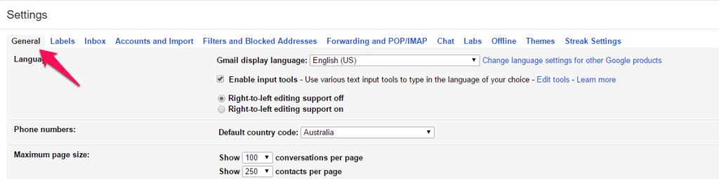
If you use Gmail, follow these steps:

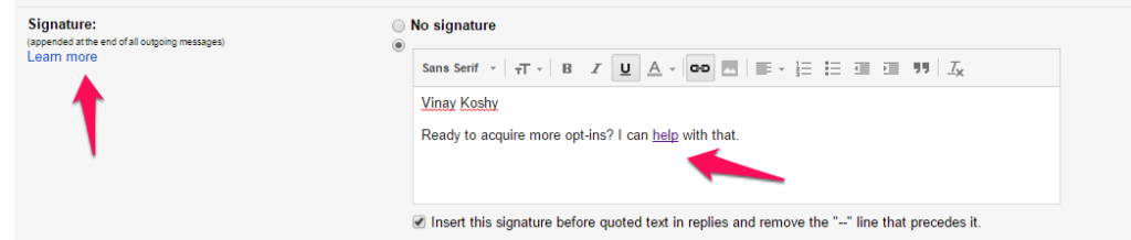
Your link could lead to a landing page or an article that is proven to get more email subscribers than others.
Check your Google Analytics account to find a popular article to link to.
Turning popular posts into lead magnets might not seem useful. Bryan Harris of Videofruit was of the same opinion - until he tried it.
The feedback he received completely changed his perspective.
How?
Downloads make referring to content or a sequence of steps easy. The user can also save it to a location where it would be more meaningful to them. In other words, it increases the perceived value of the post and the efficiency of utilizing it.
Kim Garst took a slightly different approach by turning a popular post into a landing page. Visitors have to subscribe to get access to the PDF of the Facebook post ideas.

Here's how to get subscribers from your lead magnets:
A person who comments on your article is likely to be interested in your content (assuming that it isn’t a spam comment). What better person to encourage others to sign up to your email list?
If you have a WordPress site, use the Yoast Comment Hacks plugin. It can redirect your first-time commentators to a thank you page that has your opt-in form and an incentive.
Stuart Walker from Nichehacks used an alternative plugin – Aweber Comment Form Plugin. It can add a tick box that allows commentators to sign up to your list. He found that this addition alone accounted for 12.20% of his total email sign-ups.
The University of Alberta conducted an experiment to promote their daily email. They used a nudge pop up that appeared after a visitor stayed on a page for 10 seconds. The result?
An increase in subscriptions from 1-2 to 12-15 signs ups. In fact, their subscriber list grew almost 500% in less than a year.

The university used Qualaroo to implement the pop up. The same outcome can also be created with a more economical tool called Qeryz.
Careerbliss uses it to get user experience feedback on their site.

Ann Smarty of seosmarty.com uses it on her site. She uses it to gain subscribers and gauge interest in her offer.

Here's how to get subscribers from pop ups:
Research indicates that most of your visitors will leave without ever coming back.
So, can you maximize the chance of them ever returning?
Make an offer that is hard to resist. Leverage a pop-up that appears after the user has been browsing for a while.
Why the time lapse? It taps into a persuasion technique known as the “pattern interrupt”. The pattern interrupt causes something unexpected to happen. This breaks the rhythm of the brain mid-scrolling, bringing the visitor's complete attention to the call to action.
PostPlanner uses a pop up as a user begins to scroll down their home page. They do this to present offers that are unique to the individuals' needs.

Startup Vitamins makes this offer to website visitors.

Postplanner also makes a captivating offer. They trigger a message if a user has been on the site for a while without making a purchase. A full-screen splash page appears much like an exit intent pop up.

There is a lot of debate on how annoying pop ups can be. There are also lots of studies that show pop ups boost conversions rates.
But to be sure, we need to test it. After all, only one of three things will happen
To find out if the pop ups are annoying visitors, test the pop up timing and ease of return to the page.
Here's how to get subscribers with these tools:
A study by eyeviewdigital.com shows that using video on landing pages can increase conversions by 80%. According to comScore, 45% of internet users viewed at least one video online over the course of a month.
With so many people watching videos, it only makes sense to encourage sign-ups while visitors are watching your videos.
By hosting your videos on Wistia, you can include an email opt-in form. The opt-in gets shown at a selected time during your video. The feature called Turnstile has been shown to have conversion rates on average of about 11%. Timing the display of Turnstile is important, and the graph below provides Wistia's insights.

Here's how to get subscribers from Turnstile:
An essential part of asking your website visitors to do something is the call to action. After all, your visitors have to go through your call to action to do it. This is true whether it is to sign up for email updates, special offers, or product purchases.

Studies on changing the color and changing the copy of your call to action button have seen an increase in conversion rates of 32.5% and 31.47%.
Here's how to get subscribers by testing your call to action buttons:
Consider a website visitor is scrolling down as they read on. The further they scroll down, the greater the likelihood that they are interested in your content.
So what can be done to tap into this interest and give your visitors a nudge to subscribe to your list?
Try using a scroll box. It is like a pop-up box that appears only when you have scrolled some way down the page.
It works well as it appears after users have scrolled down and gotten some value from your content. The fact that it involves movement attracts the eyes. That means it stands a better chance of being noticed as opposed to a static offer you have in your sidebar.
Groove placed a scroll box on their blog. In the first 30days, they noticed that it resulted in a 1.4% conversion rate.

There are a few tactics for you to implement and get you started right now.
If you are getting qualified traffic to your site, then these visitors are yours for the taking. Why not get them to join your email list and nurture your relationship with them?
So, take action. Make it as easy as possible for them to find your services.
MailMunch's lead capture tool can automate your email list building! If you are not already a user check it out.
So, what's your go-to tip on how to get subscribers? Let us know!
Tags:


M. Usama
April 19, 2024

M. Usama
April 19, 2024

M. Usama
April 18, 2024


