


Last updated on
July 11, 2023
There's a lot that goes into setting up an eCommerce store.
First, there's deciding what to sell; then there’s sourcing your products, setting up your store, and finally starting to drive traffic to your store so you can start making money.
Unfortunately, these are just the first steps you need to take, and once you've managed to successfully implement these steps, you need to focus on how you're going to turn that traffic into conversions.
This is where optimizing your eCommerce store comes in.
To help you with this, we've looked at 9 ways you can optimize your eCommerce store to improve your conversion rate and get started with your journey of making money online.
Let's take a look at them.

Limited time coupons work well at introducing a little bit of scarcity (FOMO) to your buyers while also giving them a good deal.
Limited time coupons work particularly well at converting those prospects who’ve been keeping an eye on your products but have been waiting for a price reduction.
Limited time coupon codes can be configured with a definite start time and expiry time and usually involve a prospect having to spend a certain amount to use the coupon code.
Tools such as SmartCoupon by WooCommerce can be used to create limited-time coupon codes. When you're creating limited-time coupons, you can configure the coupon's value, the number of times it can be used, and which products you want the coupon to apply to.
Limited time coupon codes work particularly well when they are combined with other coupons such as:
Free shipping/postage coupons
Free shipping/postage can be beneficial to those buyers who need an extra incentive to complete their purchase. A coupon code that gives a prospect free shipping and a percentage off their order are much more enticing than a singular coupon offer.
Research suggests up to 44% of those who abandon their carts cite shipping costs as the main reason for doing so. One way to get around this objection is to offer free shipping, but if you can’t afford to do that, try and make the buyer aware of any shipping costs before they reach the checkout page.
You could even offer free shipping or courier service to repeat customers. You could do this by adding a QR code to every package you ship out. You can create unique QR codes for the packages using QR code generators available online.Customers can scan the QR code to verify that they have bought and received a package which will then lead them to a page that allows free shipping on their next order.
Total cart value coupon codes
Total cart value coupon codes restrict customers to only qualifying for a discount when their order is of a certain value.
For example, you could place a coupon code on your site for visitors to get 20% should they spend $50 or more.
These types of coupon codes can be intertwined with limited-time coupon codes, e.g., a site could run a coupon code stating that buyers can get 20% off should they spend $50 or more within the next 24 hours.

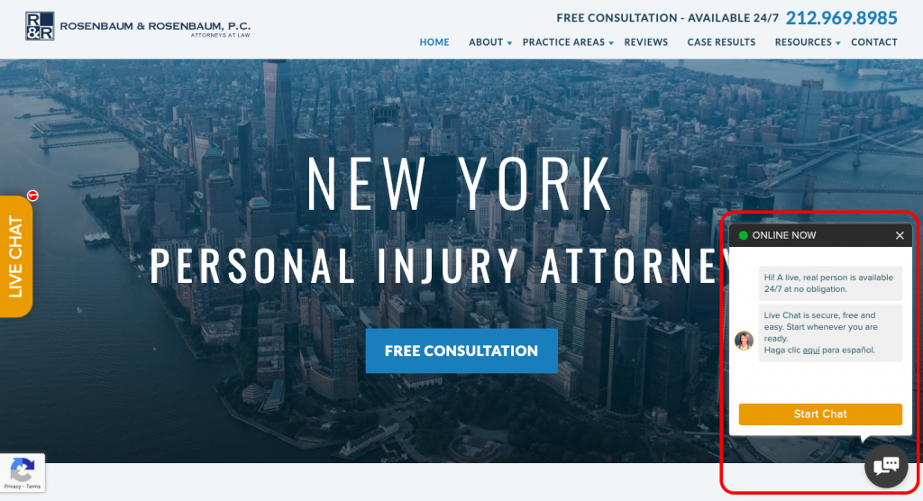
A live chat option is a non-invasive way of collecting prospects' information while also optimizing for local SEO which is particularly important for service providers like lawyers, real estate progressions, etc.. With a live chat feature, a prospect doesn't need to worry about emailing or calling your company to inquire about your services.
For example, in the image above, a visitor to Rosenbaum's site is invited to start a chat with a real person. Within minutes the prospect can be connected with a representative who can give them tailored information about their particular needs and take their contact information if they're looking to book a free trial.
This approach is less invasive for a prospect than having to fill out an opt-in form or completing any other kind of long-sign-up procedure. However, at the same time, it can also be a good way to grow your email list. You can engage with a potential prospect over live chat and then follow up via email later.
Even if your company doesn't have staff on hand 24 hours a day, chatbots can still be employed 24/7 to gather leads any time of the day or night. The right usage of chatbots can help you save money if you do not have the financial resources or financial software to hire people to deal with customers.
Pricing your products is one of the trickiest parts of running any business.
Price your product too low, and you risk eating into your profits, price your product too high, and you risk making your product too expensive for your potential customers.
Despite its difficulty, pricing is probably the most important part of your eCommerce strategy. More than 60% of Commerce buyers cite pricing as the very first criteria that affect their decision to buy.
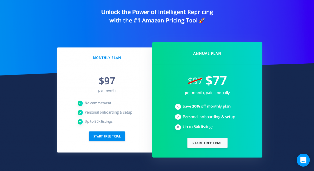
One way of testing out different pricing strategies is to offer different price points in the form of monthly and annual plans.
As you can see in the example above, GoAura offers their monthly service at $97 a month but also an annual plan that works out cheaper for the prospect. If a prospect signs up for the annual plan, they’ll save around $240 a year compared to the monthly plan but will have a higher upfront cost.
If they sign up for the monthly plan, they have greater flexibility but will pay a higher price. If the prospect wants to try out the tool before committing to a paid plan, they can sign up for a free trial.
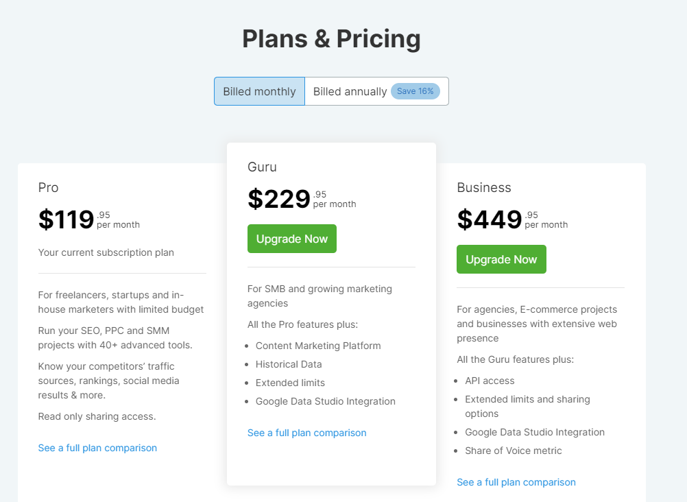
Similar to monthly and annual pricing plans, many companies offer tiered pricing options that prospects can select from based on their needs.
SEMRush, an SEO company, helps users create better content and become an expert on everything SEO. The service they offer can be pretty pricey which is why competitive pricing is imperative.
The company offers three different pricing plans based on the prospects' needs. SEMRush also gives the prospect a choice between monthly and annual pricing while making it clear how much can be saved by paying annually.
Both of these pricing strategies work well at giving a prospect choice and more flexibility when purchasing a product or service.
A/B testing refers to the comparison of two versions of the same piece of content. When you're creating and testing out landing pages, it's inevitable that you'll have to test and change different parts to see what works best.
When it comes to designing landing pages and keeping up with design trends, you have to hit the right balance between using your intuition and analyzing data, and there will always be an element of trial and error in the success of a landing page.
The first decision you'll have to make is what part or parts of your landing page you'll want to test. To help give you some ideas, here are some of the areas you may look to conduct A/B testing on:
The Headline
Your headline hooks your visitor, and your copy keeps the visitor moving down your page. Your headline will usually include your core value proposition and demonstrate why someone would want your product or service.
Trying to sum up the main benefits of your business in a couple of sentences isn’t easy, so you may have to test out a few different headlines before you stumble upon one that works for you and your business.
Some of the most common approaches you can try when testing your headline include:
This guide from Instapage can help you craft catchy landing page headlines.
The Offer
Testing out different offers tells you a lot about what your audience wants.
For example, you might be disappointed by a lack of visitors downloading your eBook; after all, you spend lots of time creating it, and it provides value; why aren't people downloading it?
Well, it could just be that your audience prefers video content over the written word. To test this, you could try offering a short 2-minute explainer video or series of videos instead.
Or perhaps you're selling an online course that isn't converting. Instead of offering the course at full price, you could try changing your offer to 20% off to see if your conversions improve.
The Call to Action (CTA)
Your call to action is your chance to win over those who visit your landing page. This is why it’s advisable to A/B test different aspects of your call to action. These aspects include:
For some inspiration, check out these 15 examples of high-converting landing pages from Unbounce.

In the above example, accident & injury lawyers Allen Law Firm show what good website navigation looks like.
As soon as someone clicks onto the website, they are greeted by a chatbot where they can speak to a representative about their needs.
The website is laid out in a logical fashion. The home page gives a clear idea of what the law firm does, which gives the visitor a clear idea of what Allen Law does. This is key; if visitors to a website are unclear what it's offering, the website's conversions will suffer.
A visitor to the site can easily see at the top of the web page the different areas of the site they can access. If they want to learn more about the law firm, they can click on the 'About Us' section.
If the visitor/prospect wants to see what areas the law firm practices, they can hover over the 'Practice Areas' and select the relevant area they wish to learn more about.
The visitor can also easily submit their details for a free consultation in the opt-in form located towards the top of the web page. Overall, Allen Law Firm's website gives users a great experience, and they've done a great job at making their site easily navigable for visitors to their site.
You want to make sure your eCommerce site is easy to navigate, and a visitor landing on your site can easily tell what your company or brand is about and the products and services you have to offer.
Easy navigation also helps your link-building efforts. A journalist or fellow website that is quoting should be able to easily find what your services are, what your pricing is, etc. Making things easier for them could possibly mean more links for you.
Another interesting point to note is that 30% of eCommerce site visitors will use a site's search functionality to find what they're looking for. As you can see from the screenshot below, those shoppers who use a site's internal search function can have a considerable impact on conversions.

So, if your site doesn't yet have a search function consider adding one; this will make it easier for visitors to your site to find what they need, which is particularly important if you're going to be adding more content and products to your eCommerce site.
You'll also want to make sure the products your site carries are under the right categories. So always check your site regularly to make sure your products are listed and discoverable in the right places.
For more information on doing on a WordPress site, you can check out WooCommerce's product taxonomies pages here.

With 48% of respondents to an Econsultancy survey stating that trust badges reassure them that the site their buying from is secure and trustworthy, trust badges are evidently a great way of letting your website visitors know that your web page is legitimate and that they're entering their payment details into a secure site.
Some of the most popular trust badges include:
While you can place your trust badges throughout your website, you want to make sure you're placing badges in relevant areas.
For example, a guaranteed safe & secure checkout badge should be placed on your checkout page. If your product has won any awards, place those badges on your homepage.
Guarantees work well at lowering the risk for the buyer. A good guarantee builds trust with the buyer and showcases your confidence in your products and services' quality.
Some of the most common guarantees include:
A money-back guarantee effectively says to a buyer that they can return it stress-free if they are not satisfied with their purchase.
A best price guarantee gives a buyer reassurance that your products/services are the most competitively priced on the market, while a lifetime guarantee gives a buyer confidence that your products/services are high quality and will last for an extended period of time.
Cart abandonment also takes place whenever a user has to fill in too many details or the form is very long. To counteract this negative, you could add simple explanations whenever you are asking for information from your customers.
For example, Recruitee, a talent acquisition platform, explains to customers that their phone number is used for security and safety purposes.

This simple sentence can convince a customer to fill in private information and complete their purchase.
Of course higher value products are going to need more convincing than a simple badge. For example, LFA capsule fillers include information about their warranty and shipping policies below each product page. Adding this vital information can make all the difference when a customer is on edge about buying your product.
Customized products let consumers customize their purchases and help to give a consumer a unique brand experience.
Famous examples of customizable products include Lenovo allowing customers to build their own custom laptops, and Nike, allowing consumers to design their own sneakers.
If you can give your consumers an element of customization when choosing their product, such as its color or size, then try and do so.

Tools such as HotJar, CrazyEgg, and ClickTale give website owners and marketers insight into the areas of a website, users are most attracted to and which areas need improvement.
A Heatmap can help you understand how users are interacting with your site, particularly your CTA's, and whether they are located in the right place. You can use this data in your decision-making process when you're testing new CTA copy or CTA placement.
For more insights on how to use heatmaps to improve your site's conversion rates, check out this post from Humcommerce.
Cart abandonment costs eCommerce stores over $18 billion per year in revenue. This means that you can improve your cart abandonment rate even slightly, you can see a nice spike in revenue.
Some of the recommendations we’ve given, such as putting trust badges on your site, can go a long way to reducing your cart abandonment rate. Other tips include:
You can even use an email marketing software to update users when they have left items in their cart.
Hot Topic follows this practice and makes thousands of dollars sending this simple email to customers who have abandoned items in their cart.

As you can see, there are quite a few different tips and tricks you can use to optimize your eCommerce store’s conversion rate.
Be prepared to keep making changes and tweaks to your site on an ongoing basis, it can take an element of trial and error, but with enough persistence and analysis, you can ensure your eCommerce site’s conversion rate remains healthy.
Aqsa Mughees works as a Content Lead at Mailmunch with 5+ years of experience in creative content strategy. With a grip in digital content creation for the tech industry and an undying love for writing, she is crazy about helping businesses grow through content marketing.
Tags:


Hamna Abid
July 11, 2023
Hamna Abid
June 23, 2023
Ammar Mazhar
May 30, 2023


