
.png)

Last updated on
July 3, 2025
In a world where inboxes are flooded with hundreds of emails every day, getting someone to notice and actually open your email is no small feat.
While excellent copy and catchy subject lines matter, color is one of the most underestimated drivers of email engagement.
The right hues can boost click-through rates, reinforce your brand identity, and evoke emotions, influencing buying decisions.
So, let’s dive into the best email marketing colors and how to use them to your advantage.
When you open an email, what grabs your attention first? Before you read a word, your eyes are likely drawn to the colors. In the crowded world of inboxes, where users make split-second decisions about engaging or ignoring, color becomes an unspoken language.
It can catch attention, stir emotions, and influence decisions all within the blink of an eye. This is why choosing the right colors in email marketing isn’t just about aesthetics; it’s a strategic move that can dramatically shape the performance of your campaigns.
We process visuals 60,000 times faster than text, meaning that color can speak volumes before your reader even begins to read. With a well-chosen color palette, your email will instantly stand out, grab attention, and encourage action.
Colors don’t just look good — they feel good. Or sometimes, urgent. Or trustworthy. Or exciting. This is the essence of color psychology in email marketing. People naturally associate different emotions with different colors. For instance, red screams urgency, while blue signals trust and calm. These subtle cues can push readers toward opening an email or clicking on a CTA.
Don’t believe the importance of colors in email marketing? Here are a few stats to help you understand why having the right colors in your email matters.
These aren’t just numbers—they’re proof that high-converting email colors matter.
Color isn’t just decoration — it’s communication. Before your subscribers read a word of your email, they feel it through color.
You can create a sense of urgency, build trust, or highlight a luxury offering; your color choices are silently shaping how people perceive and respond to your message.
Understanding color psychology in email marketing helps marketers tap into emotional triggers and influence actions with subtle visual cues.
.jpg)
Red commands attention and signals immediate action, perfect for flash sales or limited-time offers. It evokes strong emotions and can raise heart rates, making it an ideal choice for prompting quick decisions.
Examples:
However, it’s best used sparingly, as too much red may feel aggressive or overwhelming.
Blue is widely used in B2B emails, and it instills confidence and professionalism. It’s a go-to for industries like finance, tech, and healthcare where security and reliability matter. Light blues create a calming effect, while darker blues suggest strength and dependability.
Mailmunch takes liberty by using blue as its primary color. These colors have become a part of the brand's personality, with blue and midnight blue being the primary colors, while yellow and lemon chiffon are the secondary colors.
Green is synonymous with nature, health, and financial growth. It’s perfect for wellness campaigns, eco-friendly brands, and financial products. It conveys a sense of renewal and balance, helping readers feel reassured and optimistic.
Brands like The Body Shop and Lush utilize elements of green in their branding and advertising to show that they are close to nature and care about the environment and the people using their products.
Bright and cheerful, yellow sparks curiosity and positivity. It works well for announcing product launches, events, or promotions. While attention-grabbing, yellow can become straining in large doses, so pair it with neutral tones for balance.
Brands like Snapchat and Post-its use yellow as their primary color, showing a positive outlook and a bright, cheerful vibe for its users.
Neutrals never go out of style. Black adds sophistication and luxury, white offers clarity and space, and grey brings a modern, understated feel. These colors help emphasize more vibrant hues and give structure to your layout.
Gucci, Chanel, Apple, and even Nike use black in their branding and products to showcase their luxury status and their sleek and elegant designs.
Orange is energetic, enthusiastic, and friendly, making it a great choice for calls to action and playful brands. On the other hand, Purple conveys creativity, elegance, and exclusivity, making it a strong choice for premium products or artistic ventures.
Cadbury, Taco Bell, and Roku use purple as their primary branding colors to showcase their sense of creativity and elegance, while brands like Dunkin, Fanta, and Reese’s use orange as their primary colors to showcase their fun and friendly personality.
Color does more than just make your emails look pretty; it tells a story. It sets the mood, evokes emotion, and even nudges people to take action.
Whether you're announcing a product, sharing a blog post, or launching a flash sale, the right color choice can help make sure your message lands the way you intended.
Before picking colors for your emails, take a step back and look at your brand. What do people think when they see your logo or visit your website? Are your visuals bold and energetic, or calm and minimal?
Your email campaigns should mirror that same identity. For example, if your brand leans into earthy tones, those same browns, greens, or beiges should appear in your emails. Everything feels consistent and instantly recognizable — like a friendly wave from a familiar face.
Tip: Reuse brand colors across your logo, website, packaging, and emails to reinforce who you are and build long-term trust with your audience.
Different types of emails serve other purposes, and the colors you use should match the mood.
Think of it like dressing for the occasion:
The idea is to let color quietly support your message without getting in the way.
Your audience plays a massive role in how your emails should look. A playful, bold email might work great for a fashion brand but could feel out of place in a corporate setting.
Tip: Always consider your audience’s mindset. A busy executive skimming emails between meetings wants clarity, not confetti. A shopper looking for weekend deals might be more receptive to bold, colorful messages.
Colors aren’t static. They change with the seasons, moods, and current events. Leveraging seasonal color palettes is a subtle but effective way to make your emails feel timely and relevant.
Here’s a quick guide:
Pro tip: Ensure your seasonal color schemes align with your brand palette. You want seasonal flair, not a total makeover.
Color isn’t just about aesthetics — it’s a tool to help you guide your reader through the email and keep things clear.
.jpg)
.jpg)
Just like a great outfit, a good email color scheme is all about balance. Bold colors can be powerful, but too many can overwhelm your reader.
Pair brighter elements (like buttons or banners) with neutral backgrounds. This keeps your layout clean and allows the important stuff to shine.
.jpg)
.jpg)
Think of bright colors as signposts. Use them to highlight what you want the reader to focus on: CTAs, deadlines, discounts, or new features. A pop of color can steer the eye exactly where you want it to go, but use it sparingly for the best effect.
.jpg)
More than half of emails are read on phones now, so always check your color choices on a mobile screen. Light backgrounds with dark text are usually safest for readability. Avoid color combos that blend together or make your message hard to read on small screens.
.jpg)
Your CTA (call-to-action) button is the heart of your email. It’s the thing you want people to notice — and click!
Make it stand out with bold, contrasting colors. Here’s what works well:
Make sure the button color contrasts with your background, and remember to test its visibility on mobile, too.
Choosing colors isn’t just about creativity but clarity, accessibility, and cultural awareness. Avoid these common pitfalls that can derail even the best email design.
It’s tempting to focus on bright, saturated colors, especially when trying to grab attention in a crowded inbox. But too much intensity can work against you.
Think of it like using a highlighter on a printed page: if everything is highlighted, then nothing stands out.
What to avoid:
What to do instead:
Pro tip: Less is more. A splash of bright color can have more impact than a full-on rainbow.
Color shouldn't just look good. It should work for everyone. Around 1 in 12 men and 1 in 200 women experience some form of color blindness, most commonly difficulty distinguishing between red and green.
If your email relies too heavily on color to communicate meaning (like red for “stop” or green for “go”), you risk alienating part of your audience.
What to avoid:
What to do instead:
Remember: Accessibility isn’t just a bonus, it’s essential for inclusive communication and a better user experience.
Color isn’t universal; it’s cultural. The same shade can spark different emotions depending on who’s viewing it and where they’re from.
Let’s take red as an example:
This doesn’t mean you must redesign every email for every culture, but if you have a global audience, it’s worth being mindful of these associations.
What to avoid:
What to do instead:
Bottom line: If your email audience spans different regions or cultures, consider how your color choices might be received.
Regarding email design, theory is helpful, but seeing real-world examples can be even more powerful.
The best brands use color not just to make their emails visually appealing, but to reinforce their identity, guide attention, and trigger the right emotions.
Let’s explore how some well-known companies apply color in their email campaigns with clear intention and style.
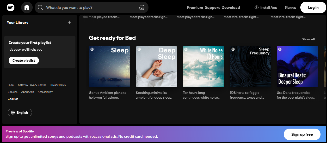
Spotify keeps it bold and modern with a signature combo: dark backgrounds and vivid green CTA buttons. The contrast here isn’t just stylish, it’s functional. The green “Play Now” or “Get Premium” buttons pop against the sleek black, drawing your eye immediately where it needs to go.
Why it works:
This is an excellent reminder that strong contrast can be your best friend when you want your CTAs to stand out.
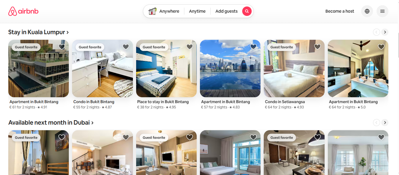
Airbnb takes an entirely different approach, using a palette of soft pinks, corals, and muted reds. These gentle colors evoke warmth, friendliness, and a sense of belonging — all core themes in Airbnb’s brand story.
Why it works:
Instead of shouting at you with color, Airbnb creates a calm, emotional atmosphere that invites you to engage, like being welcomed into a cozy space.
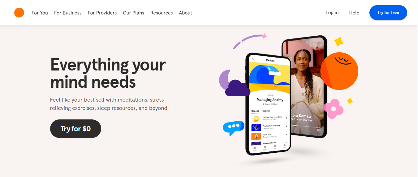
Headspace, the mindfulness and meditation app, is a masterclass in using color to reflect mood and purpose. Their emails often feature soothing oranges, light blues, and white space radiating calm and clarity.
Why it works:
Their use of color supports the message, helping users feel centered even before they click.
These examples show that color isn’t just decoration, it’s communication. Whether you want your emails to feel urgent, comforting, trustworthy, or fun, your color choices set the tone before a single word is read.
So, take a page from brands like Spotify, Airbnb, and Headspace:
The result? Emails that aren’t just seen, they’re felt.
Color plays a powerful psychological role in email marketing, impacting how users perceive your brand, feel about your content, and act on your calls to action.
From buttons to background hues, the colors you choose can directly influence open rates, click-through rates, and conversions.
But selecting the "right" colors isn’t just about aesthetic appeal; it’s about performance. That’s where testing and optimization come in. Below are key steps to help you systematically test and refine your email color strategy for maximum impact.
.jpg)
Your call-to-action (CTA) buttons are the primary drivers of user engagement, and color directly influences how noticeable and clickable they are. Use A/B testing to evaluate how different button shades perform.
For example, test a bold red CTA against a more subdued blue or green one. To get clean and actionable results, test one variable at a time, just the button color, while keeping the copy, layout, and size consistent.
Over time, patterns will emerge that indicate which color schemes resonate most with your audience.
Once your emails are live, tools like Mailmunch can help you measure the effectiveness of your color choices.
Their built-in analytics dashboards track real-time engagement data, such as click-through rates (CTR), conversion rates, and heatmaps, helping you determine which color combinations attract attention and drive action.
You can segment reports by campaign, device, or user demographics to see whether certain colors work better for different audiences or devices.
Optimization doesn’t stop at a single test. Use performance data and customer feedback to refine your email color palette continually.
For instance, if feedback suggests that specific colors strain the eyes or look inconsistent with your brand, consider making subtle adjustments. Monitor how saturation, contrast, or tone changes affect behavior over time. Staying adaptable ensures your emails remain visually appealing and effective, even as customer preferences evolve.
Pro Tip: Make sure your color palette is accessible, contrast ratios, and color-blind-friendly designs help ensure every subscriber has a consistent, inclusive experience.
Mailmunch’s email builder isn’t just drag-and-drop — it’s smart. Our AI-powered design assistant helps you:
Whether you’re creating a holiday flash sale or a B2B product update, Mailmunch takes the guesswork out of choosing colors.
The colors you choose in your email marketing do more than look good — they communicate emotion, encourage action, and define how people experience your brand. Whether you're going for trust, urgency, creativity, or simplicity, there’s a color palette for that.
In summary:
Want to see how the best colors for email marketing can boost your next campaign? Try Mailmunch today and let our innovative tools help you design emails that convert.
Green, orange, and red often perform best depending on your goal. Be sure to test different combinations to find the right fit for your audience.
Yes! Seasonal palettes keep your brand feeling timely and relevant. Colors help you tell a story, and changing pallets based on seasons can help you interact and appeal to your customers more.
While subject lines influence open rates, in-email colors significantly impact click-through and conversion. Subject lines are the first thing that customers see in their inboxes, and they are more closely related to open rates, whereas in email, colors play a vital role in keeping the customers interested and help drive click-through rates.
Yes, but keep it cohesive. Use one core palette per email and vary it slightly between campaigns for freshness without confusion.
Ayesha Ejaz is a passionate writer who loves diving into research to explore new topics and broaden her knowledge. With a keen interest in learning through writing, Ayesha crafts informative and engaging content across various subjects. You'll find her unwinding with music or challenging herself with word search puzzles when she's not writing.
Tags:


