
Last updated on
March 29, 2023
If you have just launched a website for your business, you need to slow down on how much you can achieve with your sales and revenue. The truth is, sales will not increase overnight. Though you may drive healthy traffic to your website, the conversion is not guaranteed. It takes time to convert your visitors to buyers. Available statistics show that the average conversion rate of a website is 2.35%. However, top companies register up to a five-time higher conversion rate.
But, the question is if your business prospects don’t come back to you, what should you do to ensure that you don’t lose on them?
You build an email list and nurture prospects to buy your products.
The key here is to convince visitors to fill in opt-in forms. Your aim is to boost sign-ups by reducing friction amongst customers to complete the form.
In this post, we touch on a few of the major elements of highly converting opt-in forms. Let’s get started.
When it comes to generating leads, visual content plays a critical role. B2B companies that create visual content increase their conversion rate 7 times more than those that don't. Statistics show that visitors are more inclined to content that features visuals. This may be because the human brain processes visuals 60,000 times faster than text.
Posts that feature visuals also generate 180% more engagement compared to those that don't. When creating opt-in forms, visuals can form part of the lead magnets that incentivize visitors to share their contact information with you.
A few examples of lead magnets you can consider, based on your target audience, are ebooks, blogs, social media channels, research reports, and videos. When creating opt-in pages for these lead magnets, include a catchy image of the product, or a video related to the product.

Using an opt-in form or landing page that includes a video can increase conversion rates by up to 80%. If you opt to use social media channels or blogs, you can use icons to draw the attention of visitors. Though simple icons can play the role of guiding or pointing readers to call-to-action buttons and have the ability to increase conversion rates by 30%.
Content upgrades are freebies positioned within a post and are related to the topic being discussed in the post.
For instance, if you have published an article on 'how to increase eCommerce sales', you could offer a freebie on 'different ways to promote an eCommerce site on social media' to enhance value for your reader.
The idea is to have prospective customers click on the freebies, as they read the post and sign up in order to get the freebie. The fact that content upgrades are related to already published posts makes them highly effective in generating leads for B2B companies.
By providing content upgrades in their blog posts, companies are able to target their ideal customers each time. Placing them on the most frequently read posts can help grow email lists pretty fast.
Content upgrades offer companies several benefits including enhancing blog content and making blogs an easy read. An interesting example of blogs that use these content upgrades to boost lead generation is Wonderclass. On its “Ultimate guide to goal setting” post, the site offers readers a free goal setting workbook.

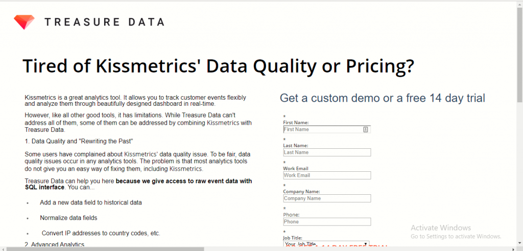
The number of fields that you include in opt-in forms affect conversion rates. The simpler your opt-in form or landing page is, the better. Existing statistics show that the fewer the fields you have on a lead generation form, the higher the conversion rate.
Although there is usually a trade-off between the quality of leads. When you have more fields in your form, you get more information from subscribers and if they’ve taken the time to fill out a lengthy form, it also shows they are interested.
Based on the graph below, the average number of fields ranges between four and five.

If there is anything to remove from your opt-in pages, it should be doing away with form fields that are unnecessary. For every field you include in the form, find out how relevant it is to what you want to achieve. If it is of no relevance, consider doing away with it. However, you can increase conversion rates by up to 50% by reducing the number of fields from four to three.
As you create your opt-in forms, ensure that you reduce friction that could be caused by poor organization and structure of the form. The way to do this is to consider the lead magnet you are offering - is it an ebook, a webinar or a pillar page?
Evaluate the benefits and the value your offer brings to your prospects. Use this value to determine the number and types of fields to include in the form. Make the form easy for your users to complete.
A classic example of a company that has perfected its opt-in form is Shopify. This online store features a single field and images on its opt-in page. This takes a short time to complete and appeals to visitors. The company does not ask visitors to provide credit card information this removes the fear of having to pay in advance before trying a product.

To ensure that your visitors don't leave your website without providing you with lead information, ensure your opt-in form is placed on an area, where visitors don't have to scroll to view it - this area is called ‘above the fold’.
Remember the average amount of time that visitors take to make an impression about your web page is 50 milliseconds. As you have only a short duration to capture visitors’ attention, companies must consider carefully where they place opt-in forms on their websites.
In doing so, their marketing teams have to balance every aspect of post-click pages to gather leads.
Though the company may be using one post-click page, marketers should consider the following issues when thinking about optimizing opt-in forms:

Your opt-in form needs to be accompanied by a call-to-action (CTA) that stands out from the other elements in your form. This helps capture the attention of prospective leads and encourages them to take action and click.
The color of the CTA button also matters. Studies show the brighter the color, the better. Between red and green, red buttons tend to carry the day with a 34% higher conversion rate.
Also, ensure that you use an actual button for the CTA to distinguish it from the other elements that appear on the page. While paying attention to the color of your CTA buttons, you should not forget about the copy that accompanies it. Ideally, the copy should be brief and direct, so visitors can view and process it quickly.
What is of importance to note is that even the slightest adjustments to CTA copy can have a significant impact on conversion rates. Be sure to run your opt-in forms through an A/B test to ensure that all elements are working well and those elements resonate well with your target audience.
When you are seeking to generate leads for your business, you need to ensure seamless communication between prospects and your company. You need to make it easy for current and prospective customers to reach to you with questions or requests they may have about your business or the products you offer. Often, people will use different communication channels to reach your business - including phone calls, social media, emails, and live chats.
One way to ensure you do not miss out on anything your prospects need is to streamline communication using a help desk ticketing system. This system ensures that every incoming communication is captured as a ticket, assigned to a customer rep, tracked to ensure proper resolution, and closed.
Existing data shows that when customers need issues resolved, they want representatives they engage with to be knowledgeable and they want the issues to be resolved fast. A ticketing system can help your company give visitors a positive customer experience by ensuring their issues are resolved with speed and by knowledgeable representatives.
While your website may have all the necessary ingredients to attract visitors, you need to do more to convert those visitors into quality leads. One way of doing this is by using call-to-actions. However, asking visitors to take action is not enough. Every site they visit, people are asked to provide their emails. As such, the question to ask is why should they share their contacts? What value would they get for completing your opt-in form?
To encourage your visitors to fill opt-in forms, consider giving something valuable that they would be willing to receive in exchange for their email address. Offering a valuable bait like an ebook, white paper, a podcast or a free course to visitors is one of the best ways to make them want to exchange their email addresses. While this tactic is not entirely new, getting a bit creative with free offerings can help you overcome content noise and truly engage your target leads.
A good example of a website that offers customers bait in exchange for their contact details is Social Triggers. The website invites visitors to subscribe to its mailing list and get a free ebook.

Increasing revenue online requires hard work on your part. Any B2B company that wants to do this must start by generating quality leads. If you are just starting to build an email list for use in lead generation, strategies on how to create an opt-in page discussed above can go a long in improving your conversion rates.
It is, however, important to note that each website is unique and its audience is also unique. As such, it is critical that you test the strategies and find the one that generates the kind of results you want. Begin by implementing one strategy at a time and grow gradually to a level where you have all of them running concurrently.
Content marketing guru at Mailmunch. I’m passionate about writing content that resonates with people. Live simply, give generously, stay happy.
Tags: