


Last updated on
March 6, 2025
In the ever-evolving world of digital marketing, website pop-ups have become a staple for businesses looking to engage visitors, generate leads, and boost conversions. While some users may find them annoying, when done right, pop-ups can be incredibly effective tools for achieving your marketing goals. This blog will explore the different types of website pop-ups, provide inspiring examples, and share best practices to help you create high-converting pop-ups that enhance user experience rather than detract from it.
Website pop-ups are small windows or overlays that appear on top of a webpage’s content. They are designed to capture the visitor’s attention and encourage them to take a specific action, such as signing up for a newsletter, making a purchase, or downloading a resource. Pop-ups can be triggered by various user behaviors, such as landing on a page, scrolling, or attempting to exit the site.
Pop-ups are more than just flashy distractions—they are strategic tools that can significantly impact your website’s performance. Here’s why they matter:
Not all pop-ups are created equal. The type of pop-up you use should align with your specific goals. For example, a welcome pop-up might be ideal for promoting a first-time visitor discount, while an exit-intent pop-up could help reduce cart abandonment. Understanding the different types of pop-ups and their purposes is key to using them effectively.

What They Are: Welcome pop-ups appear as soon as a visitor lands on your website. They are often the first interaction a user has with your brand, making them a great opportunity to make a positive impression.
Best For: Special offers, newsletter sign-ups, or introducing new visitors to your brand.
Example: A clothing retailer might display a pop-up saying, “Welcome! Get 10% off your first order when you sign up for our newsletter.”

What They Are: These pop-ups are triggered when a user moves their cursor toward the close button or attempts to leave the page. They are designed to re-engage visitors who might otherwise leave without taking action.
Best For: Reducing cart abandonment, offering last-minute discounts, or encouraging users to stay longer.
Example: An e-commerce site might show a pop-up saying, “Wait! Don’t miss out—get 15% off your order before you go.”
What They Are: These pop-ups appear after a user scrolls a certain percentage of a page, indicating that they are engaged with the content.
Best For: Offering content upgrades, lead generation, or promoting related products.
Example: A blog might display a pop-up after a user scrolls 50% of the page, saying, “Enjoying this article? Download our free eBook for more tips!”
What They Are: These pop-ups appear after a visitor has spent a set amount of time on a page, suggesting they are actively reading or browsing.
Best For: Engaging active readers or offering additional value.
Example: A news website might show a pop-up after 30 seconds, saying, “Want to stay updated? Subscribe to our daily newsletter!”
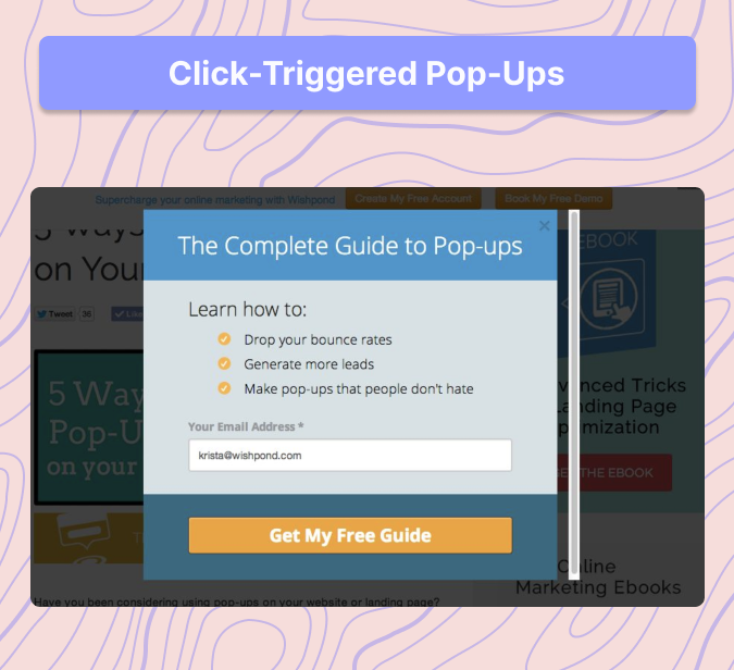
What They Are: These pop-ups appear only when a user clicks on a specific call-to-action (CTA) button or link.
Best For: Lead magnets, hidden discounts, or providing additional information.
Example: A software company might display a pop-up after a user clicks a “Download Now” button, saying, “Enter your email to receive your free trial.”

What They Are: These pop-ups include interactive elements like spin-the-wheel, scratch cards, or quizzes to engage users in a fun way.
Best For: Increasing engagement and conversions through gamification.
Example: An online store might show a pop-up saying, “Spin the wheel to win a discount—up to 50% off!”

What They Are: These pop-ups break forms or offers into multiple steps to make them less overwhelming and more user-friendly.
Best For: Surveys, detailed lead capture, or complex offers.
Example: A travel agency might use a multi-step pop-up: Step 1 asks for the user’s email, and Step 2 asks for their travel preferences.

What They Are: These pop-ups are specifically designed for mobile devices, ensuring they don’t disrupt the user experience on smaller screens.
Best For: Mobile lead generation without frustrating users.
Example: A mobile-friendly pop-up might slide in from the bottom of the screen, offering a discount code without taking over the entire display.

What They Are: These pop-ups appear when a user is about to leave a page with items in their shopping cart.
Best For: Recovering lost sales and reducing cart abandonment.
Example: An e-commerce site might show a pop-up saying, “You left something in your cart! Complete your order now and get 10% off.”
You can also set up a cart abandonment series via email using Mailmunch’s cart abandonment tools to help you revive your lost sales.

What They Are: These pop-ups display real-time customer actions, such as purchases or sign-ups, to build trust and create FOMO (fear of missing out).
Best For: Building trust and encouraging conversions.
Example: A product page might show a pop-up saying, “John from New York just bought this product 2 minutes ago!”

What They Are: These pop-ups ask visitors for feedback on their experience or preferences.
Best For: Understanding customer behavior and improving user experience.
Example: A website might display a pop-up asking, “How satisfied are you with your shopping experience today?”
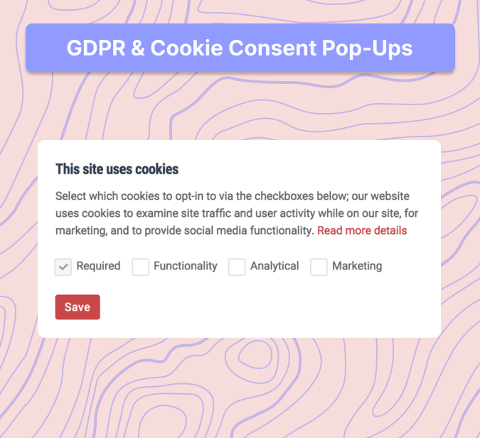
What They Are: These pop-ups inform users about cookie usage and data collection to comply with regulations like GDPR and CCPA.
Best For: Ensuring legal compliance and building trust.
Example: A pop-up might say, “We use cookies to improve your experience. Accept?”

What They Are: These pop-ups create urgency by displaying a countdown timer for a limited-time offer.
Best For: Flash sales, product launches, or time-sensitive promotions.
Example: A pop-up might say, “Hurry! This deal expires in 10 minutes!”

What They Are: These pop-ups advertise upcoming webinars, product launches, or sales events.
Best For: Driving event sign-ups and increasing attendance.
Example: A pop-up might say, “Join our free webinar on digital marketing this Thursday!”

What They Are: These pop-ups promote partner brands or affiliate links to monetize website traffic.
Best For: Generating additional revenue through partnerships.
Example: A pop-up might say, “Get 20% off our partner’s product—limited time only!”
Head over to Mailmunch today to get started with strategically created Popups for your website.
❌ Bad Example: Forbes.com

✅ Good Example: Neil Patel’s Blog

❌ Bad Example: Ticketmaster

✅ Good Example: Airbnb

❌ Bad Example: Old Navy

✅ Good Example: ASOS

❌ Bad Example: Macy’s
✅ Good Example: Warby Parker
❌ Bad Example: Some News Sites (e.g., Washington Post, LA Times)

✅ Good Example: HubSpot
Website pop-ups are powerful tools for engaging visitors, generating leads, and driving conversions—but only when used correctly. By understanding the different types of pop-ups and implementing best practices, you can create pop-ups that enhance user experience and deliver real results for your business. Don’t be afraid to experiment with different strategies and test what works best for your audience. Start experimenting with a pop-up strategy on your site today and watch your engagement and conversions soar!
Ready to take your website to the next level? Start experimenting with Mailmunch and create a pop-up strategy today to see the difference it can make for your business!
Ayesha Ejaz is a passionate writer who loves diving into research to explore new topics and broaden her knowledge. With a keen interest in learning through writing, Ayesha crafts informative and engaging content across various subjects. You'll find her unwinding with music or challenging herself with word search puzzles when she's not writing.
Tags:


Ayesha Ejaz
January 27, 2026

Brooke Webber
October 29, 2025
.jpg)
Ayesha Ejaz
October 15, 2025


