Marketers are always looking for new ways to increase their reach. We tend to try all the new tricks that come our way. Exploring and experimenting is in a marketer’s DNA.
While this a useful trait to possess, it's also important to strike a balance between what’s new and what works. Sometimes it’s important to go back to tried and tested marketing techniques to improve and build upon them.
One reliable tool a marketer possesses is email marketing. If you’re still not bought on its benefits, read this guide on the manyfold advantages of email marketing.
You collect subscribers through your website, and then you send emails to these subscribers to build relationships with them and sell products.
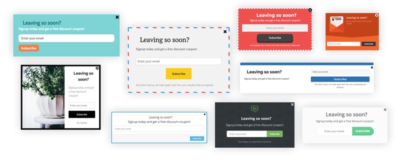
The whole process starts with an opt-in form: A form placed on your website designed to collect email addresses. It can be a pop-over, sidebar, top-bar, scroll box or an embedded form.
A good opt-in form can help you collect email addresses at a striking rate, while a poor one will sit, collecting dust.
So what makes a good opt-in form?
The most important thing to remember while creating a form is it should be relevant to the person you want to sign-up for your mailing list.
You also need to design a form that catches attention and encourages a user to share their email address.
Let’s get into all the elements that can help you create a great, highly-converting opt-in form.
A big chunk of what makes a form good comes down to design.
Opt-in forms that don’t prioritize design can be both difficult and confusing to fill out and unattractive and unimpressive to look at.
Here are steps you can take to create forms with good design.


When designing a form, pay close attention to the words you use. You have little space to make the maximum impact using precise words.
Good copy will clearly deliver the value of signing up with a form. Good copy will make it easy for your user to understand what’s in it for them, along with the next steps they can expect. Conversely, if you fuddle up your words, your value proposition will be unclear and your form’s conversion rate will take a big dip.
Most of the time, people won’t get into your email list just like that.
They need a strong reason.
One of the best ways to get them to opt-in is to use a lead magnet: something valuable that you offer your visitors in exchange for their email address.
Lead magnets can look like:
Both your copy and design should point towards the lead magnet: the main reason why someone will give you their email address.
Besides the actual shape or form you present your lead magnet as, it’s important that if you want people to want your lead magnet, it should be:
For pop-over forms, timing matters a lot. You can really improve your conversion rate when if your pop-overs display when a visitor is most susceptible to your message.
Show it too soon, and the visitor will get annoyed and bounce off your website. Show it too late and you might miss out on possible conversions, there’s always a chance people might leave before the pop-over loads.
A good way to properly time your pop-overs is by looking at your analytics.
Look at the average time people spend on a given page. The longer they stay there, the less likely they are to bounce.

Here I have a page with an average time on page of 5:36 or 336 seconds.
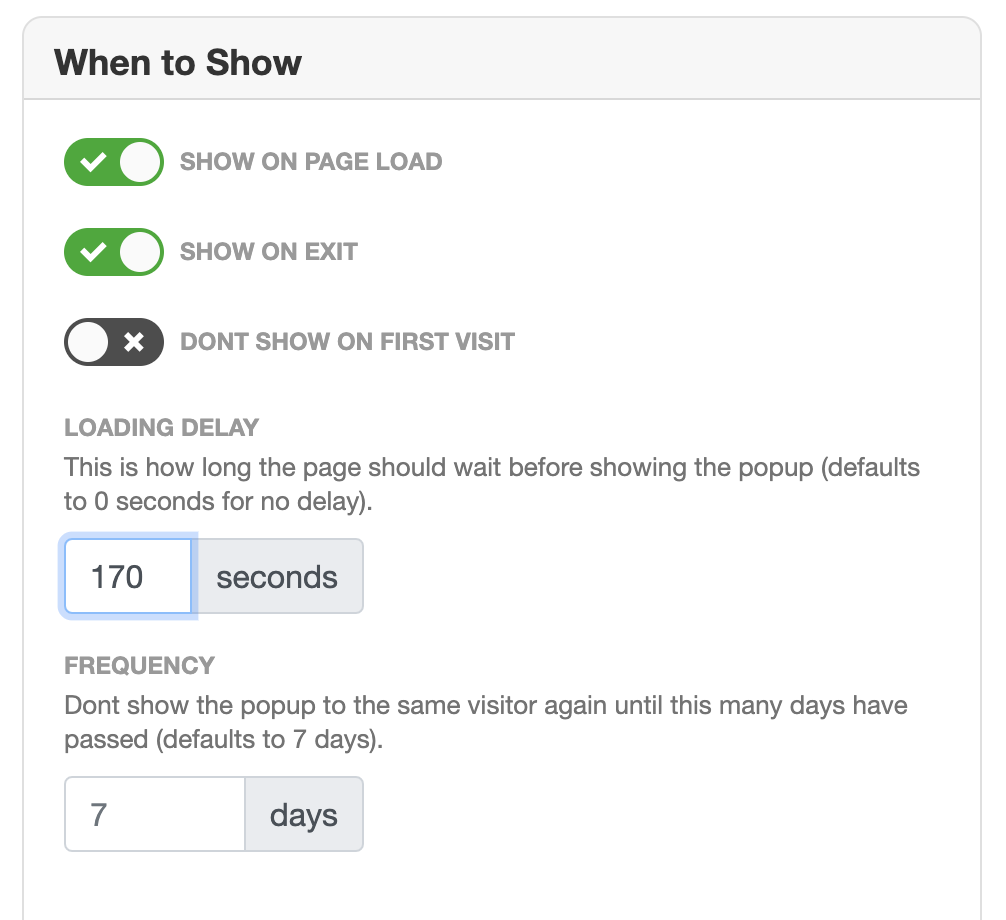
Now it’s safe to assume that if someone has already been here for half the time, they’re interested in the content. Therefore, I’ll choose to display a (relevant) pop-up form at 170 seconds (which is almost half the average time on page).

This way, I can optimize my pop-over form for maximum conversions where I only target interested people while still managing not to disrupt a visitor’s flow.
Most Form builders also give you an array of options to time your pop-overs. For example, MailMunch allows you to configure your form according to visitor behavior.

To increase your form’s conversion rate. You can choose to display the same pop-over after a certain period has passed.
You can even choose to not show forms on a visitor’s first visit or to only show it when they’re about to exit.
All these features allow you to customize your form’s timing to enable you to play around and find the perfect settings to display a pop-over.
Form Placement
Just as timing can affect a form’s conversion rate, form placement also plays a crucial role.
While pop-overs tend to take over a screen to hold a user’s attention, there are other, more subtle and smooth ways to place a form. You can use top-bars, scroll boxes and embedded forms.

A top-bar, as the name suggests, appears on the top of the webpage and remains there even if you scroll up or down. These are useful when you have sitewide discounts or new updates you want to highlight.
Scrollbox forms let you further customize the placement of your form. You can choose to trigger your form based on percentage scrolled. Just like with pop-overs, you can choose to display a scroll box form when you know a user is hooked to your content.

A good opt-in form makes a striking contribution to your email marketing efforts. It can get you a lot of leads and help you build relationships with your users.
To create a good opt-in form, you should ensure:
While there are great rules to help you with all these elements of building highly converting forms, use these tips and guidelines and experiment with what works for you and your customers. The more you’ll experiment and iterate, the greater will be your chances of converting visitors into leads.
What forms do you use mostly on your website? Do they bring you a lot of leads or are you struggling for results? We’d love to hear from you in the comments section below
Rukham is the Content Lead at Mailmunch. He believes trust should be the basis for all marketing communications.
Tags: