

Last updated on
September 3, 2025
Let’s be honest—no one likes squinting at an email that doesn’t fit their screen. In a world where nearly everyone checks emails on their phones (often before getting out of bed), having emails that actually look good on mobile is a non-negotiable. That’s where responsive email design comes in.
This approach ensures your emails automatically adjust to fit any screen size—a phone, tablet, or desktop. Instead of alienating half your audience with hard-to-read layouts and awkward formatting, responsive design makes your message easy to engage with anywhere, anytime.
In this guide, we’ll demystify responsive email design, walk you through best practices, show you awesome tools, and even highlight real examples to inspire your next campaign. Whether you’re just getting started or looking to fine-tune your approach, this guide has you covered.
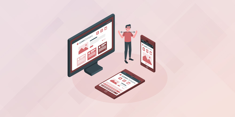
Think of responsive email design like a smart, flexible layout that knows how to behave on different screens. It uses tools like fluid grids, media queries, and scalable images so your emails can adapt to a phone, tablet, or desktop without breaking a sweat.

Responsive emails rely on CSS media queries—rules that tell your email how to look on different devices. For example:
These rules kick in depending on the screen’s breakpoint (e.g., 480px, 768px, etc.). Combine that with scalable images and flexible tables, and your email is now adaptable across devices.
Responsive email design = emails that automatically look great on any device. No pinch-and-zoom, no broken layouts—just smooth, readable content.
If your emails don’t work well on mobile, you’re basically turning away half your potential audience. But let’s dig deeper.
Responsive design isn’t a luxury anymore—it’s table stakes. It’s about meeting your audience where they are, and where they are is on their phones.
The term mobile-responsive email design gets thrown around a lot, but here’s what it really means: designing with mobile in mind first, then adapting for larger screens. It’s easier, smarter, and honestly, it just makes sense.
Why go responsive? Your competition already is, mobile traffic is exploding, and customers expect better.
Let’s break down the pros and cons of responsive vs hybrid design with a side-by-side look.


Gmail’s gotten better at handling responsive styles, but it's not perfect. Many designers use a hybrid + responsive combo—best of both worlds. Gmail gets something solid, and the rest of your audience gets the fully responsive experience.
Let’s dive into some actionable best practices to help you nail your responsive designs. Here’s a handy table that summarizes the key tips you’ll want to follow:

Creating a truly responsive email starts with understanding the nuts and bolts of how email coding works. While tools make things easier, a bit of coding knowledge gives you more control and flexibility.
Email HTML is its own beast—it’s not quite like web HTML. Most email designs rely on nested HTML tables to control layout because many email clients still don’t fully support div-based layouts.
To make your email responsive:
Avoid relying solely on <div> tags—while modern clients like Apple Mail support them, older ones like Outlook can break your layout.
Media queries are the magic behind responsive design. They allow your email to apply different styles depending on the screen size or device type.
Example:
@media only screen and (max-width: 480px) {
.container {
width: 100% !important;
}
.mobile-hide {
display: none !important;
}
}
This snippet tells your email: “If the screen is smaller than 480px, make the container full-width and hide any element with the class mobile-hide.”
Here’s a quirk of email design: many clients strip out or ignore <style> tags altogether. That’s why inline styles are crucial.
Instead of writing:
<p class="headline">Hello!</p>
Use:
<p style="font-size: 18px; color: #333;">Hello!</p>
Inline styles help maintain visual consistency across Gmail, Outlook, Yahoo Mail, and more. Tools like Premailer or email builders like Stripo automatically inline your CSS for you.
If you’re aiming to improve your responsive email design and coding skills, start by mastering HTML table layouts, inline styling, and media queries. These three pillars will make your emails not just look good—but perform reliably, too.
If you’re looking for inspiration to take your responsive email game to the next level, these real-world examples show how top brands are nailing the mobile experience with thoughtful design. A great responsive email doesn’t just shrink to fit—it adapts with purpose, making the most important content pop on smaller screens while maintaining an engaging layout across all devices.
Here’s why these brands consistently create standout responsive email design examples:
If you’re just starting out or want to refresh your approach, study these examples as a benchmark. They prove that using a thoughtfully crafted responsive email design template doesn’t mean sacrificing creativity—it means making smarter design choices that work anywhere your audience reads them.
The email landscape is evolving fast. Responsive design today goes beyond just shrinking content.
AMP for email allows users to interact directly inside their inbox—think carousels, forms, and product cards. It’s the next frontier for engagement.
More users are switching to dark mode. That means your emails need to be legible and stylish whether the screen is white or black. Use transparent PNGs, avoid pure black backgrounds, and always test.
Back in 2018, mobile design was still catching on. Today, it’s a standard. The shift from “responsive” being a trend to a necessity is one of the biggest evolutions in email marketing.
To wrap things up: responsive email design isn’t just a best practice—it’s a baseline requirement. From better user experience to increased conversions, the benefits are clear.
So whether you’re designing your next campaign or reworking your entire strategy, now’s the time to go responsive. With the right tools, training, and mindset, your emails will not just reach your audience—they’ll resonate.
Responsive email design is a technique where emails automatically adjust layout, font size, and images to look great on any screen—whether mobile, tablet, or desktop.
Because over half of all emails are opened on mobile. Responsive design ensures a better user experience, higher engagement, and improved deliverability.
Top tools include Mailmunch, Mailerlite, Mailmodo, Stripo, and Litmus. Choose based on your experience level and campaign goals.
Not necessarily. Drag-and-drop editors let you build mobile-friendly emails without touching code. But knowing HTML/CSS can give you more control.
Look into Mailmunch’s template gallery, Stripo, or marketplaces like ThemeForest. Many ESPs offer built-in mobile-optimized templates.
Ayesha Ejaz is a passionate writer who loves diving into research to explore new topics and broaden her knowledge. With a keen interest in learning through writing, Ayesha crafts informative and engaging content across various subjects. You'll find her unwinding with music or challenging herself with word search puzzles when she's not writing.
Tags:


Ayesha Ejaz
January 27, 2026

Ayesha Ejaz
January 19, 2026

Ayesha Ejaz
September 11, 2025


