
Last updated on
May 11, 2023
Not all elements in your eCommerce email are equal in importance. Some information you want to share is more important than others, and for your email marketing efforts to be successful, it’s crucial that your audience can see and understand it. This is where visual hierarchy comes into play.
Visual hierarchy is at the core of design, whether it’s web or graphic design. And it is one of the first things you should consider when you start crafting that new email for your eCommerce store. A professionally crafted email that follows the rules of visual hierarchy can help you to quickly attract the attention of your customers and get across your message effectively.
To help you get started, in this article, we try to understand what visual hierarchy is, what are its key elements, and what are the 3 ways you can use visual hierarchy in eCommerce email design for better results.
In its very basic, visual hierarchy is the way to rank the design elements and their influence in the order you want them to be viewed. It helps you put each element in the right place, depending on how crucial it is to your message, and how much you need them to stand out.
Visual hierarchy in email allows the receivers to concentrate on the most important parts of your email. It has a vital role because when people open your email, you only have a few seconds to grab their attention before they move on. So, the visual representation of your content is crucial as much as any other piece of your overall email marketing strategy, including written content, managing workforce talent, using a special tool, and more.
Knowing the key elements of visual hierarchy is a good start when you just start implementing visual hierarchy as part of your email marketing strategy. With time, you’ll develop a deeper understanding of which elements and designs perform better for your brand. However, try not to overcrowd your emails with these elements, otherwise, it will become confusing.
The elements of the visual hierarchy are what you use to make the viewers concentrate on a specific part of your email. To better understand visual hierarchy, let’s have a look at some of its key elements and how they work.


In this email by Aeon, related topics are placed next to each other and separated by color, so the viewer instinctively knows that these two elements are somehow connected.


Many large brands have experienced design teams that put these elements to use when crafting email templates, to improve performance and increase sales. To understand these elements in action better, try to pay close attention to eCommerce emails you are getting from other brands. As you try and test several strategies and come to understand which of them gives better results, include it in your business playbook to ensure a consistent approach to email marketing.
As we’ve mentioned earlier, the right visual style helps to advance your message. Not only does it make it readable, but more appealing and gives context and depth to your content. To achieve this, below are 3 tried-and-tested ways you can use visual hierarchy in eCommerce Email Design to amplify your brand message.
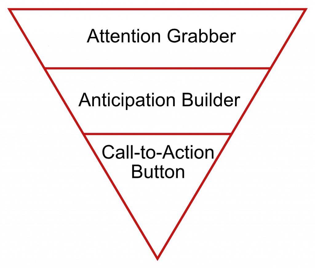
The inverted pyramid is a visual hierarchy method that is designed to eliminate all distractions and center the attention of the viewers on what’s important.

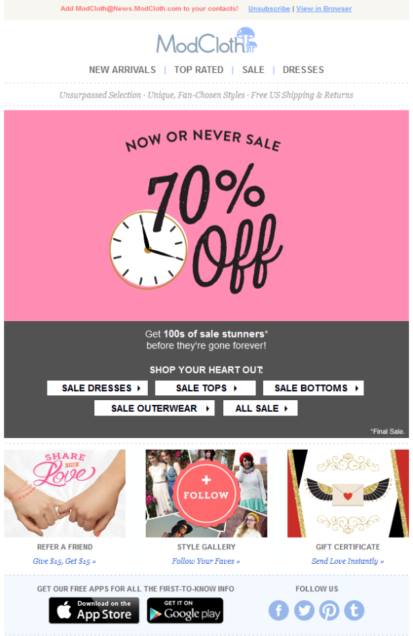
The key focus of this method is a single call to action. In the example email below, the aim of the email is to prompt the viewer to read an article. This is a very effective methodology that grabs the attention of the reader with a hook and by the time they reach the CTA, they are eager to learn about the offer.

This visual hierarchy method may not always be a good option for eCommerce stores. It will work great if you are promoting your new blog post, but in case you want to announce a sale of several products, this may not work.
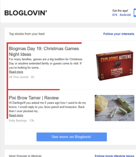
Z pattern (also known as the ZigZag pattern) is one of the most effective and widely used visual hierarchy patterns in eCommerce email marketing. It is also a very simple and easy-to-follow pattern as the reader will easily skim through your content through zigzag eye movements.

The reason this pattern is so easy to digest is that it is structured in a way that we read it the same way we read books or other large chunks of texts - from right to left, then a little down and back to right.

This is an excellent method to use if you need to include a lot of content into your email but don’t want it to look overcrowded and overwhelming. Each consecutive line, for example, can be used to redirect the viewer to a different place on your website or a different product.
You will also see this type of pattern on social media platforms like Instagram, where people use various grid tools to make their feed look a certain way. So, whether you post to Instagram from Mac or PC, or are using a specific mobile app, this pattern will help your users and email readers get engaged.
This pattern initially was developed after many eye-tracking studies to see where the readers concentrate their attention more. Studies have shown that people start reading texts online as in the case of the Z pattern: from left to right. Then, as the text goes on, the sweeps to the right become shorter, as the viewers no longer read the line till the end.

Based on these studies the F pattern entered the visual hierarchy. It suggests that the important information you want to share should be placed across the top of the email for your subscribers to read it. Less important or optional information should be placed along the left part of the email in order to be noticed.

While it’s true that when it comes to promotional materials, people skim through rather than read every word, if your content is interesting and catchy, they’ll keep reading. So when using the F pattern to design your email, don’t cut out important information just to make it shorter.
Adding gradients, random shapes, geometry, colors, and matching can help you guide the eye movement of your subscribers and lead them towards your call to action.
Emails shouldn’t just be walls of text that tell about what your brand has to offer. Visual hierarchy makes your emails appealing and readable. and helps you convey your brand message in a way your audience will want to read it. All of the elements and principles we’ve discussed above will not fit into one email. However, they give you a wide space for creativity and testing. Take some time to test them, try different design elements, and analyze the results to understand better what works for your eCommerce store better. You can even include key concepts of visual hierarchy in the employee onboarding training of your marketing team to make sure everyone is on the same page about your email marketing efforts.
Georgi is a result driven SEO specialist with passion for automation and neuromarketing. With the help of Off-site SEO custom scripts we make sure we get the best for our clients.
Tags:

M. Usama
April 19, 2024

M. Usama
April 19, 2024

M. Usama
April 18, 2024