


Last updated on
January 30, 2024
Running an e-commerce website comes with a very unique set of challenges. When something goes wrong, it can be difficult to diagnose the cause. A lot of these times, it's difficult to find resources online that can help you diagnose and resolve your problems.
One such problem is the issue of creating a smooth shopping experience for your online customer. 88% of online consumers are less likely to return to a site after a bad experience.
To avoid such trouble and ensure a silky smooth experience, I’d like to propose how you can avoid some of these problems by creating a functional, user-friendly category page.
The Category page is basically the bridge between your homepage and your product pages.
After your homepage, the category page is the next most important step in your funnel. This is the part where you help narrow down options for people and guide them to their desired product page so they make a purchase.
Just like browsing a supermarket, the easier it is to navigate and find desired products, the easier it will be for people to buy things. On the other hand, if the experience is confusing you can expect people to stop visiting the store. The category page is like store aisles, get them right and your customers will have a smooth shopping experience.
In this article, we’ll discuss category pages and how you best design them so that they are functional and entice people to click and go to the product pages on your site.
We’ll have a look at all the elements that go into making a category page, after which we’ll discuss common factors across successful category pages that you can implement for yourself.
Finally, we’ll talk about how you can take measures to keep testing and monitoring your category page to keep improving it for maximum efficiency.
While every website designer/owner infuses their own style into a category page, there are some elements and practices that are a point of focus for all.
Your catalog page’s layout is the way information is arranged and presented to your visitors. This includes texts, images, links, and all relevant information that helps a visitor navigate the store. According to studies, 38% of people will stop engaging with a website if the content or layout is unattractive.
A good page layout leaves nothing to chance, every detail on the page serves a purpose. The layout:

While layout refers to the overall composition of your category page, let’s get into the details of the elements involved in the layout.
Quite possibly you’ve already decided on colors before you build (or improve) your website. Nonetheless, its good to keep a few tips in mind that can not only improve your aesthetic but also emphasize your brand’s image.
First of all, you should understand what different colors represent.
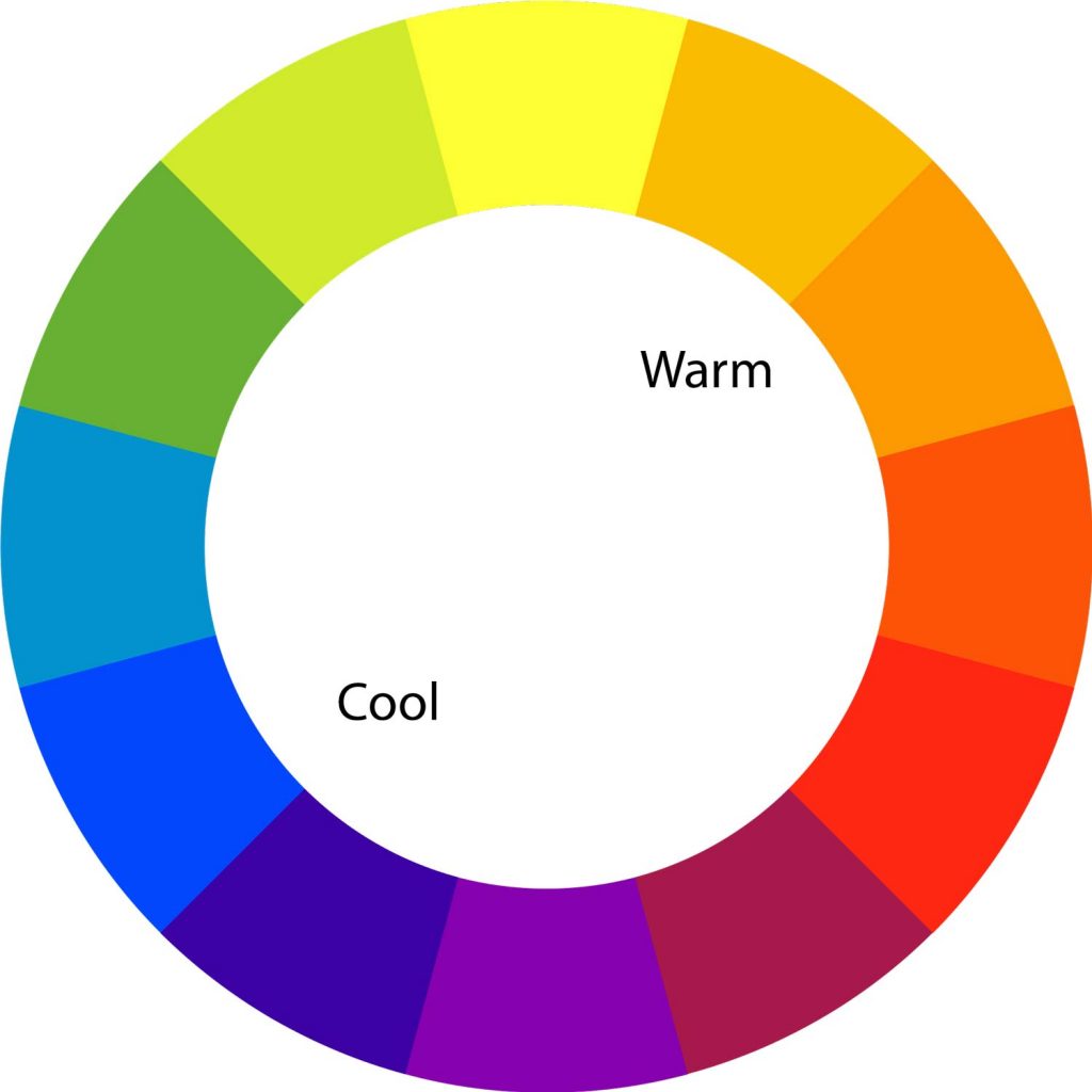
Blue represents refreshment, calmness, and cleanliness. It’s also associated with professionalism.
Red evokes aggressiveness, love, attraction, danger, and vibrancy, all depending on the context in which it is used.
Green shows life, healthiness, and is also associated with wealth and money.
Yellow is used to depict warmth, happiness, and joy.
Purple evokes associations with wisdom, royalty, and creativity.
To learn in more detail what different colors mean, learn about them here , here, and here.
With an understanding of color psychology, you can revisit what your eCommerce brand means and stands for, and then decide what sort of emotion you want people to feel when they visit your website. Then, you can choose the colors that best represent your brand, giving your customers a more meaningful experience.
The next important step is in deciding how many and how much of a color to use.
Ecommerce websites tend to use light tints of whatever color they decide to use. This is done intentionally so that while the color still conveys its message, it's not so overwhelming that the attention is taken away from the actual focus of the page: the products.
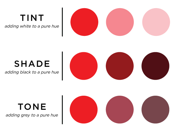
You’ve probably also noticed that most websites these days have a lot of white, so why all this talk about color?
Well, you have to use color prudently and use it in spaces where you want to have contrast or attract focus.
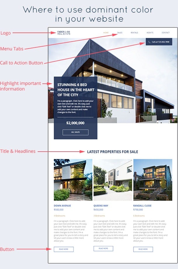
In this example, blue is only used to highlight important elements such as buttons, navigation items, and headings. Since blue also represents professionalism, it goes nicely with a serious category like real estate.
You could choose to do something similar to your category page, for example by highlighting the main categories using your primary color and subcategories in accent colors.
The navigation bar is a super important design element. It gives your users a sense of orientation and helps them find what they’re looking for, smoothly and quickly. It's important to get it right because they appear on almost all pages of your website.

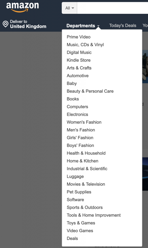
The navigation bar segments your website into its most important categories. Amazon has chosen to group its products under the ‘department’ link while other links in the navigation bar are more about personalization. Barnes and Noble have taken a different route, using each link in the navigation bar to present different product categories.
Navigation bars come in all shapes and sizes, you can use top bar navigation or have a vertical navigation bar. You can choose how many drop-down levels to have: do you want to reveal more options when a person hovers on a link? Or do you want them to click and go to a different page?
Horizontal vs vertical navigation bars

The debate on whether to use vertical vs horizontal bar doesn’t have a clear winner, but there are points to be made for both use cases. You can use horizontal navigation bars when:
Conversely, it makes more sense to use vertical or left side navigation menus when:
How many levels of navigation should you use?
Another important consideration for your navigation bar is how many levels you want to add to it.
Do you want people to click on high-level links and visit category pages to browse further? Or would you rather have them go into sub-categories by hovering over links to find their desired products?

One advantage of adding sub-categories is that it makes the shopping experience quicker for visitors, and they can browse your website without having to leave the page.
Conversely, if you have products that require informed purchases or are highly dependant on images, you shouldn’t opt for drop-down navigation. Amazon takes the horizontal path because its consumer categories are easily recognized by most consumers.
Breadcrumb navigation
Breadcrumb navigation is another useful feature to guide your visitors. It reveals the exact location of the user on the website and shows their trail. This is especially useful if customers have clicked on a lot of links to get to a certain product.

Add action items
Action items include options like shopping carts, wishlists and user profile options. These allow a person to quickly toggle between items they’ve selected or want to buy. Action items encourage people to follow through and complete purchases.
Because people read from left to right, they naturally expect action links on the right-hand side of the navigation bar because moving right suggests moving forward. Use the left side for more informational links.
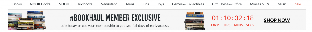
Feature banners are really useful when you’re running a promotion on a specific category. Or if you want to attract attention to some important news. They’re usually above the fold, below the top-level navigation and above the categories grid. Although you can adjust the placement of the banner as you see fit for your category page.
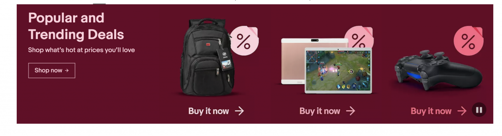
The best thing about banners is that you can add call-to-action buttons like this example from eBay. This lets you direct a lot of your traffic towards the hot deals you may have going on.
If you want high engagement with the banners, make sure they’re relevant to the categories people are browsing through, so that your promotion actually appeals to them.
Besides highlighting offers, banners also add visual appeal to your category pages. So even when you don’t use them from promotions, you can display them in subcategories using appealing product photography to inspire visitors to keep browsing.
This is another way to differentiate between categories if you don’t want to use a uniform layout for your category pages.
For example, if you’re an apparel store, you’d still display categories by gender, type, season, etc. But along with that, you could feature best selling items from one or two categories to further bolster sales.
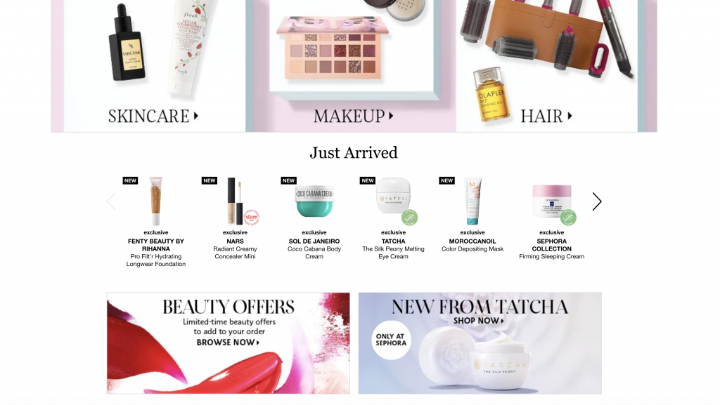
In this example from Sephora, they display main categories on top, followed by a row showcasing ‘just arrived’ items below. So people who’re willing to explore new items may choose to click on them.
Another interesting point is Sephora also uses two below the fold banners to highlight other offers available on their website.
It's often best to use generic images that represent a whole category of products rather than a single brand to represent categories. For example, when people search ‘laptops’, its best to show them a picture of a generic laptop rather than Macbook Air, the brand choices come after they enter a category.
Also, if all the categories displayed have the same priority or importance, you should use standard size images for all of them. This gives your category page a feel of uniformity and also makes it easy for the visitor to browse.

Finally, here’s a checklist from smartinsights of things you should follow before uploading images. These tips apply not only to your category displays but also for your product page images:
It's very important for websites to have quick load times otherwise it can affect your organic rankings and also increase your bounce rates.
To optimize images, you should compress and resize them for category pages. Given that you probably have a lot of images on display on your category page, plus the fact that people only inspect product images in detail on the product page, you can get away with using small images.
You can still compress image files without losing quality using free tools like Picmonkey or compressjpg.
It's also vital that you optimize your images for SEO.
First, whenever you upload an image, don’t use a generic or random title for the image like DSC004_1.jpg. Instead use a descriptive name like yellow_winter_jacket.jpg so that when Google crawls your images, it has more information to help it classify and index your images.
Second, it's important to fill out alt-tags for your images. Because search engines can’t ‘see’, they need text descriptions to understand an image. It's best to use plain English and describe accurately what goes on in an image.
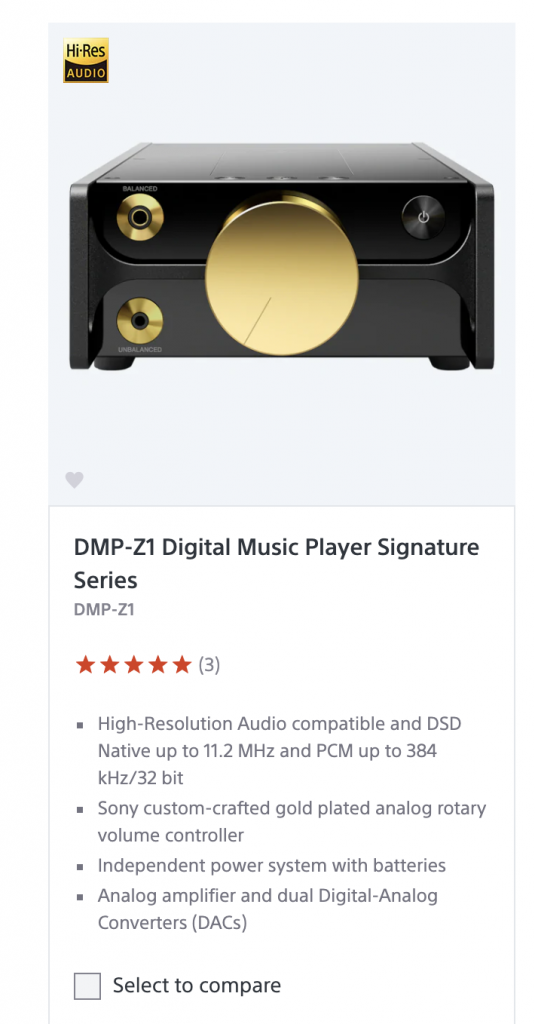
For example, in this screenshot from Sony’s MP3 players' category, you’d give it an alt text description something along the lines of “Picture of DMP-Z1 Digital Music Player Signature Series.”, which is exactly what they used.
You’ll do well by using category names your target audience is familiar with rather than using obscurely creative, or internal terms your company uses. Using familiar labels not only helps the customer understand categories but it also helps you rank in Google.
There are also cases when consumers need additional help in understanding the categories when the product is complex, it is relatively unknown or requires the customer to be educated. In such cases, it makes sense to add more detail to product or category descriptions.
Look at this category page from easternleaf.com:
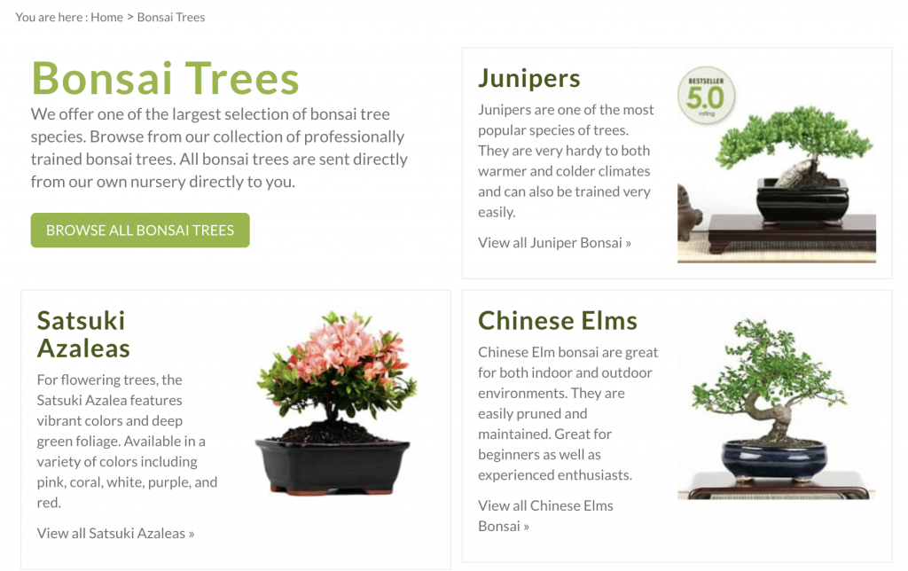
Easternleaf.com sells herbs and plants from South East Asia which aren’t readily available in the west. Due to their lack of availability, customers often aren’t sure what they’re about to buy and so this website makes sure to give a succinct, useful description of all their categories so customers can learn what sort of products they are going to browse.
For example, instead of just describing what the plants are, easternleaf.com describes the nature of the plant (easy to maintain vs difficult) and the sorts of climate they can survive in. With this information, the customer can filter their interests from the category page and land on product pages that are relevant to them. This makes navigation easier for customers and increases click rates for EasternLeaf.
Now that we’ve discussed all the important elements that go into creating an eCommerce category page. Let's now look at some common practices by successful eCommerce websites that separate them from the competition. Hopefully, you can take the bits relevant to your website and apply them to increase click rates and provide a smooth shopping experience.
How are you going to get a prospect to the virtual checkout lane?
You’re going to make the product thumbnail as enticing and as clear as possible, while still trying to keep the information brief.
Here are some things you should include in your product thumbnail:
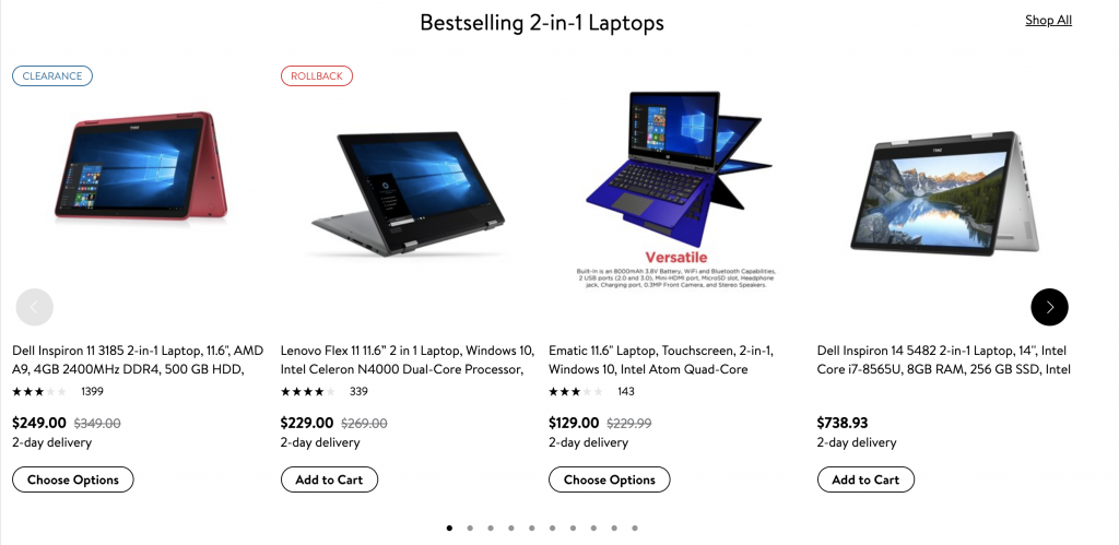
The screenshot above is from Walmart’s laptop categories page. You can see how they use the best product thumbnail practices. They:
Faceted navigation allows visitors to narrow in on their choice by using multiple filters to find the right product for them.
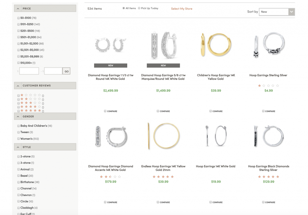
In this screenshot, you can see this website allows customers to find the exact product for them letting them filter through price, ratings, gender, and even style. Such multiple levels of filtering can help your customers quickly find the items they want while exposing them to similar items in the same range.
Even if you apply all these changes to your website, how would you know they’re working?
The simplest way to find out is to A/B test your category page changes.
You create a new version of your page and change just one thing (image, banner, description, etc) and test it against the current version of your page. You define a metric (time on page, click-through rate, change in revenue, etc.) and let both versions run simultaneously. Traffic coming to your website will be evenly split between both versions of the page. After a while, you check both the old and new version against your defined metric to see which one performs better. Then you choose the better performing version, or you reiterate with more changes until you get a satisfactory result.
Here are some things you can change and A/B test on your catalog page:
Here are some numbers you can measure to verify if changes work:
A/B testing will put you in the habit of practically testing your hypothesis and hunches, thus putting you in a more confident position to make changes.
There will also be times where A/B testing may not be possible and in such cases, you can ask yourself 3 simple questions that will guide your decision in implementing a change.
Some useful questions to vet any element (courtesy of Seer):
Ex. If you’re going to add feature banners, will it be a distraction, or will it add to the value of your category page?
Ex. Maybe your customers are short on time and prefer a quick shopping experience. In such a case, adding an add to cart option on your category page will provide them value.
Ex. It's not a good idea to run a banner promotion for golf clubs if the shopper is on the page for hand-made jewelry. It will only serve to distract from the real purpose of the category page.
We get it if you’re short on time. Here are the main takeaways from this article for the busy bird.
Your category pages are the main bridge between your homepage and your product pages. To get people to visit product pages, you should create user-friendly category pages optimized for conversion.
To create such category pages, you must pay attention to the:
A category page is comprised of these elements and if you can get them right, you’re sure to hit a home run with your conversions.
In the words of Jon Macdonald, a conversion rate optimization specialist:
The Category Page must be both obvious and humble:
Successful eCommerce websites make sure that their category page product information is useful and relevant, they provide the best navigation and they keep testing and reiterating changes to improve their performance.
If you take a leaf from their books, (or from this article), you’ll be well on your way to creating highly converting category pages.
Are you an eCommerce website owner? What elements do you focus on to boost your revenues? Let us know in the comments below!
Rukham is the Content Lead at Mailmunch. He believes trust should be the basis for all marketing communications.
Tags:


Hamna Abid
July 11, 2023
Hamna Abid
June 23, 2023

Ammar Mazhar
May 30, 2023


