
Last updated on
May 12, 2023
Landing Pages are an essential component for most digital marketing campaigns. Their basic purpose is to get incoming site visitors to take action, usually in the form of subscriptions or purchases.
Conceived in 2005 by Microsoft to boost sales for Microsoft Office, landing pages have become an established industry practice, and for good reason. Companies with 10 to 15 landing pages increase leads by 55%. Companies with 40 or more landing pages get 12X more leads than those with five or less.
Using landing pages to boost conversions works but only when they are designed properly. A lot of online companies put lofty expectations, believing landing pages will guarantee them higher conversion rates. This is only true when landing pages are optimized and designed for a superior user experience.
Let’s look at the basics:
What is the goal for a landing page?
To get people to click on CTAs (Call-to-Action buttons).
How are you going to get people to click?
By creating landing pages using principles of attention driven design that focus attention on Call-to-Action buttons.
And so, in this post, we’ll showcase a few basic design considerations, which when kept in mind, can get people to engage with your landing pages and increase your conversion rates.
This is probably the most critical design decision that reflects on a landing page’s ability to convert. Attention ratio is basically:


[credits unbounce]
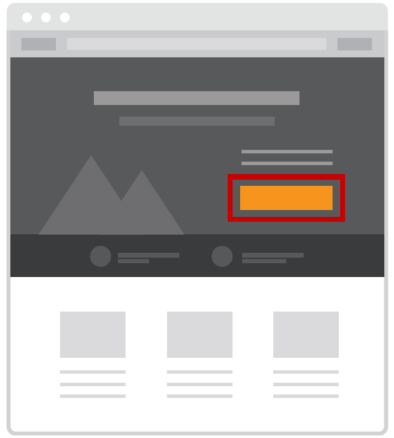
For a marketing campaign, given that you’re looking for the visitor to do a single thing (sign-up or make a purchase), your landing page attention ratio should ideally be 1:1. This means that there is only one button to be clicked on the landing page, and that is the only button the visitor should be clicking on.
Unbounce conducted an A/B test for a landing page. In sample A, they had an attention ratio of 10:1 (meaning 10 clickable links), and for sample B the ratio was 1:1.
Not surprisingly, the B variant performed 31% better. This means they had 31% more ebook downloads with variant B than variant A.
Note that there are cases where its ok to have more than 1 link on a landing page. The idea is to keep the ratio as low as possible and the landing page as least cluttered as possible.
The principle of direction states that landing pages should be designed in a manner where obvious cues (graphic or text) are placed to guide a user from the sales copy to the CTA in the most fluent manner, with minimum distractions.

I remember my time in Turkey trying to navigate through superstores and grocery centers. Not knowing the language I couldn't understand basic instructions that pointed towards the different sections. I had to browse each aisle to find the items I needed manually. It took me 5 times longer to collect my weekly grocery items than it would normally.
Now only if I understood the simple directions (which I eventually had to learn), my shopping experience could have been more fluent. Many times I couldn't even buy the items I needed just because I couldn't find them (the personnel also spoke Turkish so no help there).
The same principle applies to landing pages. If you don’t provide directional cues, your visitors will end up exiting without considering your offer. That's a one-way ticket to Increased bounce rate land.

Look at this example from Airbnb. It's a well-directed landing page that smoothly guides your mini journey to the CTA. The eye first lands on the headline which is attention-grabbing for obvious reasons (they are offering you money!). Then with a slight glance at the feature image, the user notices the red button saying 'Start Hosting'.
If that doesn’t do it for the reader, there’s a second chance to reel them in. In the bottom panel below the image, a person can get a quotation for how much they can possibly earn. If the quote is enticing enough, they can then click on 'Sign up to host'.
Notice also that this landing page has an attention ratio of 2:1. Airbnb could have used 1 to 1, but the direction of the page makes more sense to have a 2:1 ratio.

As the heading suggests, using contrast can really throw light on any element you want to emphasize on a landing page. Black on red, blue on green, bold against a minimal font, all these tactics can be used to put your CTAs in the spotlight.
If used correctly, contrast is a good way to show what’s important so users can focus on those sections of your landing page.
Similar to contrast, highlighting is used for text.
In our age where attention is the most valuable thing a consumer can provide, you have a few moments to make your point stick. Most people skim through sales copy anyways (unless they are super interested), that’s why highlighting certain parts of your copy can show them which parts are worth paying the most attention.

On our website, we’ve shown referrals from users who like our service. The important thing to note here in this example is how, when the eye skims through the text; the focus naturally falls on the highlighted (bold) parts. Going through them you get the gist of what the review is about: a significant increase in conversions.
Highlighting is an effective method to deliver a point quickly but be warned not to use it excessively. Research shows that the upper limit of useful highlighting is around 10% of a text. Beyond that, highlighting loses its ability to grasp attention.

Proximity means that items are connected or have a relationship with each other. They become one visual unit which helps to organize or give structure to a layout. What does this mean for your landing page?
The proximity of elements near CTAs influences the probability of conversion.
Elements that support and complement the Call-to-Action button will make it pop out more and increase the chance of conversion.
Elements that are not in harmony with the CTA, or take attention away from it, will decrease the chances of visitors converting to subscribers or customers.
The more ‘organic’ your landing page looks, the easier it will rest on the eyes.
Organic? Now how do you bring life to a digital webpage?
You make it breathe. You make it breathe by using a design concept called white space.
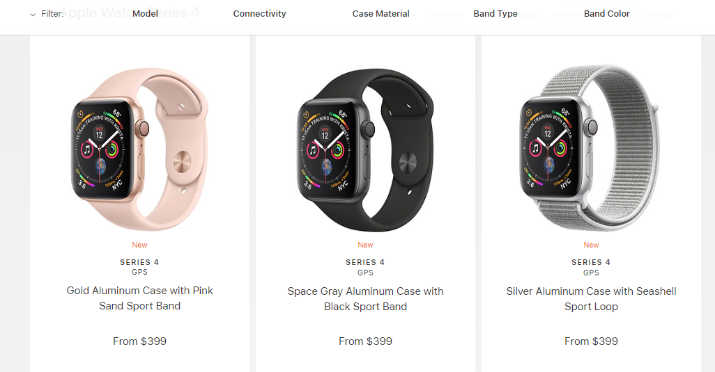
Just look at any of Apple’s product pages. The products visuals seem really accentuated because of the white spaces in the background.

Large spaces between a cluster of elements help a user to prioritize what to focus on. Here’s what Pratik Hedge, a UX designer has to say about white spaces:
“As per studies, the average attention span of an internet user is 6 seconds, which is even less than what a goldfish has(7–8 seconds). Effective use of white space helps the design to get the message through to the user quickly and increase the probability of interaction by highlighting the CTAs (Call to actions).”
The concept of grouping is related to proximity. By grouping similar elements together or nearby, you create a relationship between those elements. Grouped objects are more straightforward to focus on and more comfortable to interpret.
How can you use grouping to make your landing page better?
Pair together those elements that are communicating the same or similar message. For example.

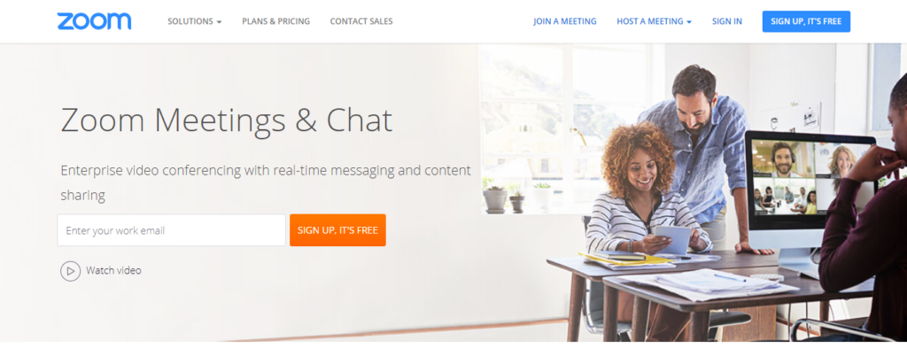
Zoom had divided their landing page into sections by grouping together elements that make their message stand out and clear.
The first section of the landing page briefly outlines the features and benefits of Zoom.


Below the fold, they use social proof as a sign of credibility. They do this first by displaying numbers that reflect well on their service. Then they use actual reviews from users to lock down on their offer.
Grouping social proof and benefits into distinct sections allow the user to seamlessly go through the landing page and not get overwhelmed by information.
There you have it. With these 7 design principles, you are on your way to creating highly converting landing pages, by nature of their attention-driven design. Just to repeat, you can use:
All these principles of design can help you create landing pages with Call-to-Action buttons that demand the most of a visitor’s attention. And if a visitor is focused on your CTA, you’ve made a great landing page with high probability for conversions.
Rukham is the Content Lead at Mailmunch. He believes trust should be the basis for all marketing communications.
Tags:

M. Usama
April 19, 2024

M. Usama
April 19, 2024

M. Usama
April 18, 2024