
Last updated on
February 8, 2023
Newsletters can be a key part of your business. They are a very inexpensive way of keeping your clients and prospects informed and engaged. But newsletters are only effective when people actually read them.
That’s why you need to know how to design the right newsletter for you.
In this article, we’ll go through the perfect newsletter’s anatomy, study some great examples, and help you design the best version of your newsletter yet.
Let’s get started.
Newsletters are very cost-effective. That translates into a lot of competition. 35% of marketers send 3-5 emails per week to their customers, trying to engage with them. With that level of competition for your clients’ attention, if you don’t keep up, you’ll get left behind.
People from North America only click on 13% of the emails they get, and you don’t want to be among the remaining 87%.
Good email design lets you stand out, showcase your company’s style, and get people to click, and even look forward to your emails.
Think about it.
You wouldn’t engage with an email if the content was a block of text or pixelated pictures, would you?
You open and engage with marketing emails because they give you engaging content that’s relevant to you. It can be a coupon code for those shoes you’ve been meaning to get or this promo in your favorite coffee shop. Whatever it is, those emails popped out because of their subject line, and you end up engaging with them because it doesn’t take more than a few seconds to get what you want.
Your readers expect you to maintain a good design in all of your communications. Good email design will be the difference between an email that readers can’t wait to open, and an email that always ends up in the junk folder.
Looking for inspiration? Here are some examples of great newsletters, and what you can learn from them:


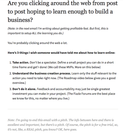
Fizzle’s newsletter gives its readers valuable and unique content that can’t be found anywhere else. This newsletter is incredibly simple, goes to the point, and gives a reason for subscribers to read it by giving value right away.
Although this newsletter is very heavy on text, the value that the text gives to the reader makes it all worth it. And, since they can’t write a full blog post in the newsletter, it motivates people who want to learn more to click through.
Why would your audience open your content if they can see the same content on your Facebook page or Instagram account?
Instead of integrating every marketing strategy into all channels, develop unique marketing strategies for your newsletters. Provide value right away and keep your readers engaged by giving them content that they can’t find anywhere else.
If your content is unique, your readers will feel unique for reading it.

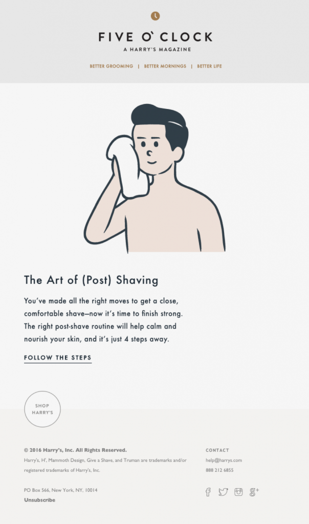
Instead of using newsletters as simple sales pitches, Harry’s uses a simple instructional email on something its users may forget to do after using their products: using an aftershave.
With this email, Harry’s reinforces its brand; it’s not just a razor’s sales page, it’s a men’s grooming brand. By educating its customers, Harry’s becomes a subject expert, so it’s natural for its customers to shop more than just razors with them.
No one wants to feel like they’re being sold something. Use your newsletters for inbound marketing so you can solidify brand perception while making sales.

This beautifully designed newsletter by Adidas looks just like its website.
The color scheme is very simple: white, green, and neon orange. Yet, through a very carefully-designed style and perfectly-selected images, the newsletter gets away with being very long and populated with images by giving a uniform visual experience to the reader.
Think of your newsletter as an extension of your website. Use the same color schemes you already use in your website so your clients get a consistent and memorable brand exposure. Fashion marketing emails are usually a great example of it.
Pay close attention to your fonts and your images to achieve a visually-homogeneous experience. Try out style guide templates to choose and stick with a style that’s relevant to your brand and message.

In this newsletter, Tiffany showcases just one kind of product: the celebration ring. Through a beautiful illustration, a Tiffany-blue background, and perfect blocking and placement, six rings take center stage and entice the readers to look for more of them.
However, that’s not the only CTA in this newsletter. Towards the bottom, in a completely separated space, an invitation to “drop a hint” gets readers to share the newsletter with a loved one.
The striking simplicity and the two CTAs ensure the product is as impactful as possible, within a second of opening the email.
If you want to showcase a new product or offer, there’s no better way than letting the graphics speak for themselves. Separate sections of your newsletter and find new and creative ways of presenting your product to your audience.

This newsletter, called “Moz Top Ten”, doesn’t give any unique content for readers. Instead, it curates content the audience would like to read from multiple sources, including its own blog.
This is the most basic form of a newsletter: an email with the most relevant news. By knowing its audience as perfectly as possible, Moz can tailor content suggestions that will actually get clicks, reinforce the brand, and keep the audience engaged.
Put yourself in your audience’s shoes. What do they want to see? Why are they subscribed to you? What would you be interested in if you were them?
These emails are very easy to make, but they require very good knowledge of your audience. Compile as much data as you can to give relevant content to your audience.

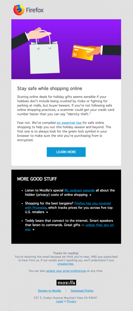
This may look like a very nice and simple newsletter of a new blog article. However, Mozilla takes a step further by perfectly curating everything behind the copy and visuals: the metadata.
Examining the email you’ll find proper metadata and alt text for all graphics so everyone can see what the email is about, even if the media doesn’t load.
Your readers will often see an incomplete version of your newsletter. Email servers will automatically deactivate images and media for multiple reasons. Sometimes the media will simply not load.
Make sure your message goes through by properly structuring email headings, specifying alt text for all images, and adding as little copy as possible on images.

Gantri is a furniture website that sends two emails a month, so it has to make them count. This email is not only fully mobile-optimized, but it’s also a perfect example of a simple truth: less is more.
The message is simple: “Do you like this lamp? Click here to find out what it costs, and find more like these.”
Gantri entices readers to click through by choosing one of their most interesting-looking lamps. Like Gantri, you should also showcase your most interesting product. It doesn’t have to be the best-seller or the flagship, it just has to be the one that gets the most questions.
Choose the best images you have and pick the simplest, most enticing ones. One image is worth a thousand words so, if you don’t have them, invest in a professional photographer or designer to get them.

With this gorgeous and interesting-looking newsletter, Blue Planet II takes its audience through a journey. As they scroll down, they go deeper and deeper into the ocean, and learn as they go. The newsletter culminates with a CTA, almost making a little reward out of it.
This stunning and effective newsletter creates a sense of wonder and excitement, making it look like a teaser of what’s to come after the CTA.
While you can’t take your audience on a trip in every one of your newsletters, you can evoke some of the same feelings of wonder and excitement.
Use infographics and other media to educate your audience and motivate them to click through. Use a call to action that’s as attractive as possible through simple and interesting narratives.

Who knew rounded corners could be so much fun?
In this “MOOsLETTER”, a simple, almost plain feature becomes invigorated with a perfectly-designed GIF.
This is a great example of how out-of-the-box media can fill your content with life and excitement when used properly.
GIFs can be a great feature to have in a newsletter. They don’t need to be smooth or perfect-looking, they just need to be fun.
Experiment with some GIF makers to add some animation to your emails and grab your audience’s attention, even towards the simplest things.

Mercedes-Benz’ newsletter is filled with information that a small, yet important percentage of its audience will want to read.
This newsletter doesn’t have any sales pitches or promos. Instead, it shows a deep understanding of a segment of their audience by showcasing and sending a few articles that will be relevant to a small number of people.
This highly-personalized content is only successful through proper segmentation. Cater to your audience by sending the right content to the right people.
Use the items they’ve bought, their user persona, and their purchase history to find out more about what they want out of your brand. Then, fulfill those needs through personalized emails, like product information for the people who’ve bought something, or relevant articles for the people who are still early in the sales funnel.
Inspired and ready to start? Here are a few things to keep in mind when designing a great newsletter:
About a third of email recipients will open an email exclusively based on the subject line. That’s why you need to pay close attention to your subject lines.
Test out several lines and ask for opinions. There’s no reason to shy away from “clickbaity” lines, as long as your newsletter pays off. Using emojis in your subject lines is another way to get more click-throughs.
You can also use tools like Zurb’s TestSubject to get an idea of how the subject line looks like in multiple devices.
Test styles and make sure your subject line is as irresistible as possible.
You wouldn’t open an email from someone you don’t know, so why should you ask the same from your audience?
A lot of companies simply use their company name as the sender’s name, but that steals away from personalization. You can add a touch of personality if you use the name of an actual person instead of a faceless company. For example, instead of “UpLead”, you can name it after the person who writes the emails, like “Will, from UpLead.” Have your customer in mind when selecting a sender name, so you can choose one that’s relatable to them.
Lastly, ditch the “no-reply” address. Instead, invite people to respond to your email with any questions they have to open a line of communication.
Almost half of all emails are opened on mobile. If you want to reach people on the go, you need fully mobile-responsive emails.
Keep your copy short and make sure your images are fully responsive. You can also use AMP and other similar technologies to send different emails to be opened either on a computer or on mobile.
There’s nothing worst than realizing you made a typo or missed a CTA right after you sent a newsletter to thousands of people.
To prevent this, double-check every aspect of your email. MailChimp, for example, has multiple tests in place for you to go through before sending emails. Use grammar check and make sure all links are placed correctly before sending anything.
Prevent a mistake by sending your newsletter to a small batch of people early, including your team, so there’s still time to correct anything if you need to.
Lastly, test everything. Subject lines, design styles, copy tone… even your sender name itself can have a huge impact on click-throughs. A/B test as much as you can to continuously gain insight and finetune your approach.
Designing a newsletter is a critical part of everyday marketing. Keep an eye on the details, make your emails irresistible to open, and don’t forget to test and improve as you go along.
Content marketing guru at Mailmunch. I’m passionate about writing content that resonates with people. Live simply, give generously, stay happy.
Tags:
.png)
M. Usama
March 21, 2024

M. Usama
March 18, 2024

M. Usama
March 11, 2024