


Last updated on
December 31, 2024
If you’re reading this post, odds are that you already have a landing page. And that particular page has generated a few leads for you. But, simply creating a landing page alone is never enough.You need to continually optimize it for conversions. Try a bunch of things to learn from failures and successes.
In this post, we will look at all the different ways in which you can test your landing pages.
After you have read the content, you will be excited at all the different things you can try for conversions on your site.
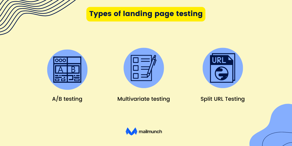
A/B testing also called split testing is where you compare two different versions of a landing page. Ideally, you make tiny changes in the two variants, depending on the goals of the test. A/B tests help you decide on elements and changes that impact user behavior and continually run tests to arrive at the most effective version of the landing page. A/B testing helps you refine your sales funnel based on different stages of the marketing funnel the prospect is in.
A common way to A/B test landing pages is to change something simple like the color of the CTA button.
Sometimes a different color or a different word helps you improve conversion rates.
How A/B testing works is simple. You create a modified version of your old landing page after making one change. What you modify is your variable. The variable can be anything like the hero image, the headline font styling, or the CTA wording. Once enough time has passed after running the tests, you can compare data from the previous and current versions of the landing page to see if there’s been a change.
A/B testing isn’t a one-time activity. The process continues with you making incremental changes to your page to fine-tune your landing page to produce the highest possible conversions. Every test you now run builds on the last test you ran. And even slightly disappointing results are good because they give you an idea of what’s wrong with your site.
You will hear about A/B testing mentioned in the same line as multivariate testing. With A/B testing, two versions of the same changing one variable at a time are compared. A multivariate test compares multiple variables at a time.
Multivariate testing is essentially A/B testing on steroids. With multivariate testing, you are cross-comparing multiple variables on a web page compared to A/B testing which compares performance against just one variable.
If you want to move things faster, multivariate testing could be the key.
However, there’s one thing you need to pay attention to: The traffic to your landing pages.
Testing for multiple variations invariably means you require more traffic to arrive at meaningful results. If you don’t generate that much traffic to your sites, an alternative is to run ads on your landing pages to conduct a multivariate test.
Multivariate tests are a powerful way to build landing pages that convert well and work with all kinds of traffic.
Multivariate testing allows you to test the hero image, the headlines, and the website copy all at one go. You don’t have to create separate versions of the same page for testing all possible combinations you can think of. It’s a quicker way of testing new things.
Split URL testing is when you test multiple variations of your website or landing pages that are hosted on different URLs. The website traffic gets split randomly between these different variations with conversion tracking in place to help you learn which variation performs the best.
The variations you create in a split test are accessed with different URLs tracking each variant’s performance separately to see which variation shows a better conversion rate.
Use Split URL testing to make design changes say testing a single page checkout vs a multi-page checkout flow.
Now that you know what the different types of landing page tests are, let’s run some of these tests on landing pages.
At any rate, it doesn’t make sense to test things randomly. If you don’t know why the proposed change changes conversion rates in the right direction, why would you even want to effect the change? That’s not testing; that’s moving in entirely random directions with no goal.
For better results, base your hypotheses on what may work.
There are a few different ways to understand how a page is doing. Quantitative data in your analytics is an excellent place to begin.
If your analytics data shows that most of your visitors are exiting the page when filling up the sign-up form, perhaps that’s where you should look first. Start by reducing form fields.
Or perhaps improve your headline. There are so many ideas, and not all are destined to produce results.
Analytics presents you with the right idea regarding which tests to run from the start.
With analytics, you can determine:
Assign a score of between 1 to 10 for each answer. Take the average of the scores to arrive at the overall score. The higher the score, the better your chances of driving the desired results.
To begin things on the right track, start with experimentation. A structured approach to testing will bring predictability to the mix and help you achieve your long-term goals.
It will help you improve conversion rates in the long run rather than land some quick wins either here or there.
A landing page test methodology is uniform irrespective of what you’re doing, be it A/B tests, multivariate tests, or even split tests.
Ideally, it relies on the following things:
What separates a good testing team from one that isn’t that great is the fact that winning teams often run a thorough analysis of the test results spread across segments and look at instances where the losing variation performs better than the winning version.
So let’s cover the first part, analyzing your landing page to get valuable data that you can use to conduct your tests.
Poor conversions are often a significant setback for marketers. As a result of poor conversions, you may find yourselves clueless and go on a haphazard run pulling down images, uploading others, changing the design or color of the CTA button, and finally running A/B tests to see if your tests are producing even a tiny lift in conversions.
To remove the guesswork out of the conversion rate optimization strategy, try to get significant insights that you can use to develop your tests.
Here’s how to do that:

Conducting a survey online helps you uncover the pain points of your target audience.
The first rule to understand with surveys is that you’re asking for a favor from your website visitors.
That’s why you need to make the request appealing.
Here’s what I would do.
To understand the user behavior of people visiting your site, use heatmaps as they help you understand and visualize user behavior data. You can use heatmaps to identify the best sections on your landing page with high visitor interaction and see the sections that attract the most traffic, showing high visitor interaction. You will also get a glimpse of sections that don’t perform well and need changes.
To get the most out of heatmaps, here’s what to do:
Session recordings let you see how visitors navigate the different elements of your landing page. These recordings record clicks, taps, mouse movements, scrolls, and more.
Analyze the different session recordings to understand what people going through the landing page feel. This will help you fill gaps in your customer journey and lead to successful sessions.
Form completion rates are another important aspect to understand. Forms are a critical part of the landing page experience. Longer forms have higher bounce rates than shorter forms. However, shortening the length of the forms isn’t always enough.
You need to know why your forms aren’t converting people.
Why are some people struggling to complete the form, and how’s the same affecting your conversion rates? Form analytics help you see different metrics like interaction time, abandonment rate, and more.
Which variable is modified when running your A/B test depends on the goals and the details of your landing page. Modifying any of the features on the landing page will generate an equally big impact on conversion rates.
.png)
If you’re using the wrong words to phrase your CTA button, you will get very few clicks on the button.
Here’s an example—Culligan a water filtration company had to figure out which phrase would perform the best on a landing page. They tested two variations: one that said Get a QUOTE and another that said GET PRICING. The phrase Get A QUOTE won, with that version getting a 104% increase in form submissions.
Let’s examine why.
The two call-to-action buttons paint two different pictures for the lead.

Here’s how. Both CTAs, in essence, at first glance, mean the same thing. But Get a quote and Get pricing are two different phrases conjuring up two different scenarios and, as such, inspire two very different things.
The phrase— “Get a quote”— sets the right expectations and users know what they will get after clicking. Users imagined speaking to a sales rep and getting personalized pricing information. This reduces their work and helps them find something more quickly.
The Get pricing button language flip-flopped the entire scenario leading them to imagine that they would be redirected to a pricing page, and they associated that with more work. They have to look at the pricing, determine which option might be right, and understand the various features offered under a particular plan.
Whenever you’re writing a new copy, think of the impact you will be creating on the target consumer—test that creative and see if it resonates with your audience.
Clearly, first impressions matter; since the headline is often the first thing people see, you should nail it. There’s no space for a confusing or irrelevant headline that deters readers from continuing and damages your conversion rates.
To optimize your headline, for starters, try varying the headline length, try a different wording, and ultimately try conveying the product's main benefits with the headline.
A generic headline creates urgency without revealing the benefits.
Here’s an example: Get your free copy today. The line doesn’t give away anything on why the user should download the guide.
A useful headline helps visitors see the benefits: Make money in metaverse in 30 days with this free guide is an example of a useful headline.


They not only provide a good guide but also collect email addresses and run a survey regarding what people are interested in at one go.
Such headlines create the need to download the guide.
Here’s another example from GrowthCollective. Their headline - “Hire the world’s best freelance marketers” perfectly sums up what they’re about. This is followed by social proof from the world’s best companies like Google.

If you’re not sure your headline sets the right expectations, test it, just like GrowthCollective.
Creating the perfect headline requires the right balance. It should be informative so that people understand the value, brief and compelling too.
Like with the headline, the landing page copy should clarify what you get by sending your contact details.
To ensure this happens, make the copy talk about questions, and feedback that solves potential objections to strike a tone with your audience.
Never overload your page with plenty of words since pages with too much info can scare people away. Break down the text with bullet points so it’s easy to read. You can even run NPS surveys to understand how people experience your page.

For instance H&M separates visitors by the language they speak by offering a language selector right when someone visits their landing page.

For opt-in-forms, it’s ideal to keep the form fields to a minimum. Users may be annoyed if they’re asked to enter too many details. Simply asking for an email address is often enough.
For example, Zerobounce’s opt-in form asks for the fundamental things— an email address. It’s present in their blog posts like this one on setting a tone for your emails.

Also, you can invest in an email marketing tool or marketing automation software that can send an automatic welcome email to the respondents, just like Mailmunch.

The CTA button is the cornerstone of your landing page and prompts visitors to the next step. It’s crucial to make them clear, compelling, and simple.
All aspects, like the color, the placement, and the copy, are important.
Chanty for instance offers opt-in forms at the bottom of some of their blog posts, especially ones that they use to generate leads. They are a project management tool and compare other tools with the help of a table in the post. The post is a great opportunity to generate leads.

Slider carousels on your landing page are extremely confusing. They keep moving, and your visitors may not be enjoying the fancy bells and whistle experience that may have shelled out a few thousand dollars on.
People browsing websites don’t want to look at sliders. They are conversion drowners. They are bad for both SEO and usability.
Sliders are terrible for usability. Adobe, Gap, and Hilton used to use sliders before but ever since switched to static messages.
Build targeted landing pages for different industries
Know this: You can’t build a landing page targeting every person on earth.
You can be a SaaS software, financial software, or an insurance tool.
That means you need to speak a different language to different audiences.
Honestly, if you’re creating a landing page, these are the questions to ask yourself before taking the first step:
If it isn’t already obvious, dynamically changing copy with targeted messaging is the clear winner here.
You scarcely ever optimize landing pages for pageviews. Landing pages are optimized to meet their end goal. Optimization aims to land conversions, ensuring that the message matches the ad's intent that the audience clicks.
For example, Veed helps you create a video through its free tool. On its video editor page, you can see different features of its tool.
Every function is explained with the help of images.

Somnifix does the same thing on its pricing page, explaining each different tier but going a level up by also including social proof at the top of the pricing page.

The testimonials help us see how the product can help us and what it does.
Now that you know which visitors go to each page on the site you know full well how to retarget them after their first visit, their on-site behavior, and know which customer segment to target.
Nobody buys from a business that doesn’t look and feel credible. However, that doesn’t mean you can establish credibility with an unnecessarily long going over each and every product feature.

For instance, Amazon’s product pages go into painstaking detail regarding product features. The product page cross-compares similarly priced products or products sharing the same function—say an LED tv.
Finally, the page ends with stunning visuals that capture what the product does and give a good idea to the customer regarding what he is going to get.

There are plenty of metrics you can optimize a landing page for.
Here are a few metrics worth paying attention to
The average time people spend on a landing page isn’t always an indicator of whether the landing page needs tweaks. If the average time spent on the page is less than five seconds, the nearest thing to infer is that the UI could be clunky and doesn’t inspire people to stay on the page. There are different ways to identify this, especially by time on page.
Even though there are many new metrics and dimensions to analyze, bounce rate continues to be one of the oldest metrics that is still tracked. Low time on the page, coupled with high bounce rates, could be attributed to clunky UX, bad copy, and differences between the ad and the landing pages.
For a successful landing page testing experience, you must test the following:
Before deciding on the software for your landing pages, ensure that you can set these tests up without hiring a developer. A visual editor is the best piece of software you can use to access quality templates for any business and sector and collect data.
Mailmunch’s landing page builder lets you send traffic to your product pages in seconds and lets you split-test the pages.
It has a drag-and-drop builder using which creates pages is easy and you get access to thousands of free images with the ability to continually run tests.
Google Optimize is a free tool from Google for conversion rate testing. It has both integrated analytics and a tag manager. It relies on goals that your audience sets with Google Analytics to give you the best results.
However, it lacks more advanced tools like session recordings, heatmaps, surveys, form analysis, etc.
A poorly drafted landing page costs conversions. To create a good landing page, ensure that you do the following:
Conversion rate optimization isn’t a process that begins or ends in one step. If you keep testing your landing page elements, that give you a decidedly huge competitive edge over many others who don’t test. You will have data to back up your decisions, but you will also see the surprising revelations the results give you.
There may be no tried and tested formula to improve conversion rates and lower conversion costs.
But that doesn’t mean we can test arbitrary hypotheses that aren’t based on anything real.
Create a structure so that you can produce repeatable, predictable, and reliable results. Here’s how to do that:

Conversion intent refers to the likelihood of someone signing up for your offer, filling up a form, or giving away some personal information. Low intent or cold traffic consists of visitors who are not aware of your brand and don’t have the intent to convert. High intent or hot traffic consists of visitors who know the brand and may want to convert in the present.
A high-intent visitor visits a landing page on their own or through a direct visit. They may use the branded search on PPC to find your site. To make the conversion possible, the CTA has to match the visitor’s conversion intent.
If you want the cold display traffic to click and convert on the book a demo CTA, then the headline or the hero graphic has to make sense to them. Even if the conversion takes place, it’s unlikely that it will lead to a sale. Because the higher the intent, the more momentum builds up regarding marketing and sales funnels.
Remember that someone scrolling through LinkedIn without any specific purpose has a different intent than someone who searches for a specific product or its demo on search engines. You can’t run an ad where you want people to book a demo from people who haven’t signaled an intent unless we are talking about Facebook lookalike audiences. Only when the channel, the CTA, and the intent align then A/B tests will produce meaningful results.
On Facebook, when running ads, separate them by lookalike, custom, and saved audiences. Then send the correct CTA according to intent.
A lot of the popular advice will suggest you remove everything above the fold to choose random copy for headlines and subheadlines. Visitors choose to focus on the CTA and its wording. Two styles may mean the same thing to you but entirely different things to your audience.
Once the intent is matched, change the offer or the goal to increase conversions.
For example, here are some of the most popular CTAs you can experiment with
The offer in and of itself remained unchanged with the headline and subheadline only changing. That improved the conversions with each change of the CTA copy

When you click on the “Get your free marketing plan” button you get this page—a multi-step form.


If someone sees a form with endless form fields the first instinct might be to reduce their number. Know this: fewer form fields don’t automatically raise conversion rates.
For lead capture forms can make or break conversions, and it’s often the first impression that will affect how the conversion progresses.
The form layout, its number of fields, labels, field order, placeholders, button copy, radio button, and list of features to test never ends
Adding multiple form types helps you convert more people
Once you go to a landing page and give them their information, you get a confirmation message.
But should you stop after the thank you message?
Here is ChiliPiper’s confirmation page that appears after you fill up the short form.


Once the lead has filled up their information, you must immediately act on the information instead of making people wait by having a sales rep follow up on the lead. This helps you take advantage of the momentum that was built up. On your landing pages too, why not take them to a page that lets them choose a date and time for their meeting? This is for scheduling a demo with you.
Use the thank you confirmation page to move prospects to the next step in the conversion funnel and get them to close the sale quicker.
Landing page testing is a must-do to improve conversions. Use multi-step forms, and ensure that the intent of the form matches the intent that was built when you attracted the traffic so you can improve conversions. Use copy that understands the buyer. Carry on the momentum built until the random visitor converted to a lead.
Most landing page tests don’t work well because they have poor data or none of it. When you use the right data set followed by consistent testing, you will improve conversions.
A voracious reader and a music lover, Ammar has been writing engaging and informative content for over 3 years for B2B and B2C markets. With a knack for writing SEO-optimized content, Ammar ensures the results speak for themselves.
Tags:


Ayesha Ejaz
July 29, 2025

Ayesha Ejaz
April 24, 2025

Ayesha Ejaz
April 9, 2025


