It helps you get more leads.
It helps you get more subscribers.
It helps you build your audience.
And it eventually increases your revenue.
Those are all the things a simple opt-in form can help you with. But they still get a bad rap for being intrusive and reducing your user’s experience.
Opt-in forms work and have been working for a very long time. That’s why we have created this blog post that has 8 of the best opt-in form examples.
If you’re excited to learn more about opt-in forms, start scrolling down now.
An opt-in form is an entity that allows your website visitor to submit their details in exchange for an offer, a discount, a free product, an e-book, or something valuable. It includes names, email IDs, personal numbers, designation, company size, company name, etc.
There are many different varieties of opt-in forms available out there. But for this post, we’ll stick to the 8 important types of opt-in forms used across the web.
An exit-intent opt-in form pops up when you are about to exit the webpage. It is based on a pre-determined algorithm that tracks the movement of your visitor’s mouse for activation. Here’s an example of an exit-intent opt-in form from AppSumo.

This popped up when we were about to hit the close button on AppSumo’s website. It is giving away a 10% discount when you buy any SaaS product in their marketplace. All you need to do is enter your email address and claim the discount link.
This pop-up is programmed to appear when the user is moving the cursor to the top of the window. This signals that he’s about to close the tab or shift to another one.
This pop-up allows them to capture visitors and add them to their email list. They can also nurture these visitors on their email list and convert them into long-time customers.
Embedded forms belong to the static family of opt-in forms. They can be used to increase your email subscribers or directly convert website visitors into leads for your products/ services. Here’s a good example of an embedded form from Neil Patel’s website.

This form is attached to his SEO tool - Ubersuggest. Everything from the header text to the subheader copy is great in this opt-in. It also has just one simple field, thereby removing objections and helping you get started quickly.
Here’s the user journey for this pop-up:
Now Neil has just successfully converted his website visitors into potential customers. That is the power of these opt-in forms. They can help you convert website visitors for products, services, and literally anything else.
Dynamic slider forms move along with the user as they scroll through the page. Here’s an example of a dynamic slider form from Foundation Marketing.

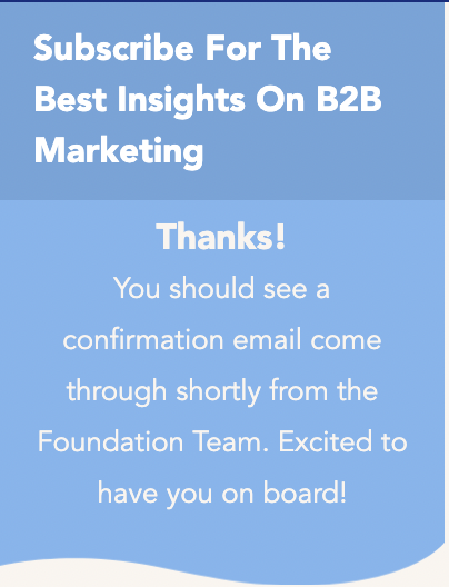
The slider bar includes a simple CTA asking them to subscribe to their newsletter. It has one single field to remove objections and increase the conversions rate on their opt-in forms. Here’s what happens when you enter your email ID and click ‘Subscribe’.

You will receive a confirmation email from their team. This makes sure that their email list is free from bots and other automated logins. Another opt-in that is simple and quick to convert new subscribers.
Some websites place a horizontal opt-in bar at the top of their website. This allows them to collect email addresses from multiple opt-in forms on the same page. This screenshot from Ramit Sethi’s website is the perfect example of an opt-in bar at the top.

Ramit Sethi’s website has an opt-in form below his header menu section. He is using that real estate to promote his newsletter (which is valuable by the way).
NOTE: This website has been rebranded from the time we last visited it. When you’re reading this blog, the website might be a whole lot different from this screenshot.
Some websites add an opt-in bar at the bottom of their page. This can be a tricky concept and can hinder your user’s experience if done wrong. So it’s always a good idea to test your opt-in bars at the bottom for a week or two before full deployment.
Our dear friend, Neil Patel has the perfect example of an opt-in bar at the bottom.

He uses this opt-in bar to book more calls for his digital marketing services. His pop-up picture along with the bold “I hope you enjoy reading this blog post” is a great way to capture visitor’s' attention.
He has no fields and a single button for this opt-in form. Once you click on the “Book a call” button you will be taken to one of their landing pages.

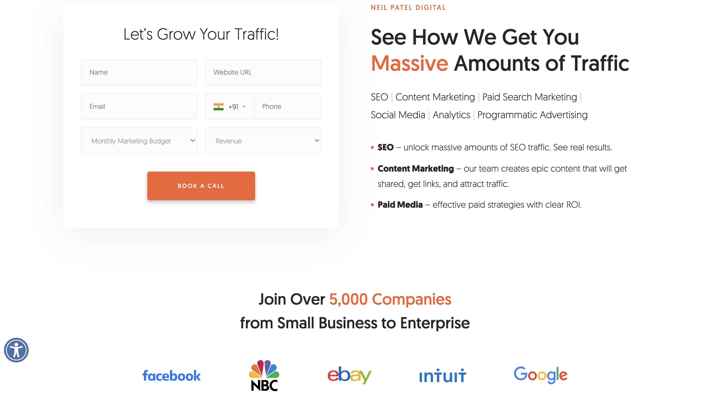
This landing page contains a number of forms along with a small amount of information and their value proposition. His team has also included the name of the companies they have worked with over the years.
On a closer look, you can notice that Neil Patel’s website has three opt-ins. One at the left, one at the top and one at the bottom. Although this is working well for him, you should always test your website before implementing multiple CTAs like this.
Slide in forms literally slide into your page when the user is reading it. They appear on the page based on the pre-defined conditions set by their website manager. This example from Sleeknote is a good example of a slide in form.

This form appears after scrolling 25% through a blog post. It shouts out ‘hello’ and grabs our attention fairly quickly. Once we click on this small yellow bar, it brings up the bigger opt-in form.

This is an opt-in form for their newsletter. Once you enter your email address and click “Send Me Everything”, a multiple choice question pops up.

The marketing team at Sleeknote is using the foot-in-the-door phenomenon to get the maximum information out of their visitor in one go. Once you select a choice and click ‘enter’, you are shown to this final pop-up in the sequence.

This pop-up features a CTA button that asks you to read their case studies. Click on that and you’re taken to a unique landing page with a list of all their case studies.

This is a good way to increase your email signups while also driving more visitors to your case studies.
Welcome mats occupy the full page of a website. They are highly intrusive, but when with the right strategy, they’re effective. Here’s an example of a welcome mat from Sujan Patel’s website.

This mat pulls down the website every time a new visitor jumps onto it. There are two things you can do from here.
We’re personally not a big fan of these welcome mat. But, we’re guilty of having subscribed to a marketing newsletter from one of these welcome mats. So in a way, this kinda does the job. But we’ll let you be the judge of these opt-ins.
Chatbot opt-ins are a relatively new way of asking for your visitors' information. Bigcommerce’s chatbot is one of the best examples of chatbot opt-ins.
The chatbot pops up and asks you if you’ve signed up for the newsletter. To make your life easy, it also gives you multiple options to choose from.
Once you click on an option, the pre-defined sequence starts and takes you through a journey.

Although chatbot opt-in forms are relatively new, they are effective. They are different from your generic pop-ups and screen mats. It feels natural when you are adding your details one step at a time.
These are just some of the opt-in forms we have encountered in the digital world. There are still hundreds of opt-in form variations out there. At the end of the day, there is no one best category out there.
Each method has its own pros and cons. The only way you can figure out the best solution is by testing everything ruthlessly. Test, iterate and test again. That’s how you find the best opt-in form that works for you.
Sania Khan is a content creator who has been writing for the past seven years. A content marketer by day and a poet by night, she previously worked for a large multinational and left it to pursue her passion for writing. She enjoys a good read with wit and tea to get her day started.
Tags:

M. Usama
February 23, 2024

Hamna Abid
July 31, 2023
.png)
Ammar Mazhar
March 17, 2023