


Last updated on
November 10, 2023
We’re all used to seeing popups on the web page. Sometimes, a pop-up happens at the worst time and ruins the user experience, making some businesses shy away from it. Therefore it can be annoying for the user.
But when used properly, popups are an excellent tool for promotion and lead generation. However, popups aren’t a one-size-fits-all solution. There are numerous types of popups that serve different purposes, and using them correctly means choosing the most appropriate ones for your goal.
So, we are delighted to share the latest information about website popups so that you can implement them accordingly.
Generated using JavaScript, popups are small windows that “pop up” on the website when a website visitor triggers it. You can add a pop-up using a short line of JavaScript code on the website.
Generally, Popups are informational or promotional offers that display on top of the content. Ideally, they capture the user’s attention quickly and prompt action with a clear, direct CTA.
You will notice that a popup includes CTA (call to action), which is a clickable button. It is enticing enough to influence visitors to click on it, directing them towards a landing page.
You want the visitor to cover all stages of the sales funnel, yeah? Popups are proven to work to decrease bounce rates. Sometimes you may not like them, but a popup does work contrary to popular beliefs!
According to Sumo, an average popup has a 3.09% conversion rate, while under best circumstances, it can jump to 9.28%. At the right place and time, popups work. The first popup usually performs over 30% better than any other tactic!
So when done correctly, popups can:
Customers will make time to engage with a pop-up that doesn’t come across as too forceful or invasive, which leads to a good conversion rate.
If it’s the right message and gets the visitor hooked, it can prompt the desired action, captivating the audience before they convert a visitor.
In addition, a popup offers valuable displays to anyone visiting the site, which makes them likely interested in what you have to offer. For example, a pop-up with gated content that expands on the topic they’re reading is more likely to get their attention than if it’s located elsewhere on your website.
Did you ever have a date gone wrong because you didn’t cook the chicken just the right amount? For a marketer, a horror story is a popup gone wrong. One small mistake can ruin the user experience no matter how smartly you plan the campaigns.

To avoid a sour taste in customer’s mouth, you can use three different types of popups:
It’s important to vary your popups to avoid ad fatigue (and a poor user experience), or a visitor sees too much of the same ad or type of pop-up and may ignore it.
Under this section, we will cover a variety of popups a website can implement as per their campaigns. It’s the best way to get rid of ad fat, which can make a customer run away screaming.
Take a closer look at the Popups.
Lightbox Popups are a common type of pop-up that appears in a smaller but new window over a web page. When the lightbox pop-up appears on the screen, the background darkens to focus on the popups (ideally) bright colors and messaging.
Lightbox popups are influential and effective at growing an email subscriber list. Hence, a win-win.

As the name suggests, the yes/no popup is unique due to the two options a user is given. A visitor can take either action offered in the campaign. Most of the time, visitors are prompted to complete their sales or explore the product pages.
Zeigarnik’s effect suggests that people dislike unfinished tasks and are more likely to finish once they’ve started; these popups are great for getting engagement.
Many popups ask for a name and email address, which visitors may be hesitant to provide. When the pop-up has a simple yes or no question, visitors are more likely to continue through the process and click yes.
With a yes/no pop-up, the yes option takes users to a new page to input a name and email address, while the no option closes the popup.

Like yes/no popups, yes/yes popups prompt response by tapping into our desire to finish a task.
But there’s one distinct factor, a yes/yes popup takes visitors to the same page but directs them to the product or service they’re looking for.
The first offer is typically the product or service with a valuable extra added. The second offer takes the visitor to the product or service page. If visitors want to close the campaign, there’s a small “x” in the corner.
There must be a way to exit from the pop-up without clicking either yes to keep the pop-up from becoming annoying or intrusive.

Gamified Popups are fun, engaging, and effective. A pop-up campaign resembling a gaming look people can play, such as a spinning wheel with a special offer they can “win,” is compelling enough to complete the action.
It captures attention with its playful design and incentivizes the visitor to complete the action and follow your prompts. The key is to make the offer worthwhile, such as a percentage discount or a gift of value.

A floating bar is a narrow bar that appears at the top of the page. Generally, a floating bar promotes sales, shipping discounts, or advertising news.
It may look like a banner, but it is triggered by a visitor to come up on the site. It captures the attention; hence, it is eye-catching and appealing, just like a traditional lightbox popup.
If you want to create an effective floating bar campaign, make sure the pop-up isn’t static – it needs to come up at the precise moment in the customer journey.

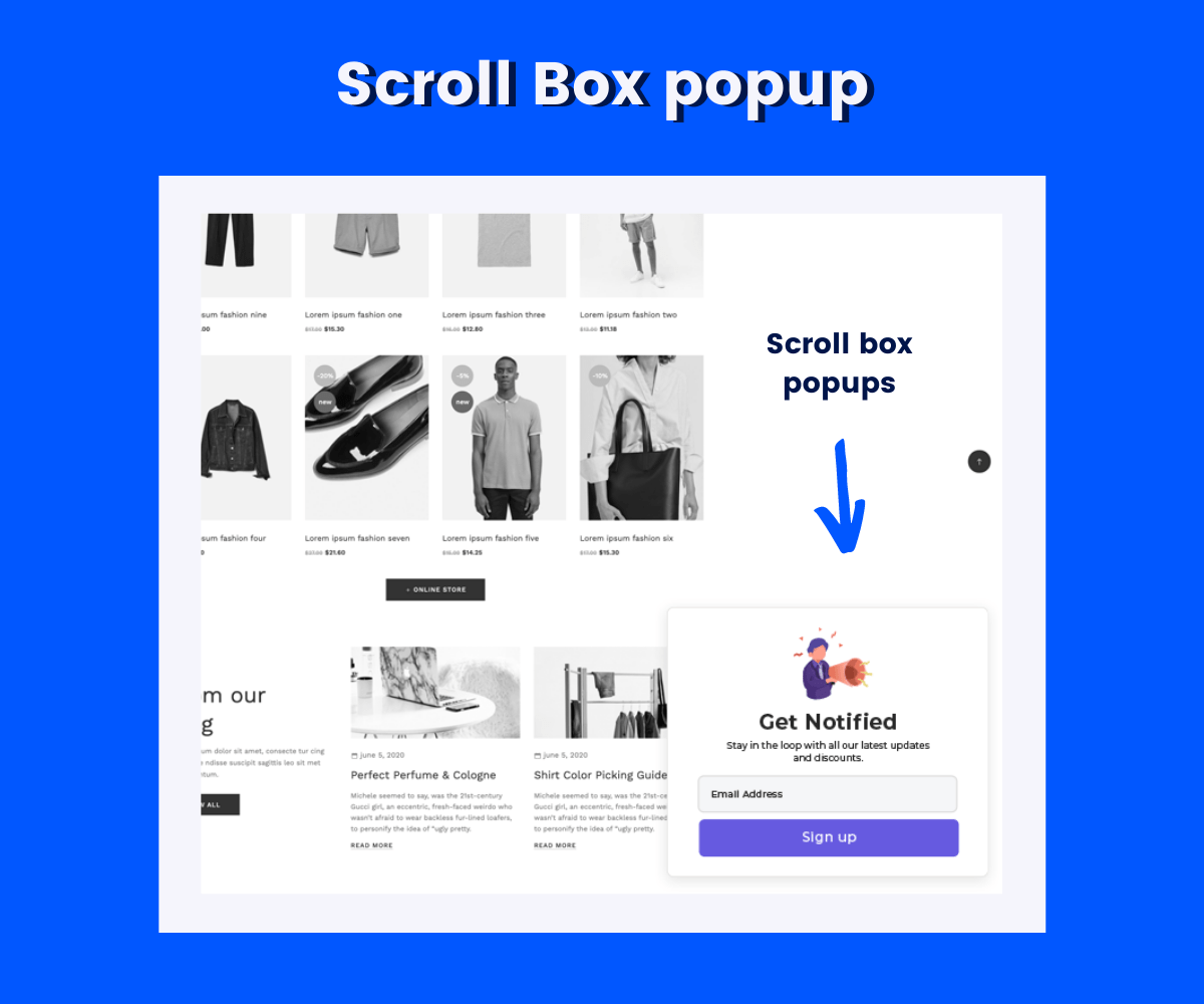
Some pop-up campaigns are subtle and don’t disrupt the visitors, such as scroll-in campaigns. These popups appear as small boxes on a webpage that advertise promotional offers or other deals, often on the side of the page.
Scroll-in popups are less intrusive because they don’t block the main page content, so the visitor can continue reading or browsing before looking at them. Once the user has spent considerable time on the same web page, it appears on the screen.
A full screen pop-up covers the whole screen and blocks the content beneath it, hence why they are considered more aggressive.
There’s no way to ignore a full screen pop-up, which gives you the ability to increase conversions and sales.
The full screen pop-up needs to be used to not annoy your visitor at the perfect time and place.

On-click popups are prompted by an embedded campaign trigger with anchor text. When a visitor clicks on the link, the pop-up campaign appears. Such visitors are prospects with a higher possibility of converting as a solid lead. Therefore, on-click popups are excellent for attracting warm leads.
Also, they help generate higher conversions.

Popups have different goals based on the marketing campaigns or business objectives.

Some of the popups by goal includes:
Popups are also used to inform visitors about something important for the business, such as changing hours or policies or information about a promotion or shipping discount. Whatever the goal, these popups are short and sweet.
Whatever your goal may be, with the help of an informational popup, a visitor has the opportunity to learn about your company and products too.

Are you looking to increase the traffic to your website? A page redirect is a perfect option to achieve this goal.
Often tied to yes/no or yes/yes popups, page redirects send visitors to a product or service page or related content of value. These popups are not only great for keeping visitors on your site longer and showing them something of interest, but they provide more value to the visitor.
According to a study, a page redirect can increase page views by 157%, which works like a charm for affiliate marketing strategy.

Users are burned out to ads, and over 40 percent of adults in the U.S. use an ad blocker to stop ads altogether.
An AdBlock workaround helps by setting a trigger that asks visitors to turn off the AdBlock and show your pop-up.
While many people want to block ads, they understand that they may miss out on deals or content. The FOMO is natural for some consumers! So, with this pop-up, visitors have the option to turn off the ad blocker just this one time and see the promotion you have to offer.

User login popups are an ideal example of how the right pop-up can improve visitors’ experience on your website. Visitors may come to a site where they have an account (or plan to create one), start browsing, and save something, only to find that they have to log in and go through the process all over again.
It can slow the buying process and even lead to losing the potential lead for good.
But with user login, you can ensure that your visitor is signed in from the start, allowing them to save wish list items or add to the cart without disrupting the browsing or shopping experience. The popup appears right on the screen without redirecting to another page so that users can keep exploring the site.

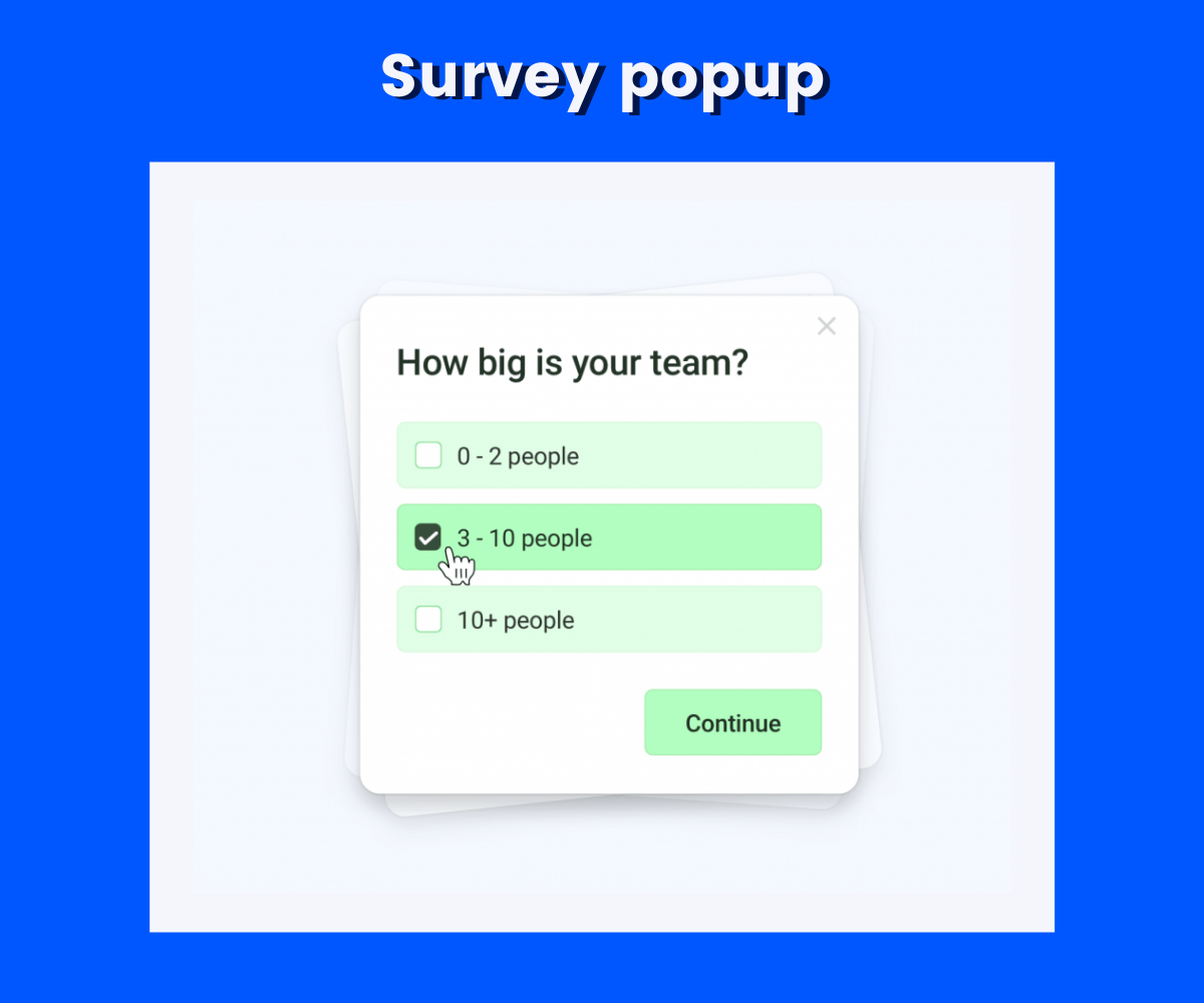
Customer surveys are a valuable tool for a business and provide plenty of in-depth insights into customers and preferences. Popups are handy tools to prompt visitors to fill out a short survey, which they may not come across otherwise.
A survey popup lets the marketers learn about their customer’s preferences. Such information is valuable therefore, a survey popup is easy to personalize according to your marketing campaigns.
Lead magnets are potent tools for building an email list. Typically, a lead magnet is something of value you offer your visitors, such as an exclusive article or blog post, a webinar, an eBook, or similar content.
This pop-up appears and displays your lead magnet, telling visitors that they have access to the free content in exchange for their name and email address.
Once they sign up, they can download the content. This pop-up is helpful because it offers something of value in exchange, so it’s more worthwhile for them.

Webinars and similar content is used to generate leads and build an email list.
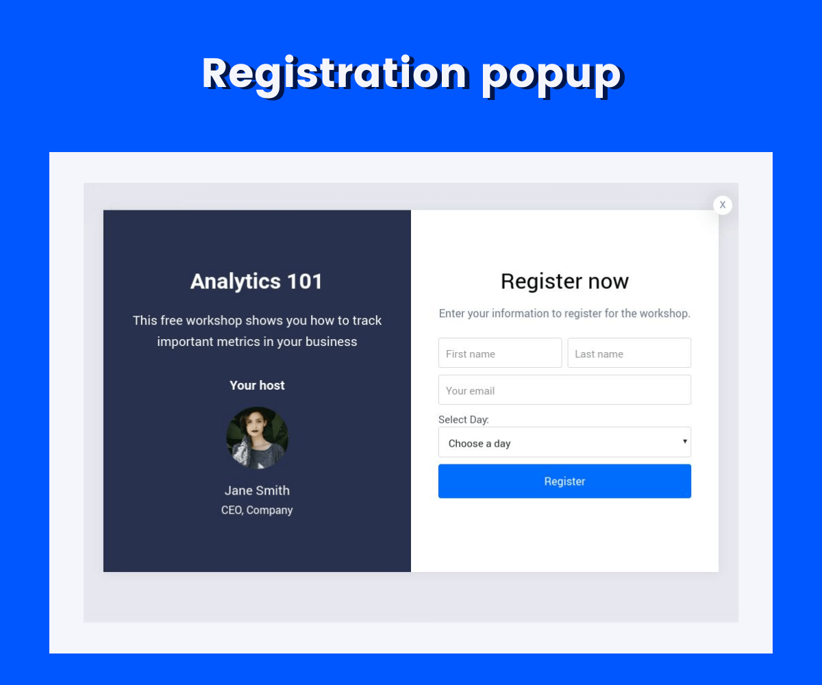
Using a webinar registration pop-up tells visitors about the webinar and gives them the option to sign up right then and there. They’re redirected to the landing page or receive an email with information when they input information.
If you’re planning a product or service launch, pre-order signup can help you build a list of interested customers and take pre-orders. In some cases, these pre-orders can be used to help with the costs of creating the product or service.
Pre-order popups may direct visitors to a landing page for pre-order or ask for an email to send a pre-order form or further information to a visitor.

Coupon code popups are rarely annoying for visitors - which is great news. You can offer a discount or promotional code that visitors uses to save on their order in exchange for a name and email address.
The key to making compelling coupon code popups is ensuring that they’re always current. The last thing you want is to provide a code that’s expired.

What’s the main objective behind creating a popup? Get the email address of the As mentioned, popups are mostly used to build an email list. If that’s the goal, you can use an email opt-in specifically to do just that. They focus only on getting an email address and not full contact information or anything else that may be off-putting to visitors.

Like email, building a phone number list can be helpful for SMS marketing.
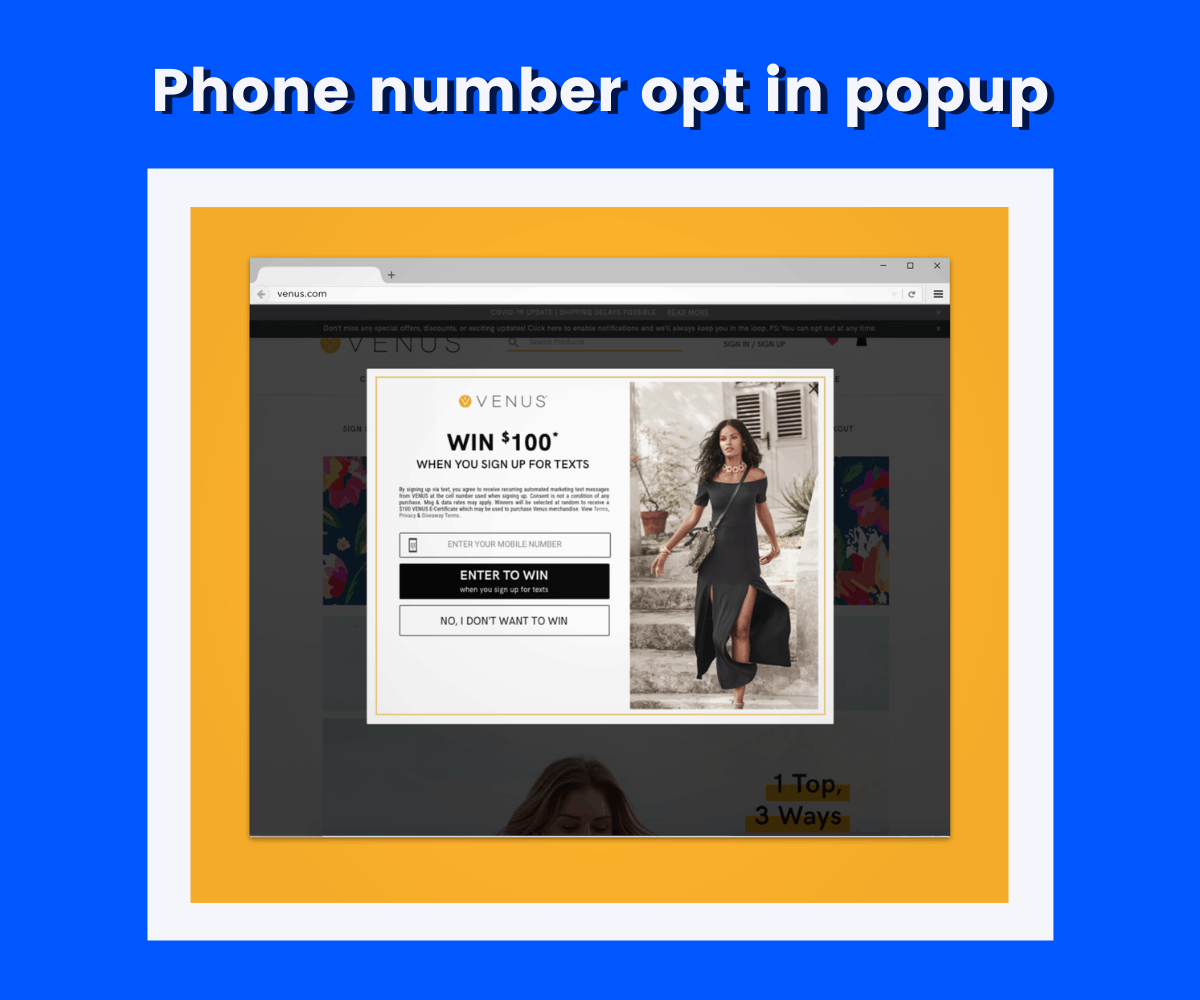
Phone number opt-ins are used to get a visitor’s phone number and consent to SMS marketing communications, such as pre-launch notifications, upcoming sales, and new content.
A product recommendation helps your customers find the products they may enjoy and increase sales. Product recommendation popups typically trigger when a customer browses a product page, and a similar product appears that they may find interesting.
Sometimes, a product recommendation may have a special incentive, such as a buy-one, get-one offer, or a discount on the total if the products are purchased together.

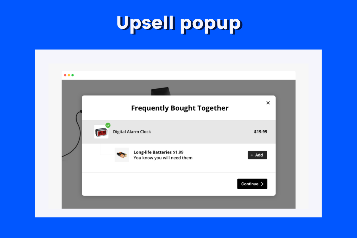
Like a product recommendation, an upsell pop-up suggests another product to a visitor that’s similar to one they viewed or purchased. The second product is typically more expensive and related to the first product. Marketers can compellingly introduce packaged deals thanks to the upsell popups.
The goal of an upsell popup is to prompt customers to spend more money on your products at a particular time.
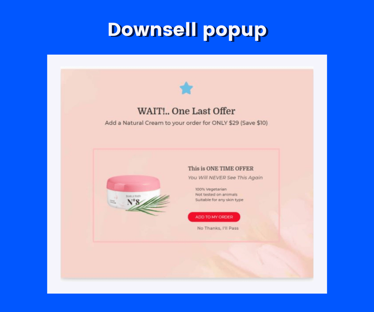
A downsell popup encourages a visitor to buy a cheaper product that’s similar to one they’ve viewed.
It typically appears when a visitor reviews a product and leaves the page without taking action, such as saving or adding to a cart, which can indicate that the product is too expensive for them.
Presenting a similar product at a lower price helps guide them into the sales funnel and may increase the average purchase in the future.
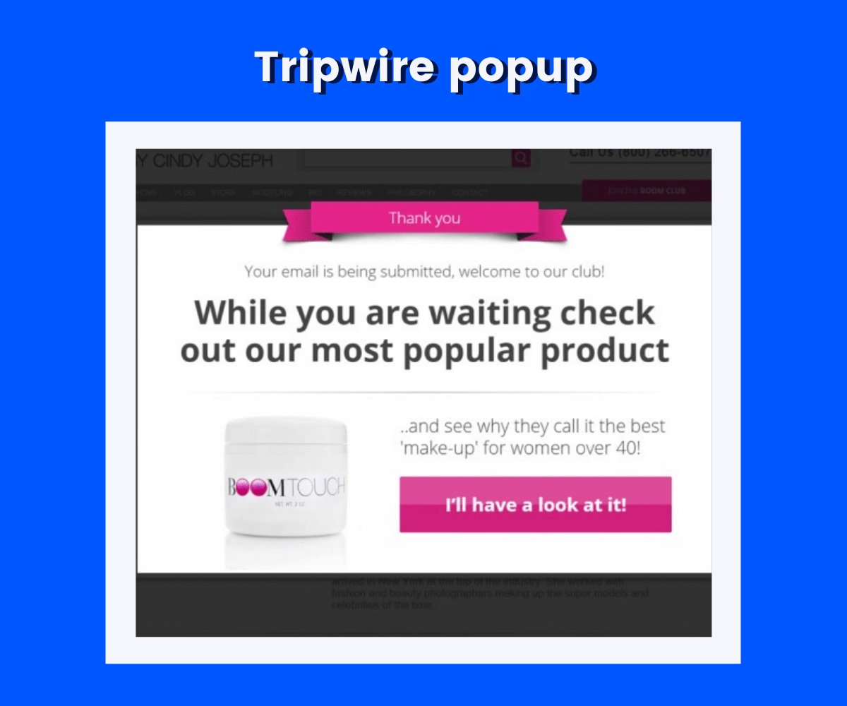
Want to offer a click-worthy product to your customers but do not know how to? A tripwire popup is a way you can achieve your targets. The tripwire pop-up is intended to push people into the tripwire funnel, which includes:
The tripwire pop-up can guide visitors into the funnel and help generate revenue through this process. Over time, customers spend higher than average on products.
Cart abandonment is a big concern for business owners and accounts for a lot of money in lost sales. A cart abandonment pop-up is a helpful tool in reducing cart abandonment and recovering visitors with items in their shopping cart.
With the help of a cart abandonment popup, you can retain 1 out of 5 visitors to buy products from your website.

Promoting old products can be a tough call. Contests and giveaway popups have many benefits like increasing social followers, growing an email list, attracting leads, and generating paying customers.
However, promoting contests can be challenging too.
A giveaway pop-up alerts visitors to your contest and generates more signups, followers, and ultimately, more revenue.

A countdown timer creates urgency for a deal or promotion and prompts visitors to act. This is perfect for limited-time sales or promotional offers and gives visitors a fear of missing out if they don’t take advantage of the offer right then.
The holiday season is the perfect time of the year to promote products via a countdown timer popup.

Social proof is important, especially when consumers distrust unfamiliar websites. Recent activity notifications instill trust and confidence in your visitors and ensure that you have other customers and visitors.
These notifications may include webinar registrations, email subscription sign-ups, and more. You can also use recent activity notifications to alert you to reviews about your business from another site.

A recent sales notification works like a recent activity notification, but it alerts visitors to a recent sale. They may not necessarily take action. So once the user sees other users buying the products or the number of products sold, it leverages the marketing tactic - FOMO.
So this popup not only provides trust but also creates a sense of urgency with visitors who worry about missing out on your products and want to purchase them before they sell out.

Popups can have different triggers or conditions that must be met before showing up to a visitor. Popup triggers are usually prompted by visitor behavior, so they only appear to visitors who’ve shown an interest in your business or products.
-min.png)
If you feel cart abandonment popups are not an effective tactic, try using exit-intent popups to recover abandoned visitors and show up when visitors appear to be leaving your website.
Many visitors who leave a site don’t return, so the popup tries to prevent them from leaving.
You can use exit-intent popups for both desktop and mobile visitors so that you can target your mobile traffic too.

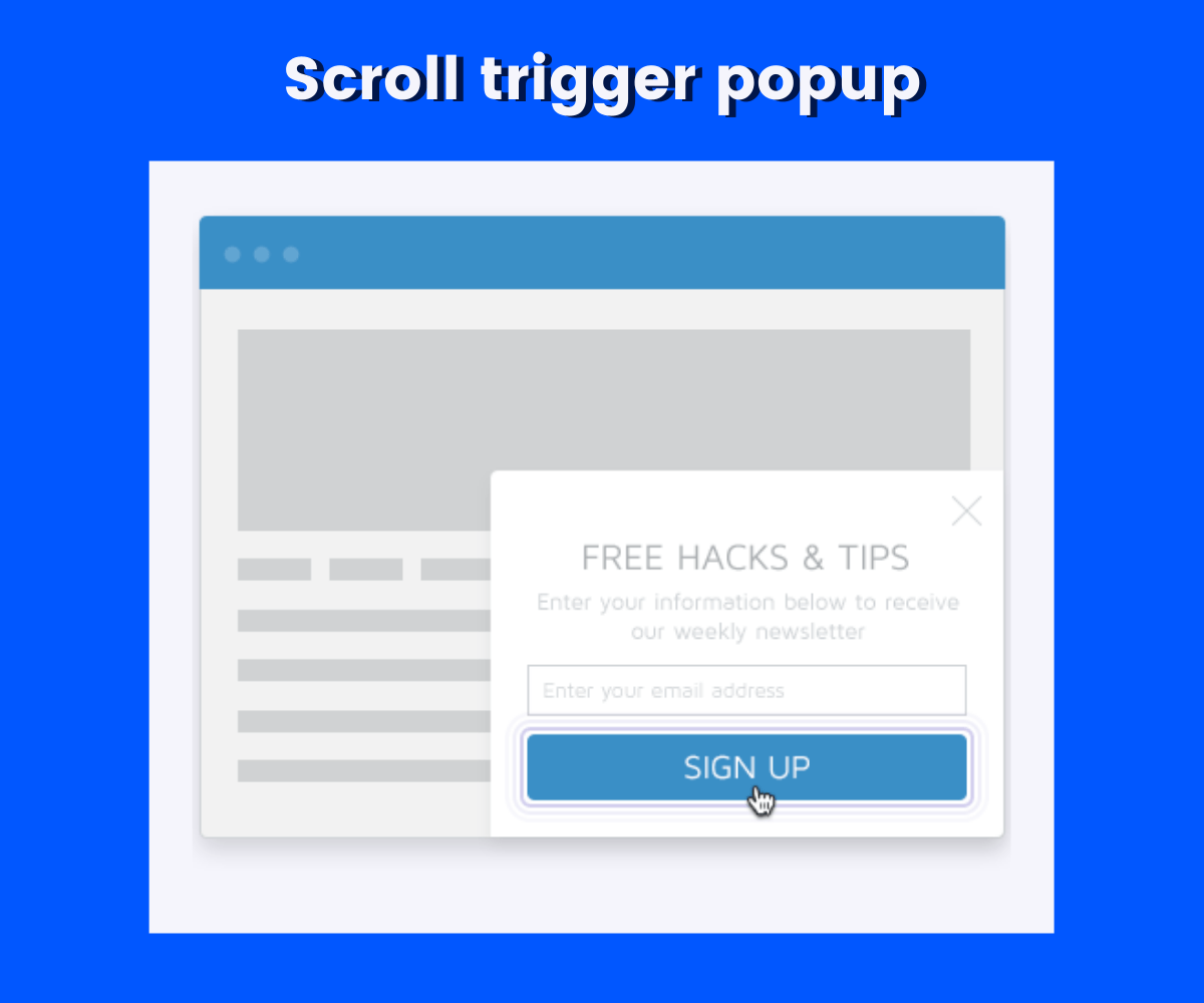
Scroll triggers show popups once a visitor has scrolled down the page. You can sync this with your content to ensure the pop-up shows at the ideal time.
For example, if you have a blog post about student drivers preparing for driver’s ed with a practice permit test, you can trigger a pop-up to appear around 30 percent that prompts the visitor to download an app with a free practice test. When the visitors reach that section, they’re primed for the offer.
Scroll triggers have higher conversion rates as the user explores your content in-depth with interest.
The time on page trigger shows a pop-up when a visitor has been browsing a page for a specific amount of time (usually under a minute).
These popups only appear to visitors that have shown interest by spending more time browsing, so they’re likely interested in your content. As a result, these visitors are more likely to take the desired action.

Generic popups aren’t as effective as you may like them to be, so a page-based pop-up can ensure to cater to the audience’s needs and offer quality content they view on each page. The message is more targeted to the visitor, and visitors are more comfortable because they’ve spent some time seeing what your business is about.
Page-based triggers can also be used to show a pop-up once your visitor has browsed a certain number of pages. Another best part of page-based popups is page-specific and relatable with the current page user’s content.

Location-based triggers are valuable for location-specific products or marketing. You can target visitors from a specific location with a direct popup campaign for your brick-and-mortar store or local offers.
If you have a global customer base, a location-based trigger ensures that only visitors from a specific country can see your campaign and allows you to adjust the currency and language.

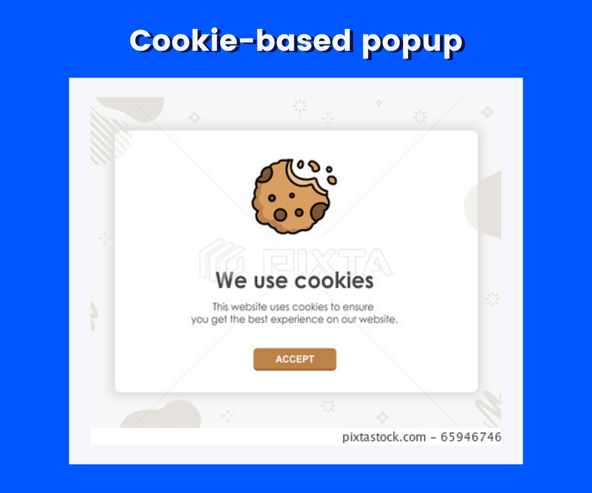
Cookie-based triggers send popups that retarget campaigns according to site traffic. With the information you already have about your visitors, you can use cookie-based Popups to sell them products or personalize the messaging.
If a visitor comes to your site and stops engaging with it, an activity re-engagement trigger sends a pop-up to encourage them to continue browsing or interacting. These popups are flashy and use sound or animation to capture attention.
In many cases, a desktop or mobile device visitor will abandon a site without purchasing a product. With an inactivity re-engagement pop-up, you can recapture your visitor’s attention and lead them into the checkout process.

A campaign-scheduled pop-up is designed to show at specific times between specific dates, such as for seasonal sales or product launches. These popups usually have a countdown timer for urgency and anticipation.
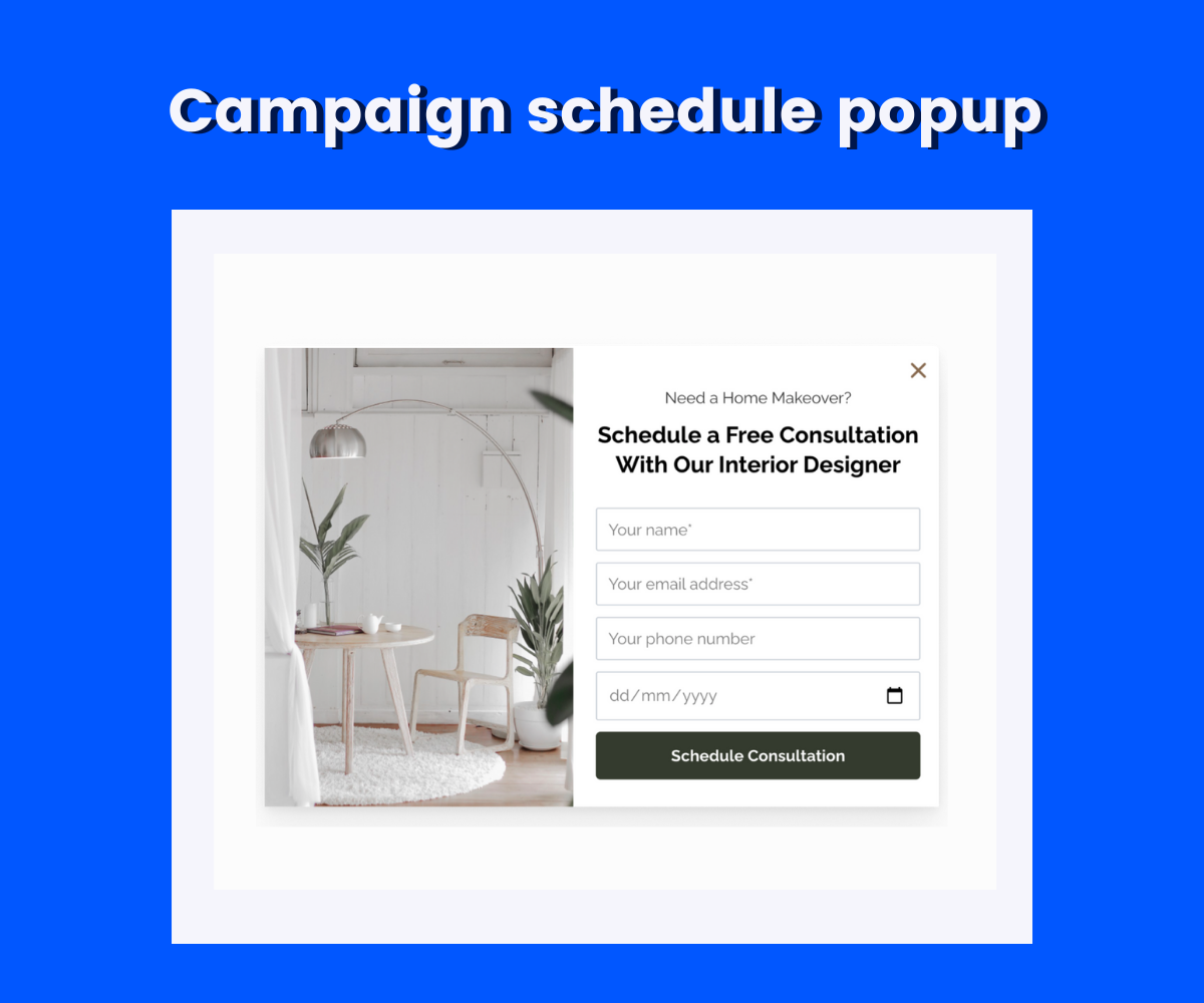
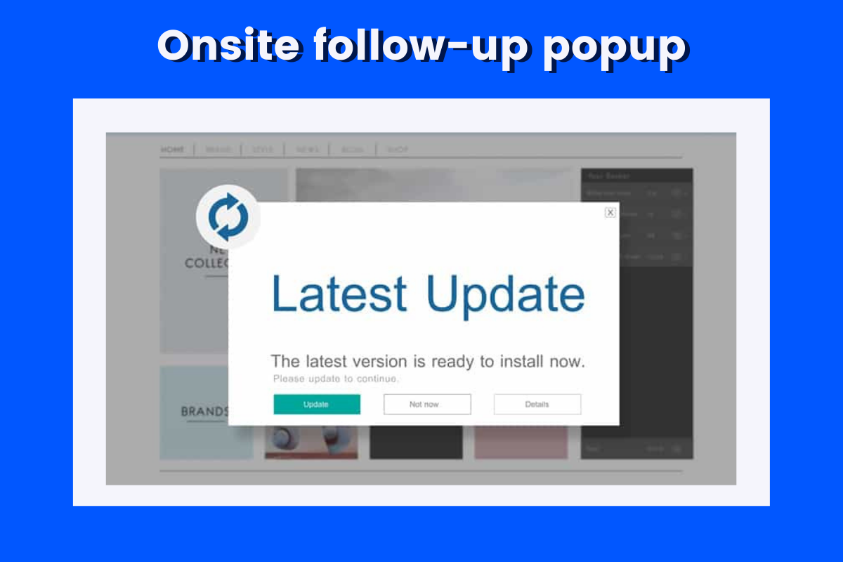
The most adaptive popup trigger, the onsite follow-up, is based on how visitors interact with the site and the best way to show popups in the future. Because these popups follow up on the initial engagement without disrupting the experience, they can boost engagement, improve lead generation, and increase sales.
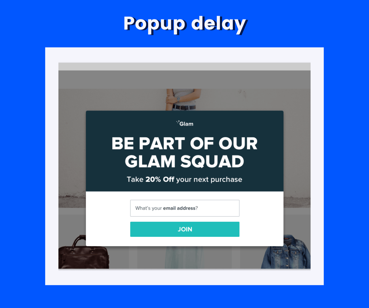
Popups can be annoying if visitors land on a page and haven’t had a chance to read the information before it’s blocked. You can trigger popups to show up with a slight delay, so visitors have an opportunity to view the information on the page before they are distracted.
Customer feels valued when they receive a welcome email. The first-time visitor popup gives a similar vibe. The first-time visitor discount is a popular way to turn a site visitor into a paying customer.
Typically, this coupon is exchanged with email signup for future offers. This is effective because visitors usually land on a site looking for something specific.

The terms and conditions pop-up is used to ensure visitors agree with the site terms before continuing. These popups are designed in a way that a user cannot close them unless they click the “I agree” button. Visitors must also scroll to the bottom of the terms and conditions before the button activates.
If a visitor doesn’t read the terms and conditions or doesn’t agree with them, the pop-up blocks access to the targeted pages. These popups are useful for restricting site entry or adding to the shopping cart.

Click-open triggers are prompted whenever a visitor clicks on an element of the page, such as buttons, text, links, logos, icons, and images. These popups are less intrusive than others and help guide your visitor through your site.

As discussed, there’s a right way and a wrong way to use popups. A popup can be an incredible tool for generating leads and converting visitors when incorporated correctly. Used incorrectly, a popup can be a huge turnoff for your visitors.
Here are some dos and don’ts for your website popups:
Before including any popup on your website, make sure it’s relevant to the visitor. For example, a visitor who’s been on your site for only a few seconds doesn’t know enough about your business or product to see if they want free content or a newsletter.
Consider these rules for popups:
Popups have to communicate a lot of information in a small space. The design should be minimal, direct copy, and a clear CTA relevant to the visitor. They should read and understand the offer quickly and decide whether to accept it.
Chatbots and live chats are helpful for visitors to ask questions and learn more about your business or site, but they shouldn’t bombard the visitor immediately. These tools usually have to expand windows or bubbles and loud notifications, which can be disruptive to the visitor.
Ideally, give the visitor 15 to 25 seconds to browse the site and learn more about your business and content. At that point, they may have questions for the chatbot.
Popups must be eye-catching but shouldn’t detract from the site or prevent visitors from seeing the content they clicked on.
Some of your options include:
Popups need to be evaluated and refined to reach goals and convert leads like any other marketing effort. It may take time to learn what popups work and how you can best use triggers and different types of Popups to motivate your visitors.
For example, you may want to try different delays for popups or chat window notifications or test various color schemes and copy for email signup popups. A/B testing is always a good option for determining the best popup results.
If you’ve ever gone to a website from a search engine link and gotten bombarded with popups before you even got to see the content, you will flee from the site right away.
Unfortunately, many websites use multiple popups that come up all over the screen before you’ve even gotten a chance to reach the headline.
These may include:
That’s entirely too much to put on a visitor and may lead them to close the site, no matter how much they want to see what you have to offer.
Make sure only the most important popups show immediately and save the others for the appropriate trigger or action to improve the customer experience.
Some websites use popups with a negative phrase for declining. For example, the popup may ask if you want to signup to receive email newsletters with marketing tips, and the options are “Yes! I’d love help with marketing!” or “No, I already know everything.”
This is rude. The visitor should be able to decline without hostile or insulting reasoning intended to guilt them into signup. In that example, changing the “no” option to “No, my inbox is full” goes a long way.
Mobile-friendly websites are vital to customer experience, and it’s only expected to grow as more users show a preference for mobile devices. Popups that appear on a mobile screen and block the content look like an ad or force a visitor to close, minimizing user experience. Google will prioritize websites that provide a better small-screen experience.
With a tool like Mailmunch, you can create mobile-friendly popups that are fully responsive and mobile-optimized to ensure visitors have a positive experience.
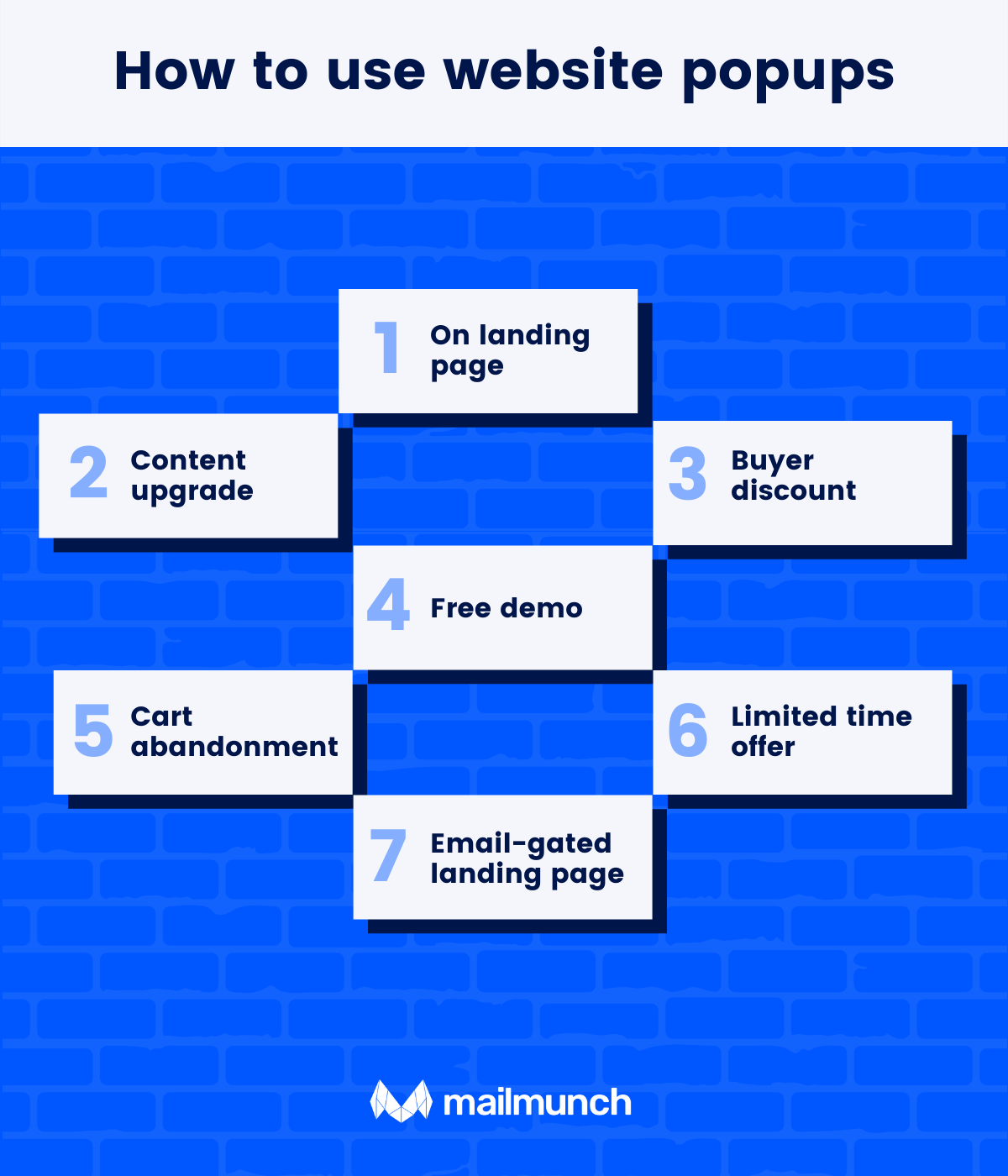
The most effective way to use popups is to hide them on your landing page above the fold. This keeps the popup itself small unless the visitor shows interest, then presents the full form for them to fill out.
If a visitor is interested in buying something from your site, a first-time buyer discount like 10 percent off is a great incentive. Many consumers expect these discounts, so they may be upset if they don’t get one.
Offering something in exchange for an email address is a great incentive for visitors, but only if you’re offering something relevant and valuable. A free content upgrade, eBook, or other exclusive content has value and should relate to the content they’re already browsing, making it enticing to offer an email address in return.
Depending on the stage of their journey, your website visitor may not be ready to buy from you, but they may want to learn more. A popup with information about a product demo, free trial, or contacting a representative to learn more about the product or service is a great exit intent popup that can keep visitors on your site. Check out how this webpage handles free New York permit tests.
Popups alerting visitors to a limited-time offer ensure that they don’t miss out on a great deal and add urgency to promotions. Countdown timers should have a scrolling header or footer that doesn’t prevent visitors from using the site – it’s just a subtle reminder of the offer.
One of the underrated values of popups is helping visitors navigate your website. They’re impossible to miss, so if a visitor is interested in exploring more content or product pages, a pop-up shows them where to go.
If a visitor puts an item in their cart and then tries to leave the website, a popup for cart abandonment reminds them to stay on the checkout page. In many cases, cart abandonment happens because of extra costs, a complicated checkout process, a lack of pricing transparency, or trust in the site.
Adding a popup at this point can address some of these concerns, such as a complicated checkout or website errors.
Looking for more? Check these 5 of the box website popup tips:
1. Match the design of the pop-up to the site’s design to keep it cohesive but distinguish it from the rest of the site design.
2. Put a simple, direct CTA button in the center to attract attention and drive conversions.
3. Use fewer input fields to increase conversion rates.
4. Use color contrast to highlight text and actions without looking too “busy.”
5. Experiment with shapes and images to make your pop-up unique and attract more attention.
Popups can be an effective tool for lead generation, customer conversion, and more, but it’s vital to do it right. You have a clear idea about what type of popup you can use on different occasions from the above types mentioned above.
Pick a popup that optimizes your sales, adds value to the content, and of course, boost sales reducing the cart abandonment rate.
Suppose you are a conservative businessman looking to experiment in terms of marketing. In that case, popups make the best possible impression on your visitors and prompt them to take action. It turns out, Mailmunch is a helpful tool to create stunning popups with the pre-built template library. Even if you are not an expert in designing, creating a new popup is still easy for you. Plus, you can use various popup templates for free.
A bookworm and a pet nerd at heart, Summra works as Content Writer at Mailmunch. She loves to play with keywords, titles, and multiple niches for B2B and B2C markets. With her 3 years of experience in creative writing and content strategy, she fancies creating compelling stories that your customers will love, igniting results for your business.
Tags:

M. Usama
February 23, 2024

Hamna Abid
July 31, 2023
.png)
Ammar Mazhar
March 17, 2023