
.png)

Last updated on
December 6, 2023
Email leads are the lifeblood of your business. Unlike social media channels that can show you the exit door any time they want, you own your list. Moreover, collecting email contacts is one of the most effective lead generation strategies that bring great results.
Email capture is a marketing technique you can use to grow your email list by asking visitors to give you their email address in exchange for something of value like a coupon, an eBook, a video, etc. Email capture matters because it gives you a channel to get in touch with your customers and guide them in their buyer’s journey. You can reach out to your list any time you want.
Now that you know why a list is so important for your business, here are 14 brilliant ways to capture email leads:

When you offer a lead magnet the prospect has to know that what he’s getting in exchange is valuable enough. Why is it so important?
It’s worth your while creating something that prospects will appreciate. According to Privy, their clients on BigCommerce generate $11.68 for every email they capture.
An engaged email list is big money, considering how valuable an email list can be for you.
Think of the lead magnet as the value you bring to the table for a user to exchange their email address with you.
Earlier, the only lead magnets were eBooks but that has now changed to videos, webinars, checklists, and more.
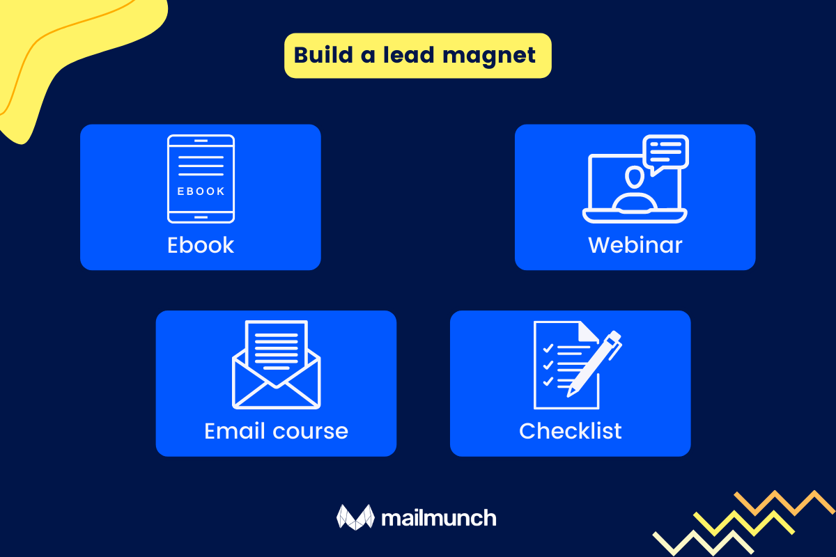
An Ebook can be anything. To save time, you can repurpose content from your blog posts. You can create the content from scratch if you want. It can be new content you create around a subject your readers are passionate about. Remember that it’s about your readers and not about you. GoProspero offers both free and paid templates as an example.
.png)
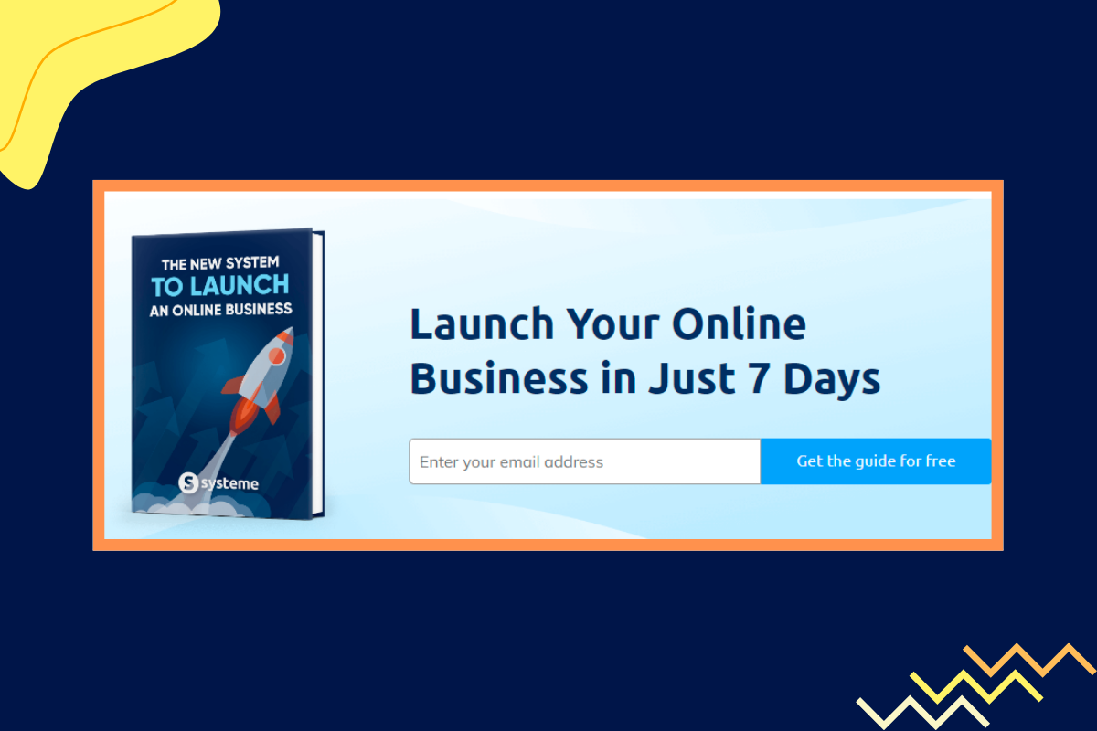
Here’s an example from Systeme.
A webinar can be around a topic you know really well about while at the same offers something interesting to your users. Perhaps an angle no one has paid any attention to.
Virtual events like webinars can help generate traffic and leads for your business.
You can take the Ebook and break it down into a series of newsletters that you send out to subscribers as a 7-day course.
Wrote a blog post that’s a guide on — correct on-page SEO changes? How about you end it by offering a checklist of on-page SEO factors for someone to pay attention to? This post on cold-email campaigns lists several easy-to-follow templates the readers can start using.
Identify the right subgroups within your core audience. Since most companies collect personal data from customers, you can do this by looking at demographic aspects like their geographic location, age, ethnicity, income levels, and more. Subgroups can also be drawn out by segmenting based on behavioral data like past purchases.
Develop insights into your audience’s personality types, attitudes, and belief systems. An example of this segmentation is people who like working from their homes and people who enjoy working from offices. Are they family-oriented? Are they more goal-oriented?
This understanding will help you target the right segment with the right offers and snag more leads.
When you target different segments of your audience — certain behavioral triggers can help you present the form when they’re primed to convert.
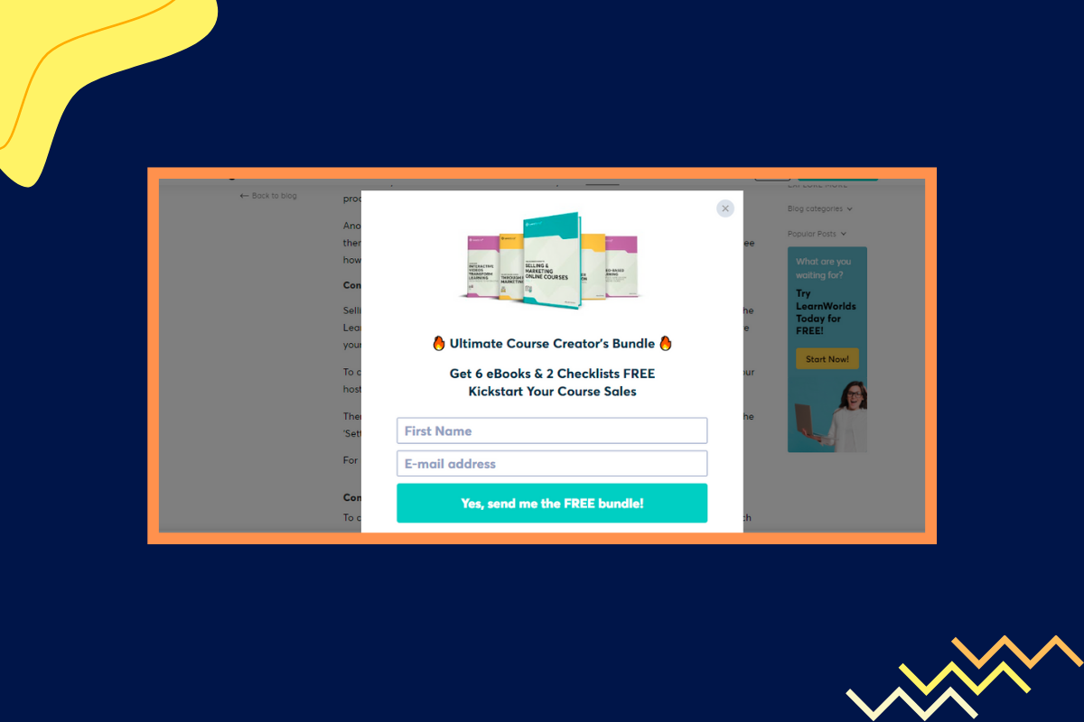
It isn’t hard to wrap our minds around exit-intent technology. The popup displays itself tracking the mouse movements of the visitor. As soon as the cursor hovers over the close button on the tab, this signals an intent to leave and up comes the popup. Magic, right?
Learnworlds, a popular course creation platform uses the exit-intent popup form to ask the visitor to subscribe. Look at how Learnworlds cleverly bundled together 6 eBooks and checklists as an offer to anyone who wants to sign up.
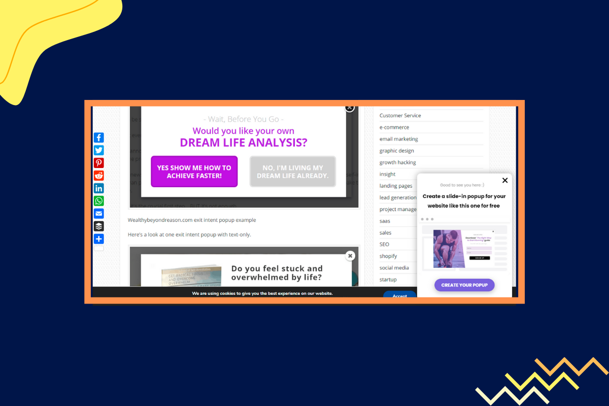
You can also place the slide-in popups in areas of your page that traditionally account for the highest conversion rate.
Here’s an example from Poptin. Note the slide-in popup at the corner of the screen in stark contrast with the rest of the page?
Here’s another example from Cience. Notice the slide-in popup at the bottom right of the screen?


The most important element is the headline. Most people decide whether to pursue the landing page based on the headline. A well-written headline is short, punchy, and gives a hint of the benefits that await the action-taker.
After the headline, the second most important element on a landing page that drives conversions is the call to action button. Ensure that the CTA stands out from the rest of the page and is in contrast with the page theme. The focus should be on the CTA button with a link that redirects viewers to the landing page. You can highlight the CTA within a container, use colors for the button that contrast with the rest of the page, highlight it with white lines, an arrow or have a human face looking at it.
For instance, have a look at this page from Curator.
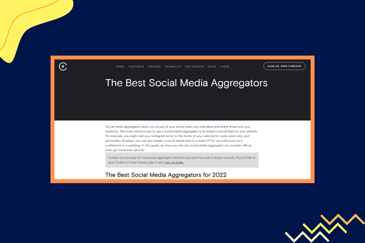
The main Call to Action button — “Sign up, Free Forever”, almost disappears into the background. It doesn’t stand out or draw attention to itself in any manner.
That’s precisely how you shouldn’t add a Call to Action button.
Now, look at this page on BigCommerce.

The CTA button — “Request Demo”, stands out from the rest of the page with its clear blue coloring. It draws attention.
Your landing page is where you talk about the offer to a potential prospect. Ensure that you speak in a language they understand and relate with.
Ultimately you never know if you’re doing enough for getting conversions unless you A/B test your landing page with similar variants of it that you create.
Matching the blog post with an intent is also called offering a content upgrade.
For instance, MediaShower has a post titled—The Definitive Guide to Content Marketing Platforms.
They end their blog post with a worksheet that compares the pros, cons, and features of all the platforms listed in their post. This is a perfect example of the content upgrade matching the blog post intent.
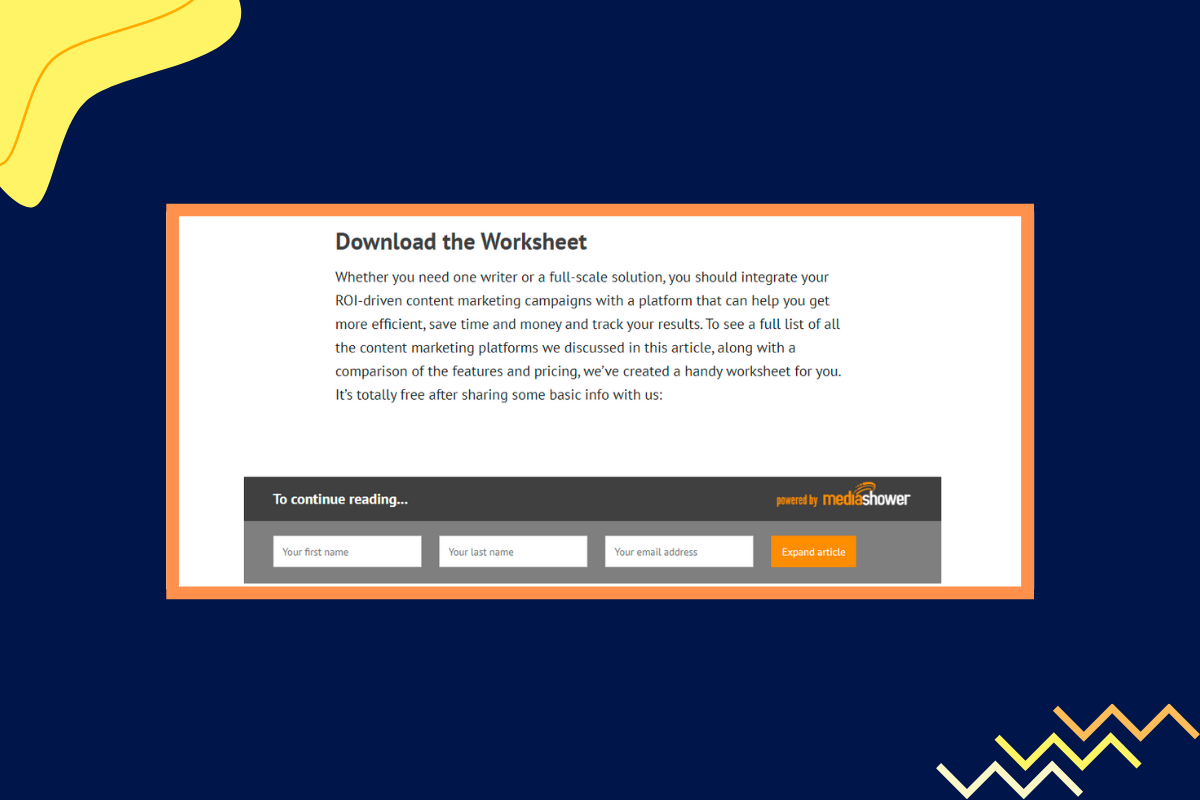
A content upgrade is a value-added offer to the subscriber for picking up a subscription to your list. You can also give visitors an option to download the PDF of the lead magnet in exchange for their email addresses.
Here in this case, the subscribe box remains at the end of the blog post.
If popups annoy readers, this is a great alternative. The subscribe box sits at the end of the blog post. It doesn’t try to get unwanted attention and doesn’t force itself on others.
Planable’s post on creating a content calendar ends with a content upgrade at the bottom of the article.

The offer perfectly matches the intent of the blog post. Not only that — it’s so easy to see the content upgrade offer, standing out in green compared to the rest of the page.
You can do this for every piece of content that has high traffic and see if doing so improves your conversions.
Databox too puts up a content upgrade (a relevant offer) for each of their blog posts. They track marketing KPIs like the number of downloads for the content upgrade and below you can see how they generated over 561 signups with their blog articles.
The right lead capture tools like Mailmunch do most of the heavy lifting for you and generate quality leads. You don’t have to worry if your forms are going to be good-looking.
Mailmunch automates email marketing. Additionally, with Mailmunch you can create different opt-in forms, popovers, top bars, and embedded forms to target leads for each campaign you run. Mailmunch offers a drag-and-drop tool to optimize your landing pages.
One of the best lead capture tools is a gamified version of your standard lead capture form.
This will work especially well for eCommerce sites. Often, on these sites, there’s a spinwheel form. Based on where the ticker lands, the prospect gets a percentage discount. Gamifying the aspect of shopping helps you snag an email address. Here is an example.

The most difficult step is finding the right reward. If you pick something up that doesn’t interest them, you’re not getting many subscribers.
My advice is to go with a digital download, as there are no associated costs with producing or delivering them. This increases your signups.
Automate how you deliver these digital downloads to save time.
Ultimately, choose rewards that are right for whatever stage of the buyer’s cycle they’re at.
Simple how-to guides, checklists, or pre-recorded webinars are all great ideas for you to work with. Have a well-documented content strategy in place. You could also create a product giveaway.
Melyssa Griffin, for instance, offers advanced training to potential prospects to encourage signups (these are pre-recorded webinars).

Consumers often love getting free products. A sweepstakes or giveaway can encourage people to sign up with their email addresses for a shot at winning a free product or service. What is more, you can start an affiliate program to encourage people to help you collect email addresses from potential leads. After all, affiliate partnership improves lead generation when done right.
It’s ideal to have opt-ins at different places through the site. We already talked about using exit-intent popups and scroll triggered popups. In addition, you can place optin forms on the sidebar.
You can generate and post a content upgrade on every blog post and get more leads that way.
For example, in this post on JimmyRose, the CTA is repeated twice throughout the blog post:
Placement 1:

Placement 2:

Here’s another example, from SocialBee. The CTA is repeated thrice:
Also, the CTA button stands out in green color.

Experts at Wishpond say that ideally, you should have only CTA on a landing page. You can repeat it twice or thrice but more than one CTA dilutes focus from the core theme on the page which is the primary action you want the user to take.
This page on Salesflare uses just one CTA. A call to sign up for its service. The CTA could use some repetition, but other than that they stick to the rule of having just one single CTA for every page.

Your forms should be mobile-friendly. 54% of the traffic today comes from mobile devices and by keeping your forms device-friendly you’re making sure that you’re generating plenty of leads with traffic that comes from mobile.
A simple form often converts better. Often, form simplicity refers to the length of the form. Try not to overwhelm the visitor with a lot of questions. If you need to ask that many questions, a multistep form is the better choice.
Klutch’s sign up form is extremely simple, highlighting the core benefits of the software in simple terms:
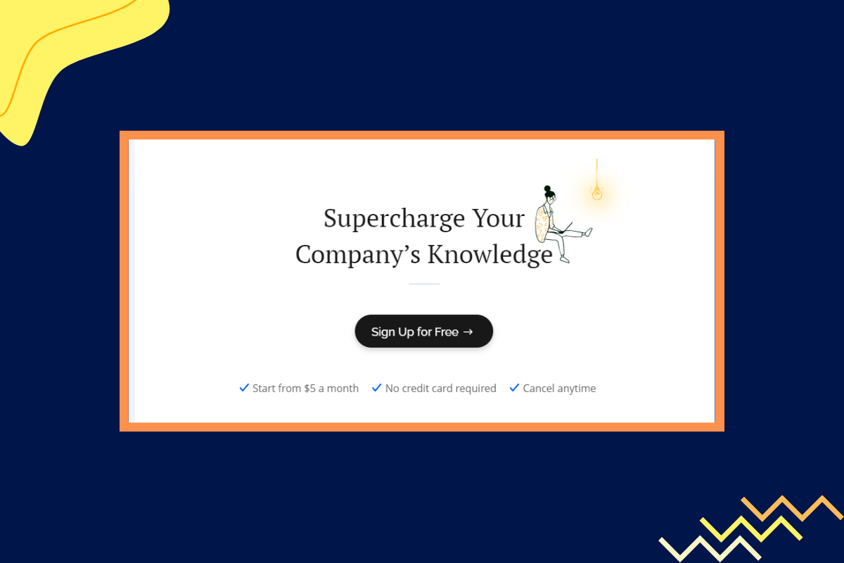
When you click on “Sign up for Free”, you get this page with just three form fields.

Mealfan’s subscription form(given below this line) is even simpler. It only asks for the email address.

FyleHq does something even better. They turn their landing page on expense management into a multi-step form.
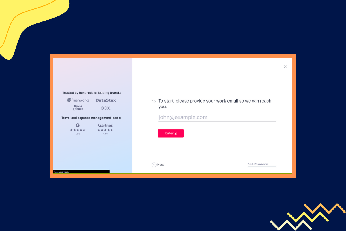
Studies indicate that reducing the number of form fields aka the number of questions on a lead generation form results in a higher number of signups. Form length is important if you’re trying to boost your lead capture form conversion rate.
When driving lead generation with content marketing efforts, it’s important that the content you post shines. That means regularly updating the content with whatever is relevant and trending in the industry.
This ensures that you’re creating and delivering helpful content to your readers. They’re more likely to share this content, generate positive user signals for your content and help it rank higher.
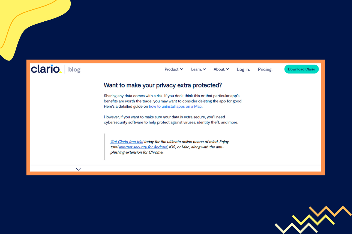
What is more, it's a good idea to publish social media posts that encourage your followers to share their email addresses. The more followers you have, the more potential email leads you can generate. Clario, a company in the data-security niche updates its content on — Companies that Collect Data, every year with new information.
In this section, we’re going to discuss 5 different tools that you can start using to capture email leads. Many of these tools have drag-and-drop builders that make it easy for you to create optimized landing pages, sign-up forms and generate more leads.
Let’s get started:

Mailmunch comes ready with a number of templates for your opt-in forms. You can customize the colors, looks, and feel of the templates to match the overall website design.
In addition, you get complete access to advanced marketing analytics data that helps you make sense of how you’re generating leads to your business with Mailmunch. You can see the number of visitors to your different pages and attribute conversions that are happening from your content. This helps you understand which content performs the best for lead generation.
With Mailmunch you get access to 100+ popup forms templates that are all 100% mobile-friendly. Coupled with display tools, it’s easy to move the forms around and create the form the way you want it.
There is a free plan for you to get started along with a paid plan that starts at $19.

Sumo’s star highlight is it offers an easy-to-use format that you can use to power up your lead-capturing abilities. There’s a free plan available that you can use with basic features. With this, it’s easy for anyone to get started immediately.
Sumo has multiple list-building tools that enhance lead capture. You can choose from options like welcome popups, smart bars, and other ways to capture leads.
The forms are customizable.
Plus you get to choose between a bunch of different styles. A number of templates are available which you can customize with relative ease..
There’s no coding involved. Sumo lets you design forms with a drag-and-drop tool.
Sumo works with WordPress, Shopify, and Google tag manager. You can get started with Sumo for free but the PRO plan starts at $39 per month.

Sleeknote is another popup builder and an email capture tool with which you can readily design banners that improve lead capture. Sleeknote streamlines the process of building and testing popup banners.
You get a drag-and-drop editor that simplifies building a lead capture form. It helps you create and launch your popups quickly.
The mobile editing feature ensures that the popup looks great on mobile devices, and is responsive.
Targeting capabilities include page-level targeting, customizing cookies, and targeting by referral source and location. There’s also a personalization feature where product suggestions are highlighted on the popup.
Sleeknote comes with a 7-day free trial. The cheapest plan is the Lite plan starting at 49 euros a month.
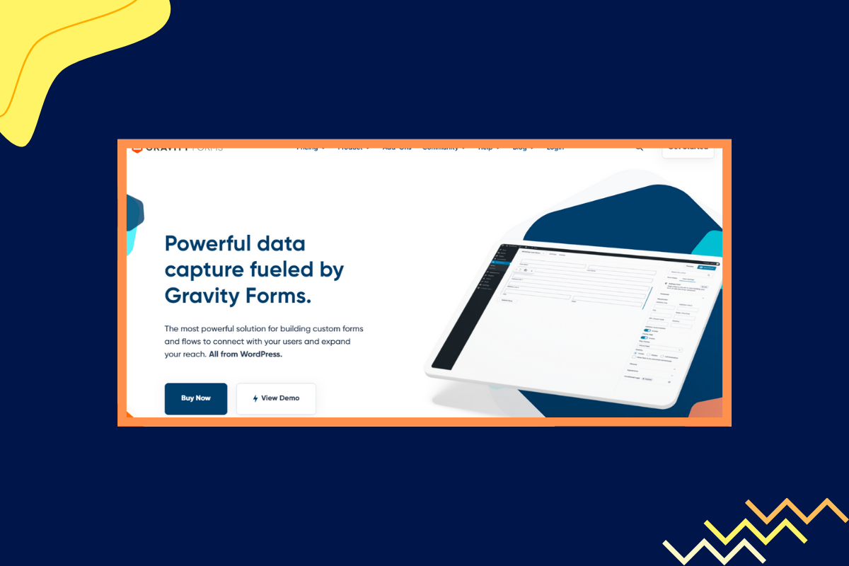
Gravity Forms is one of the best tools currently available to build complex forms on WordPress.
Gravity Forms offers you 30 plus form fields. The form displays equally nicely on mobile, tablets, and on desktop devices. Based on user input you choose to calibrate more fields to display. You can set an email notifications system for whenever someone new submits a form.
With Gravity Forms, you have some advanced features not easily seen on other tools. For example, you can add a form field that allows users to upload files.
If you’re a site that gives estimates to people based on what service they want, you can add a calculator field to Gravity Forms. Plus, with Gravity Forms there’s the option to save a partially filled out form with the user being able to return to the same later on his next visit.
Gravity Forms starts at $59. There’s no free version. However, you can visit their demo site and use the plugin and access all its different features.
.png)
Hello Bar is a great tool that helps you create and display popups. It’s simple to set up and with many options for you to customize.
It integrates with many email automation platforms too.
Hellobar gives you an email capture tool in the form of a bar that stays permanently at the top of the screen, scrolling down with the page, so that it is never out of display for the user help you get attention and win more conversions.
The message that you can use on the bar is a call to action button.
Hellobar delivers great results and one of the sites using Hellobar got 1180 plus subscribers in 30 days of using the tool. Hellobar is free to start using with the Starter plan. The growth plan starts at $29/month.
For email lead generation to work, start by targeting the right audience. It’s easy for you to attract as many people as you can. The truth is the highest impressions or views do not necessarily mean more conversions.
The more the merrier. According to data from Mailmunch 50% of those who want to grow their email leads, use at least two types of opt-in forms. You want to make sure there are enough opt-in forms on your site so that you start generating the most number of leads.
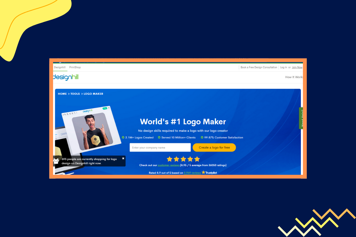
Ebooks and templates are great. But at times, a free tool is all that you need to generate plenty of signups. Designhill’s free online logo maker is a good example of this creativity in action.
There are tons of ways to grow your email list. One of the best ways is to create blog posts specifically targeted at your audience and match those blog posts with content upgrades. The right content upgrades help you grow your list quickly. You also need to keep opt-in forms simple and limit the number of form fields. Also, make use of every chance you get to convert leads. Why stop at one opt-in form when you can place five or six on your website?
Always test your landing pages and lead capture forms—use different CTAs, and different colors, and test out a different copy to optimize conversions.
The key to getting more leads is simple. Understand who your audience is and create more of the content they love. Once you have the targeting right, the next step is to multiply the number of opt-in forms, make them visible, and use highly-relevant offers to convert people visiting your site.
A voracious reader and a music lover, Ammar has been writing engaging and informative content for over 3 years for B2B and B2C markets. With a knack for writing SEO-optimized content, Ammar ensures the results speak for themselves.
Tags:

M. Usama
February 23, 2024

Hamna Abid
July 31, 2023
.png)
Ammar Mazhar
March 17, 2023